The Atlanta Hawks are getting a new look next year. Yes. Confirmed.
“Atlanta Hawks, LP” filed a trademark just this past week for the graphic you see above with the United States Patent and Trademark Office. It’s a basketball with flames shooting out the top, two wings from either side. The flames perhaps a nod to the burning of Atlanta during the Civil War?
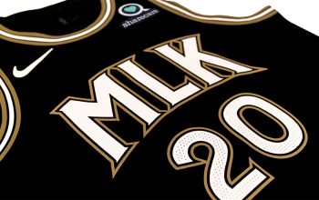
Regular visitors of this site may recognize the logo, we just saw it on the waistband of a leaked uniform design for the Hawks special 2015 Christmas Day uniforms:
That leaked uniform rendering also suggested the Hawks were adding lime green and black to their colour scheme, retaining red and dropping blue.
The new logo seen at the top of this post, which we’re presuming is an alternate team logo with the “Pacman” logo being promoted to primary logo status, is similar in shape to the primary logo which had been used for the past 20 years. With the new primary likely just a modernized 1980s team logo and the incorporation of lime green (from the 1970s) the new Hawks brand will be a real trip through the Hawks’ team history!
We still have a few weeks before we’ll see the full new brand but friend of the site Conrad Burry posted what he believes the new uniforms will look like (based off of leaks and his own hunches)… we cannot confirm or deny the accuracy of his design, we haven’t seen the real deal yet!

Recently I learned the NBA has “logo rules” in place for any new team brand introduced going forward:
1. Primary logo must include city name and team name.
2. Primary logo must not be a *direct copy* of a previously used primary team logo
3. A basketball must be incorporated into one of the team logos (primary, alternate, etc.)
This new set falls right into line with those rules. The primary will likely be a modernized version of an old logo (not a direct copy) with the inclusion of “ATLANTA HAWKS” arched off to the side of it it as we saw on a team letterhead earlier this season (see pic above).
As for the basketball? Well, I’m thinking that you’re looking at the sole reason for the new alternate logo featured in this article. A basketball to meet the NBA’s logo guidelines.
We’ll wait for the full release to share our thoughts on this rebranding, I just hope they use that lime green wisely, it’ll be interesting regardless.


