
Minor league baseball is an industry whose main goal is to appeal to families, if not specifically children. So the Hillsboro Hops, short-season single-A affiliate of the Diamondbacks, went out on a limb when they based their entire identity on one of the four main ingredients of beer. In fact, when the team unveiled its new team name after relocating from Yakima before the 2013 season, there was concern about the direction they were taking.
“Right away there were some people that just jumped right to the beer side and had this picture in their head that we would have drunks all over the stadium and Thirsty Thursday was going to be every night and all this stuff,” said K.L. Wombacher, the team’s executive vice president and general manager.
But Wombacher is quick to point out that the name Hops isn’t just popular with any old beer drinkers, it’s popular specifically with beer snobs. Hops are commonly associated with craft brewing, which as of last year accounted for 11 percent of the beer industry, breaking double digits for the first time.
“Craft beer drinkers are more like wine drinkers,” he said. “They get offended if someone is drinking a Bud Light next to them.”

And besides, the team name is about more than just beer. With 4,000 acres of hops fields, Oregon ranks second among states that produce the crop. While Hillsboro has become something of a tech town, located in the so-called Silicon Forest, the town’s roots are in agriculture.
“There were a ton of hop fields here back in the day,” Wombacher said. “So the agriculture theme kept coming back to us when we were looking at the name.”
The Hops had a couple other goals in selecting a name. After 23 seasons with a generic name, they wanted something unique. “We were the Yakima Bears before,” Wombacher said, laughing. “There are only about 300 of those logos.”
 With all of these factors met, there was one final criteria: It needed to sound good. “It came off the tongue well,” Wombacher said. “It’s the Hops. It’s real simple to say. ‘Have you been to the Hops game?’ ‘Have you seen the Hops play?’ ‘Go Hops!’ ’Hops Nation.’ All that kind of stuff.”
So the name is borne of the town’s agriculture roots, it’s captured the imagination of the growing craft brew culture, it’s unique, and it sounds good. In addition to that, it relates to the game the Hops play. “It also ties into baseball with the terminology,” Wombacher said. “Short hops, crow hops, bad hop.”
To say that the logo has been a success would be an understatement. When they debuted, they sold out of their first batch of T-shirts in 23 hours, and in their first year sent orders to all 50 states and a handful of foreign nations. Then they accomplished something that you don’t see often with short-season single-A teams playing in tiny markets.
“When we cracked the top 25 in merchandise last year, we threw a huge party,” Wombacher said. “Playing only 38 games and going up against triple-A and double-A teams that play 70 home games—I mean, 80 or 90 percent of your merchandise sales comes from the games, so we never thought we’d be able to beat out triple-A and double-A teams.”
 Wombacher credits much of the logo’s success to designer Dan Simon, who immediately saw potential in the name. “He started looking at pictures of a hop and was like, ‘Yeah we can make this guy into a superstar,’” Wombacher said.
Another reason for the success is good timing. “I think we just launched it at the perfect time,” Wombacher said, referring to the increasing popularity of the craft brewing industry. “Craft beer, hopheads, it’s just such a different culture…. We’ve been able to have minor success with it on a national basis with craft beer drinkers.”
The team’s color palette of blues and greens is intended to convey a soothing feeling of the Pacific Northwest, but if Dan Simon hadn’t intervened, things might not have been that way. Since they already had green, which connected them to the University of Oregon, the Hops toyed with the idea of using orange to bring in Oregon State fans.
Wombacher is glad Simon insisted on a cool palette. “The colors are a big part of our logo’s success—more of a sustained success than initial success,” he said. “I think the flashy colors probably get attention up front … but I would be surprised if they had staying power over a 10-, 20-year period.”
 Another design element that Wombacher credits to Simon is the tiny, subtle references to an iconic mountain and surrounding forests. “You can drive to Mount Hood, you can drive to the forest, but you’re not in them,” he said. “I thought that was a brilliant way to add a little regional scenery to the logo without it overpowering things.”
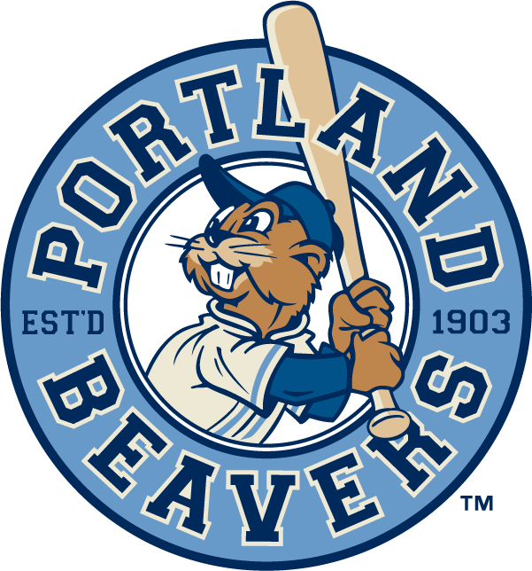 Speaking of the local surroundings, the Hops play about 13 miles from the city of Portland, which has been home to roughly a million minor league baseball franchises, all named the Portland Beavers. I was morally obligated to ask if the Hops considered becoming the million-first Portland Beavers.
“We did a couple of contests for name suggestions and it certainly came up numerous times,” Wombacher said. “But for us our biggest goal—and it was kind of a reason to go to Hillsboro rather than Portland—was to develop our own identity, to start a new generation of baseball.”
The Hops tapped into the cultural phenomenon of craft beer at just the right time, and somehow found a way to walk a fine line between being family friendly and appealing to beer snobs. The success of their logo in a crowded minor league baseball marketplace is particularly remarkable, given that they play against teams in much bigger markets playing at higher levels. It just goes to show, everything goes better with beer.
Related stories:
 More Cowbell: The Story Behind the Visalia Rawhide
  Northwestern Exposure: The Northwest League’s New Logo
  The Evolution of Dinosaurs in Utah: The Story Behind the Ogden Raptors
  Sweet Mosquitoes: The Story Behind the Sugar Land Skeeters
  Here there be the story behind the Dayton Dragons
  Bigfoot is Real: The Story Behind the Eugene Emeralds
  Soggy Froggy, Man: The Story Behind the Everett AquaSox
  The Story Behind the Carolina Mudcats: It’s the Fish, Stupid

