Roundels.
They’re all the rage in the world of sports logos these days, both in terms of clubs adopting them and the reaction many fans have when they ultimately do. For the 2015 season we’ve seen seven teams (across the 5 major leagues in North America) introduce a new roundel logo as part of their brand… seven!
But it’s hardly a new design style in sports, nor is it a new fad, roundel style primary logos can be traced back a cool one-hundred years to the 1915 Philadelphia Phillies who used a rarely seen logo featuring the Statue of William Penn on a ball diamond placed within a roundel, team name arched around above and below.
The NHL’s Chicago Black Hawks may have been the team to really make this style popular, they used six different versions of a roundel logo between 1926 and 1965:

It was during the end of the Black Hawks usage of this logo style that other clubs started borrowing the idea…
In the 1960s the Detroit Tigers, Baltimore Orioles, St. Louis Cardinals, San Francisco Warriors, and Pittsburgh Penguins all introduced logos which followed this same format:

The fad nearly went away, from 1979 through 1991 no club in the big four introduced a logo which followed this exact format (yes, you could argue the 1990 Padres were damn close). In 1992 the Montreal Expos brought this style back, taking their existing logo and sticking it in a circle, team name arched around in that manner we’re all too familiar with now.
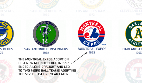
The following season the Oakland A’s and Seattle Mariners both introduced logos similar to this. Heck, the Montreal logo was apparently so inspiring the Texas Rangers pretty much took the exact same logo, colours and all, and just added their name to it eleven years later:

Which leads us to the modern re-birth of the roundel fad, this round seems to have been touched off by the St Louis Blues in 2008. Their alternate uniform logo (which we all called a rip-off of the 2003 Minnesota Wild or retro Penguins, at the time) led to a very similar style used by both the Florida Panthers and Nashville Predators a year later in 2009, meanwhile in baseball the Orioles and Red Sox were bringing back and modernizing old logos which were originally roundels, and the Angels introduced a roundel sleeve patch. From there, ka-boom.
And no, despite what their fans insist the Brooklyn Nets are not responsible for any of this. If we have to give them some credit — when they introduced their alternate roundel logo in 2012 they were the first NBA team to use this style during this decade (the 2005 Indiana Pacers wave “hi”). The Nets, and all the NBA teams which followed them, are merely just jumping on this styling bandwagon which is used across every major sports league except the NFL… If the Nets want to claim a team is copying them, they focus their claims on the Mississauga Power of Canada’s National Basketball League, because yeah… that’s pretty close guys.
Below is an infographic showing the history of roundel style sports logos spanning 100 years from 1915-2015, click the image to view it at a high resolution!
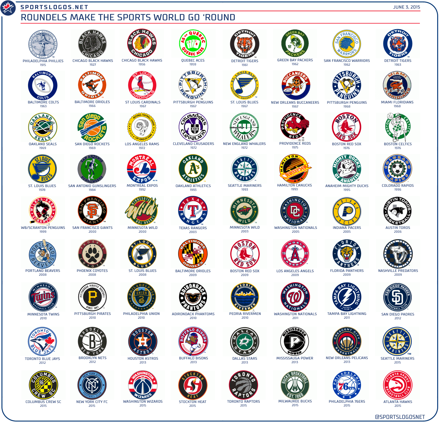
For the purposes of this retrospective we’re defining a roundel logo as one in which there is a defined outer circle surrounding the main logo and within that outer circle is the team name. We tried to keep these to logos in which the inner logo does not penetrate the outer circle — which eliminated logos such as the Florida Marlins 1993, Milwaukee Brewers current, and Kansas City Royals although those all certainly could have been added to this graphic. Leagues included are the five major leagues in North America, the top level leagues of those sports in Canada, and the top level minor league for each of these sports; we did not include anything below Triple-A baseball, for example, nor did we include college teams.
I can’t be too critical of this approach (afterall, we very purposely introduced a roundel with our recent rebranding) but it does seem to be getting a little out of hand as of late. When you can predict what a new NBA team logo is going to look like months before seeing it (as many of you were able to do on Twitter with Philadelphia and Atlanta), it’s becoming a bit of an issue.
So why roundels *now*? I reckon a big part of it has to do with the fact they work well as social media icons and favicons. It gets out all the information about a team (city, name, sometimes the sport they play, representation of their nickname) in a clean method which scales down nicely. I base that purely on personal speculation, if any real designers have actual insight on this please share in the comments.