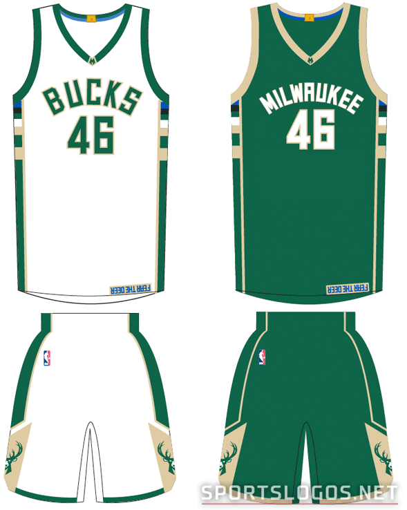
 The Milwaukee Bucks have unveiled their new home and road uniforms for the upcoming 2015-16 season, this at the first annual Bucks’ “Summer Block Party” fan event held this afternoon in Milwaukee’s Schlitz Park. The new uniforms come two months after the team launched their new logo and colour scheme.
It’s a wonderful mix of eras blended together in a new, but instantly classic, colour scheme of green, cream, blue, and black. Across the front is the new custom block font for both the team name and player number. Down the side a nod to the past, the “Irish Rainbow” of the 1980s is back but now in the updated colour scheme, what the team is officially calling the “Cream City Rainbow”
“Our new uniforms will serve as a showcase of our franchise’s proud heritage and bright future on the NBA’s global stage. The new look is a perfect representation of the city and state we call home – honouring our blue-collar community values in a timeless and modern design that speaks to the exciting future for the team and region.” – Bucks VP of Strategy and Operations Alex Lasry
Let’s take a closer look at the new threads, shall we?
 I really love how all these colours look together… I never would have thought a colour scheme of green, cream, blue, and black would work but there it is, gelling nicely. The key is that the blue and black are being used sparingly, the black hardly at all. “BUCKS” is arched across the front of the home whites in green and cream in that new custom font:
  While the roads will remain green but now read “MILWAUKEE” instead of “BUCKS”, first time in a long time the team has done this — we’ll touch on that later in this post; the Milwaukee wordmark is white with a cream outline:
  As for the rest of the uniform design, well, there’s a lot to explain, I’ve put together a handy chart to help us all out (especially that up-side-down “FEAR THE DEER” tab which I’m sure you noticed right away). If you’re having a hard time reading it just click the image to see it in a higher resolution:

An explanation of the new uniform features from the press release with my thoughts below each point:
BLUE COLLAR – The inside of the collar features a blue stripe, representative of the blue collar work ethic of not only the Bucks, but also of the city and state that the team proudly represents.
I can see the eye rolls on this one but let’s face it, we’re in an era where every aspect of a uniform needs to represent something and it must come with an explanation (“that’s your fault!” says my wife). It’s blue, it’s a collar, Milwaukee is a fairly blue collar town, blue is established as a trim colour in this set… there’s not much of a stretch here. It works in this case.
M CREST – Detailing on the outside of the collar features the modern “M” that is present in both the primary and secondary logos.
Just carrying it over from the new logo set to the uniforms; brand consistency is crucial for any brand makeover.
CHAMPIONSHIP TAB – The gold tab on the jerseys commemorates the Bucks’ 1971 World Championship season. Milwaukee is one of only 16 teams to have this feature on their jerseys.
Implemented by the league prior to 2014-15, the Bucks had the same gold tab on their previous uniforms during this past season. If the Cleveland Cavaliers win the NBA Finals this month they will also get a gold tab as it would be their first league title.
CREAM CITY RAINBOW – The unique colour block pattern on the sides of the jerseys showcases the colour palette of the new Bucks and is an homage to the popular “Irish Rainbow” detailing that adorned Bucks uniforms from 1977 through 1993.
This is my favourite feature of the new set, they’re taking the new colours and relating them to a moment in team history. This is also the only part of the new uniform to take anything from a previous team design (aside from that gold championship tab), they’re throwing it back over 20 years for this one. Originally the “rainbow” was simply various shades of green, this turn ’round the green returns but now paired with cream, blue, and black. You can take a detailed look at the new rainbow striping here.

MILWAUKEE ROADS – For the first time since 1977, the Bucks’ official road uniforms will proudly display “Milwaukee” across the chest, returning the city to its rightful place on the global stage.
It’s hard to believe but the team hasn’t worn “Milwaukee” on their full-time roadies in almost 40 years, just the alternates. We’ll assume this has to do with the oft-used reasoning of a team “trying to represent the entire region, rather than just the city”. Milwaukee’s new logo set now has a Wisconsin-specific graphic, theoretically that base has now been covered via that method.
FEAR THE DEER – A custom “Fear the Deer” player tag at the bottom of the jerseys serves as a reminder to the players each time they put on their uniforms of the aggressive attitude and team spirit they are expected to carry with them onto the court.
Yeah, it’s kinda silly… and seems fairly unnecessary, this part of the jersey will *never* be seen during the game as it’ll be tucked away into the shorts. Realistically, you’ll only see it on the fans, on jerseys hanging on the racks at the team shop or in your closet. It’s a unique spin on those inner-collar jersey mottos we’ve seen around sports, I’ll give them credit for doing it their own way at least. Did we mention it’s upside-down? As for the “fear the deer” motto, my two-year-old is terrified of the new deer logo… so yeah, it’s actually spot on.
NEGATIVE SPACE M – Detailing on the sides of the shorts is designed to create an “M” in the negative space, another subtle carryover from our team marks and a representation of our hometown pride.
I like any positive use of negative space. The Bucks are really playing up the “M” across their new brand, this whole set is an expression of civic pride.
CUSTOM FONT – Word marks and numerals are created from the Bucks new proprietary font that is featured throughout the new logo set.
At first glance I asked myself, “They didn’t just use the Raptors’ ‘We The North’ font did they?!”, and after comparing the two I found that they really didn’t. But it was close enough for me to look into it. Here’s a detailed look at some of those uniform elements which were described above:  On actual photos of the new uniform you can see that “Fear the Deer” tag is much smaller than was represented in the graphical rendering:
 Overall, it’s a major upgrade over what the club had been wearing previously. I’m a big fan of the new colour scheme even though the black along the side seems unnecessary (is “black for black’s sake” really a thing again?) but its presence is so subtle it’s almost an afterthought. Do you agree? Disagree? Let’s hear your thoughts in the comments.


