Nashville, Tennessee, had been home to a rich music scene since the late 1800s, but it was the debut of two clear-channel radio stations in the 1920s that cemented the city’s reputation as Music City, USA. WSM and WLAC launched in 1925 and 1926 respectively, drawing performers who hoped to find their own stylings carried on the near nationwide radio waves emanating from Nashville. Though the city’s music scene was diverse, it became known specifically for producing country and western talent, so much so that the genre earned the nickname “that Nashville Sound,” a phrase first seen in press in 1958.
“It might be somebody in Texas or somebody in California talking about music,” said Brandon Yerger, vice president of fan experience for the Triple-A Nashville Sounds. “They’re saying it has ‘that Nashville sound.’ Back then, it was that country-western music that was coming out of Nashville.”
Twenty years after the phrase “that Nashville sound” first found its way to the printed page, the city’s minor league baseball team, then a Double-A affiliate of the Cincinnati Reds, debuted. When your city is home to the Country Music Hall of Fame & Museum, the Grand Ole Opry, the Johnny Cash Museum, the Musicians Hall of Fame and Museum, and the “Mother Church of Country Music,” The Historic Ryman Auditorium, you don’t have to look far for inspiration for a team name.
“Now Nashville is known for so many different sounds,” Yerger said. “We have bands from Kings of Leon coming out of here all the way to the Oak Ridge Boys, a wide range of different sounds that Nashville is known for. We thought it was appropriate even though the meaning has changed a little bit with the different audience.”
The team’s original logo (on the left above) featured type that reflected musical notes and treble clefs and a guitar-swinging baseball character named Slugger. Slugger was updated in 1998 to be a muscle-bound power hitter (before steroid testing for logo characters was implemented) as part of a major rebrand.
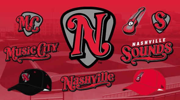
That rebrand featured a primary logo with a silhouetted baseball player hitting a ball toward the Nashville skyline, including the city’s distinctive “Batman building,” as well as musical note cap logos.
In October of 2014, the Sounds updated their look again, introducing a new super-orange identity produced by Brandiose. As is often the case with new minor league logos, this one received some pushback, but instead of fans eventually coming to embrace it, the chorus of negativity grew louder and the team took the unusual step of doing an about-face.
“It was just the overwhelming amount of people saying, ‘You know I don’t want to wear orange,'” Yerger said. “So we heard it, and the fans are who we need to make happy. We need them coming out and enjoying ballgames, we want them to want to wear this jersey and show it off proudly around town. So if they’re telling us that orange isn’t something that they want to wear while they’re supporting their team, we knew we needed to find a combination that they liked.”

That combination was red and black. When the team reintroduced its new look in a more palatable palette, fans embraced it, and the Sounds embarked on their new era with a new look in a new ballpark with a new Major League parent club (switching from the Brewers to the A’s during the offseason) on a positive note (as it were). Early in the new season, the team has already surpassed last season’s merchandise sales.
With fans approving of the new color, they have been able to focus on some of the nuances of the identity. For one, while the typeface is obviously meant to evoke the stylings of country and western music, there’s another inspiration for it. The dimensionality of the look comes from a part of Nashville that locals are well familiar with.
“When you’re walking on Broadway, you have all these neon signs,” Yerger said. “[The new look] references the neon sign look. It raises a little bit from the left to the right on the Sounds script, and the border of it is supposed to give off that neon look. It’s supposed to be a thick, bold lettering style that you’d be familiar with if you were walking down Broadway if you were looking for a bar to go into.”
Not only is the primary cap logo set against a guitar pick the way many logos are set against baseball diamonds, but the diagonal stroke emulates a guitar’s F hole (a term I was not familiar with—and one that I had to ask Yerger to repeat several times to make sure I didn’t make a horrible, horrible mistake in this article).

 On Fridays, the Sounds wear black MC caps and jerseys with “Music City” emblazoned on the front. It’s an homage to the city’s nickname, attributed to 1950s WSM radio announcer David Cobb.
On its own, the meaning of the MC logo is not always completely evident. “It is something that we have to explain. We match it with the Music City jerseys on Fridays so that people will get it,” Yerger said. “It probably would click for most people in Nashville…. Nationally, it probably needs a little bit more of an explanation.”
And while many teams host Throwback Thursdays, the Sounds throw way back for every Thursday home game. Their new stadium as of this season, First Tennessee Park, is built on the site of Sulphur Dell, an early-1900s stadium that played host to the Nashville Vols of the Southern Association.
“Everybody came through it. Babe Ruth, Jackie Robinson played here,” Yerger said. “We use it as a way to honor the past, and also, on the site where we’re playing, to teach the fans about the history of baseball in Nashville.”
The Sounds have had a handful of MLB parent clubs and have even switched classifications from Double-A to Triple-A in their history, but the one constant since 1978 has been their name. While their logo has evolved over the years (for the better, in my opinion), the team name, which is about as appropriate to the local community as it could be, is entrenched, and as a result is one of the most recognizable in the minors.


