Atlanta Hawks re-brand checklist:
Bring back the “Pac-Hawk” full-time… Done.
Eliminate blue from the colour scheme, replace with black… Nailed it.
Weird triangle pattern on all uniforms… Okay? Sure why not.
No “Hawks” across any jersey, just Atlanta or “ATL”… Wait, why?
And instead of going back to yellow make it all neon “volt” green…
It’s right about there where this suddenly unstable train has finally left the tracks.
****NOTE****
SINCE THIS ARTICLE WAS WRITTEN THE OFFICIAL UNIFORMS HAVE BEEN UNVEILED… CHECK THE BOTTOM OF THIS ARTICLE FOR UPDATES AND THE OFFICIAL EXPLANATIONS FROM THE TEAM. Original article continues
****
The Atlanta Hawks will be unveiling their new uniform set later this morning, an event which will be streamed live via their website at around 11:00am ET, fortunately the Atlanta Journal-Constitution shared leaked images of the new set last night (while I was fast asleep, so excuse me for this post being 8-hours late).
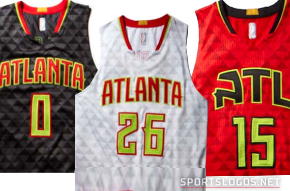
It’s basically what we thought, based off the plethora of leaks regarding this new set over the past month-and-a-half. The triangle pattern in the fabric, the “Atlanta” and “ATL” wordmarks, and that awful green. I’m surprised just how much of the green they ended up using. It’s overpowering, tone it down fellas, this was supposed to be a fairly retro looking set.
We’ll start with the chevrons or triangles making up the base of all these uniforms. As you can see from the home set above, the chevrons appear all over the jersey and on the side panel of the shorts in various shades of grey.
Since the design is still in the leak phase we haven’t gotten any official explanation for the design, we have to speculate. My first thought was it’s a tribute to the old Atlanta Omni Coliseum, former home arena of the Atlanta Hawks:
Unless Atlanta has some sort of nickname I’m aware of, like “Triangle of the South”? This is all I’ve got as a reason for it.
On the road we see a black uniform, the green pops a little better on this set but still seems very unnecessary (the numbers are what put it over the top in my books). The new Hawks secondary logo appears on the shorts waistband as it does on all three uniforms. “HAWKS” runs up the side of the shorts as opposed to the Pac-Hawk logo on the home whites.
The alternate uses the nickname “ATL” across the front in black (the black and red look great together here), but again, neon green everywhere… even on the “Pac-Hawk” logo on the shorts.
Things get a little whacky here, and scary, as the PDF the AJC linked to shows potential mixing and matching of the road/alternate shorts and jerseys. I’m hoping this is nothing, but it could mean we’ll see red shorts with black jersey and vise-versa.
So… neon green… why?

A nod back to an odd era in Hawks uniform history, perhaps. It didn’t last long but in the early 1970s the Hawks switched from red/white/blue to a blue and lime green colour scheme. Not exactly something worth throwing back to in your main identity (although “Pistol Pete” did wear it)… This is assuming there wasn’t some sort of extra pressure by Adidas or Nike (whomever was involved with this) to use whatever colour they’re trying to force us to love this year.
We’ll have more details, I’m sure, as they’re officially released by the team. In the meantime, have a look at some examples of merchandise you’ll see featuring that new colour scheme (pic also from the AJC)
***
UPDATE June 24/15 – 12pm ET
The Hawks have since officially unveiled the new uniforms during a fan and media event.
We did get some official explanations of the design, which was in collaboration between the Hawks design staff, RARE Design, and the NBA.


