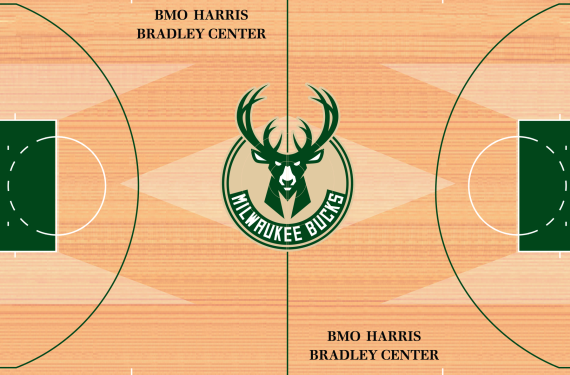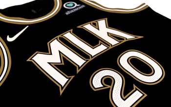
It’s been a busy day for NBA logo news. First, we got a look at the new, adventurous Atlanta Hawks uniforms. Now, just after those uniforms were officially unveiled, the Milwaukee Bucks decided to add the icing on the cake that is their new identity. The team has officially revealed their new court design.

Here’s a bit from the Bucks’ press release explaining some of the reasoning behind the design of Milwaukee’s new court:
The familiar “Mecca M’s” that returned to the Bucks floor in 2013 as an homage to the Robert Indiana “Floor That Made Milwaukee Famous” are again represented, this time with subtler wood tones that link the court to the past while helping to maintain the crisp aesthetic style consistent with the new brand. The new floor also includes a Great Lake Blue border, another link to the historic Mecca floor, and features the new Bucks tertiary logo – an adaptation of the state of Wisconsin – along with the MILWAUKEE wordmark along each baseline to reinforce that the Bucks are Wisconsin’s NBA team and proudly put both our home city and state on display for a global audience. Finally, the new floor features the words “Fear the Deer” along the near-court sideline to serve as a rallying cry for fans and players alike.
To be honest, it’s nice to see that the “Mecca M” design has been retained with the new court design. It was a nice touch in their previous court design, so it’s good that they’ve decided to retain it. Meanwhile, the blue border is also a nice touch; In my opinion, it looks like a moat of sorts. I don’t know if that’s what they were going for, but it’s another nice touch. Overall, I’d say it’s a good court.
Do you agree? Or do you think that their newest ocurt design falls flat?


