In front of over four thousand excited fans, MLS Atlanta “finally” made official their name, colours, and logo. The event was top-notch and world-class and if you didn’t get a chance to go, you really missed out. Notwithstanding the long lines to get into the facility, it was a really great celebration for the team and its fans.
Great. Now, how was the branding?
Meh.
I received that exact term as a text from no less than four separate people. When the name was released I received a message from a friend in the know saying: “I’m really sorry about that name, man”. Others said, “Is this really all there is?”, “Well, at least we can be Avengers Soccer Club now”, “Why are they going to be Atlanta UFC?”, and so on.

The Colours
“Red and black with some gold” was what we were told by owner Arthur Blank the day the team was announced. The only suspense there was exactly what tones of colours would be used including what “gold” meant to them.
RED: Some designers out there (myself included) had virtually guaranteed everyone that the red would be Falcons red. But no! The red is a bit deeper. More in the direction of an Indiana University or even Arkansas deeper red. Not quite maroon, but certainly not the red that the “Cow College” 76-miles outside of our fair city calls their own. Pleasant surprise there.
BLACK: Maybe it’s my imagination, or something they did just for the video, but it looks almost as if their black will actually be more of a charcoal.
GOLD: The gold is gorgeous. Beautiful. Perfect. Well, at least in 3D renderings and such. The dependance on the “old mustard from the tip of the French’s bottle” in print and on the web is a little disconcerting. I don’t think they’ve picked their RGB colour exactly correct, but the gold-leaf metallic is amazing. Think Notre Dame helmets or capital dome. A huge upgrade from the “launch scarves” that used a jarring orangey-yellow.
Also, credit to whomever in the room kept killing the potential addition of some ridiculous random neon colour.
Final Grade for Colors: B+
Nice richness, not a copy of the NFL team, plus metallic. Lost points for being red.
The Name
As I discussed in depth in my article railing against the name at SportingATL.com, the name is an abysmal mistake that will cost the team fans, followers, and global awareness. It’s a poor, weak effort that is difficult to resolve. Worse still, is that the team is not framing this as, “We like it, it’s the name.” Instead, they continue with the mistaken narrative (outright lie?) that this was the name “the fans wanted.” It’s not. Many of the fans hate it. If you hate it too, feel free to sign the petition, tweet about your displeasure using the hashtag #bringyourAgame (the one the team is monitoring.) However, if you are the type who thinks everyone should just suck it up, quit complaining, and eat our porridge, I’m sure you never made it to this point in this article.
On the plus side; at least it’s in English.
Final Grade for Naming: F
Actively harmful to the team and the sport.

The Logo
Back we go to that word. “Meh.”
It’s… fine. Its just not anything special. It’s a capital A in a circle. It’s doghhhhhhhhhhhhhhh- Ooops, sorry, I fell asleep describing it.
Don’t get me wrong, I love it. In the way that everyone loves their own kids; Your kid is yours, comes out however it’s coming, and you love and protect it at all costs. So yes, it’s my crest, so I shall love it.
But I don’t particularly like it. I don’t hate it either. I think anyone you hear saying they love it, really means they love the team and were fearing something worse so they are glad it’s tolerable. People who say they hate it were just expecting more, something to latch onto, something with an inspired design, that they didn’t get. I honestly think its impossible to be anything more than ambivalent about the design itself. It does not stand out in the crowd, good or bad.
Let’s break it down.
SHAPE – Roundels are SO hip here in the mid teens. Check out just a sampling of the logos in major sports that are in circles (Read more on that here) Note that the last 4 rows are all logos announced in the last 7 years:

In the next five or ten years, this design is going to look SO old and off-trend it will likely have to be changed. Perhaps there are some second and third logos coming out that will assume primary status.
MESSAGE – The main part that bugs me about this logo are the simple questions that any logo must answer; “Who is it for? And what do they do?” Neither has any answer in this logo.
Pull up this version of the logo and show it to someone you know. Ask if they know what this particular design is meant to represent. I bet you’ll likely get guesses around superheroes, manhole-cover construction, even baseball before anyone would guess soccer. Then ask for WHOM this logo exists. Arizona? Avengers? Allentown Aardvark Aliens? Sure, a logo doesn’t have to have a sports ball right in it (unless you are the NBA) but it should have a personality. Either to represent a city or feel like it belongs in the sport. Of course it is not necessary and there are plenty of examples otherwise. It just seems like a missed opportunity to link the logo with something representative of the city.
LINK TO THE CITY – Atlanta is a city full of iconic imagery; Fire, trains, phoenix, technology, birds, airplanes, hip-hop, …hell, traffic. But none were used.
EXPLANATION – The team’s Instagram provided a very nice walkthrough of the logo and branding, and while an exceptionally well done piece, it is just the name marketing nothing-speak that is written POST design in 99% of cases and it means nothing. If seeing these reasons are what sold you on the logo, you seem like the type of person who might be interested in this bridge I have for sale in Brooklyn.
LAYOUT – The assembly has some quirks. The spacing on ATLANTA looks a bit off to the eye, perhaps because of the curve and the top-heaviness of the letter T. The dimension and shadowing of the A is a little ..forced? Whatever the correct term, it almost seems like its present for no reason other than to attempt to spice up a logo that is dull. I’m torn between believing the hype canon about the bottom of the A being “anchored” to the circle, but only because I can’t find any other excuse or reasoning for it to be that way.
SINGLE COLOR – Upon the walls of the facility, the logo was projected in a single color. It was, at best, awkward. The background stripes conflicted with the dual-tone dimension on the A. One or the other needs to be left out for this single-color use.

So, to sum up –
This logo is to branding what a can-opener is to kitchen utensils. It’s not new, creative, interesting, or fun. It accomplishes a job and goes back in the drawer.
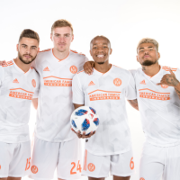
Something interesting to note is that the logo and all associated artwork thus far in the new branding; white is not used at all. There is no white in the logo. Not on their website. Not on their merchandise graphics. They DO show the logo on a white shirt and a white hat, but that may just be part of the blast of getting the logo on “everything” for launch. It might make for a unique look all in its own simply by avoiding the use of white. Not something I can immediately recall being done before.
Final Grade for Logo: B
Incredibly boring, lacks uniqueness, and has no ties to the city or sport. But, nothing offensive or bad.
ID Elements
The metallic gold is delicious and the team will certainly use it whenever possible. I hope they push merchandise manufacturers beyond their normal color palates and demand metallic inks and fabrics.
Vertical stripes are not overly used in MLS, and that is good, as when the background of your logo uses them, they are likely to be a feature of your uniforms. The AC Milan look seems to be a natural fit. In fact, fan concepts have begun to leak out, so I created some of my own. See a full set of concepts posted on Reddit’s ATLUTD page

Even AC Milan has noticed:
Good luck @ATLUTD on your new adventure! We really love your colors 🙂 #ATLUTD
— AC Milan (@acmilan) July 8, 2015
Especially in the wake of the Hawks branding announcement, one might have expected a texture, a unique piece of design. Alas, nothing distinctive to be found.
Final Grade for ID Elements: C
Vertical stripes aren’t unique, but not much else about this team is. No texture to speak of, no real design to call their own.
Summary
All in all, as an Atlanta soccer fan, this is my team’s name, crest, and colors so I will support them because I will support the team. But this set looks like it could have been made for anyone anywhere. It looks like something created and approved by strangers to Atlanta (and it was.) I can’t escape the feeling that this looks like a name and branding lifted straight out of an unlicensed random sports video game on a 1998 Sega. I just wish they had spent the time to make the branding great.
Or Atlanta.
Or soccer.
Because right now, I can’t really tell for whom this new logo was even created.


