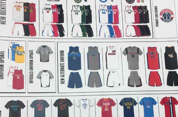
Four new Toronto Raptors uniforms, Milwaukee Bucks in black, Pistons and Rockets going silver, and a whole host of other completely unexpected new looks were all leaked late last night via an image posted on Reddit.
In total the image showed changes for *54* uniforms heading into the 2015-16 campaign, some of which (like the Hawks, Sixers, and Hornets) we had already seen but others caught us totally off guard.
Let’s take a look at the whole image before breaking it down:
How’s your head feel? Give it a second and we’ll carry on.
Starting on the top row:
We’ve got the already released new looks for the Hawks and Sixers. New here is the Clippers black alternate (which confirms an earlier leak), a Bucks black alternate, and the four new Raptors jerseys (nearly identical to our mockup from months ago)
The Clippers black jersey is simply a dark-background version of their partial logo featuring just the basketball (now in white) with the “LAC” logo on it in blue and red. Similar striping patterns up the side as the previously released home and road jersey.
Milwaukee’s black alternate is tough to see but looks like it may have the deer-head-only logo right on the front (a nod to their mid 1990s alternate?), it also appears that the player number is in between the two antlers above the deer head. Irish Rainbow up the sides like the regular set.
The Raptors have four new uniforms, all quite basic — home white, road red, two black alternates (one with gold trim for “Drake nights”). The only thing it looks like we missed the mark on was the font, but we expected that. See our earlier posts about this set here.
Row two:
First graphic shows “Uniform Updates” to Denver and Houston. These two changes are extremely minor and had been leaked previously, the Nuggets are changing the outlines on their home and road jersey wordmarks while Houston’s tweak has to do with the drop shadows on their wordmarks.
NBA officials are getting new duds… there they are.
Six new alternates follow, the only one we knew about is up first, the Dallas Mavericks. The Dallas skyline alternate jersey had already been unveiled (in September of 2014!), it’s the winning entry from a fan contest held about a year ago. It’s unofficially heavily inspired by the old 1980s Denver Nuggets uniforms.
Looks like the Detroit Pistons will be wearing a silver and blue uniform as an alternate next year, “DETROIT” arched across the front in blue and white. The Pistons had, on occasion, worn silver back in the 1980s
The Miami Heat are taking their “White Hot” thing to the next level and will wear this white alternate uniform with player number in the upper left chest and city name below. A stripe only appears going up one side of the jersey. Way to buck the template, Miami.
Like Detroit, the Houston Rockets are also going silver, and is also the only team to introduce a new sleeved alternate jersey as Adidas winds down their association with the Association. Black rings around the arms and an interesting black and white checkerboard? pattern going up the shorts and sides of the jersey. We’ll have to wait for the unveiling to get a better look at the details.
Oklahoma City Thunder just keeps on tryin, this time it’s with an orange outfit with navy blue or black stripes up each side. “OKC” across the front in that same dark colour. It’s simple, and it’s a fairly traditional look for a new NBA alternate jersey of the mid-2010s.
Last up on row two is a team who feels like they’ve gotta be annoying. I’m going to guess it’s the Phoenix Suns based on colours alone. Looks like black “PHX” wordmark on a black jersey, which has been done before and never looks good. Player number in white because you kinda need to see that, at least. Pro tip: Don’t do this.
Row three:
This row is all about the “pride” uniforms, all sleeved, they’re intended for the team to show pride in their hometown, fans, or team heritage. As is the case with the first one, a uniform already unveiled, the Charlotte Hornets’ black “Buzz City” jersey.
Chicago Bulls are next in a silver uniform which shows their history of… recent Stanley Cups? Only thing I can think of… feel free to chime in if there’s something obvious I’ve missed here.
Cleveland Cavaliers going black with their “C” alternate mark on the chest, player number to the upper right this time (opposite of Miami’s new alternate)
This one is interesting, the Denver Nuggets in white with a simplified version of their pick-axes/mountain peak logo on the front, player number (is that white on white?! grr) below and stripes calling back to their old 1980s uniforms up the sides of the shorts. Doesn’t look like there’s any yellow in this one either. Like I said, interesting.
Houston going the way of “pride” uniforms used by the Hornets, Pistons, and Blazers by wearing “CLUTCH CITY” in white around the player number on a red and yellow jersey. Worth mentioning, red and yellow never looks bad on a Rockets uniform.
The Pelicans are up next with a uniform colour scheme we’ve all been waiting for from the Crescent City, purple, gold, and green. It’s a Mardi Gras uniform folks with “NOLA” right across the chest.
Sacramento looks back at their 1980s high school photos for their new pride set, powder blue with “KINGS” arched across the front in the modern purple, number below in white. It’s simple, but powder blue and purple together is odd.
Hands up everyone who just assumed the last jersey of this row was the Portland Trail-Blazers. It’s actually the Washington Wizards paying homage to the 1970s Baltimore Bullets who wore a similarly laid out uniform. Looking forward to seeing this one on the court!
Row four:
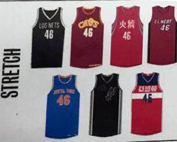
The “Stretch” uniforms. These have been explained to me. I don’t understand why the term “stretch” is used for this set (other than “it’s a stretch to come up for a reason that a pro team should actually wear these”).
Brooklyn Nets = “Los Nets”, nothing new here design-wise just something to wear once or twice a season for Spanish heritage games.
Looks like the Cleveland Cavs annual “mix up a bunch of old uniforms” uniform will be the 1980s “CAVS” set in modern colours.
Houston’s new Lunar New Year Chinese jersey.
Miami’s “El Heat” and the Knicks’ “Nueva York” Spanish language uniforms
Tough to see the Spurs uniform up next but looks like a black version of their silver alternates and camouflage jersey. I have no other details here, sorry.
Washington Wizards hopping on board the Chinese jersey train.
The collection of actual throwbacks are up next, nine of them in total, let’s run these off quickly…
1984 Chicago Bulls (Jordan’s debut), 1974 Cleveland Cavaliers, 1980 Dallas Mavericks (love the green for this team), 1966 San Francisco Warriors, the Indiana Pacers’ “Hoosiers” uniforms we covered this week, the Grizzlies’ ABA Memphis Sounds 1974 uniform, expansion season Miami Heat jersey from 1988, New York Knicks 1953 (with the stripes all around the collars, sleeves, and sides), and the 1985 Sacramento Kings.
Finally, the Miami Heat will be wearing a special “Hoops for Troops” uniform:
I’m fairly certain we will see, like, 29 other teams join in on this for 2017.
Alright, I’m exhausted. You guys take over.


