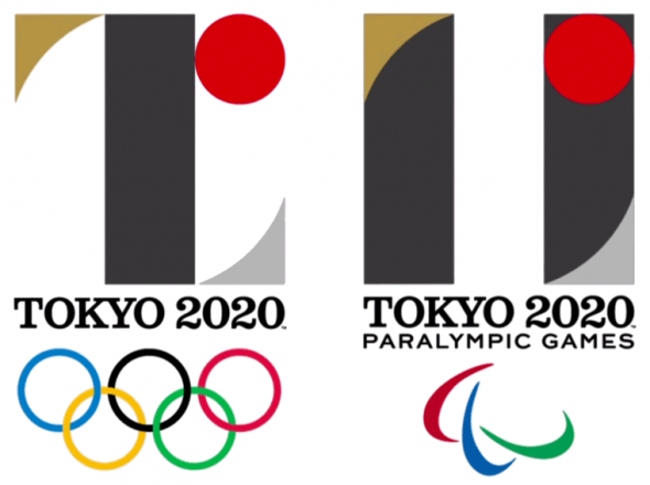
The logos for both the 2020 Summer Olympics and Paralympics was unveiled earlier today at a press event in the host city of Tokyo, Japan.
The Olympic mark features a large black “T” (not only for “Tokyo”, but also “Tomorrow”, and “Team”); beside the “T” is a red circle which despite it being the only element on the National Flag of Japan does not represent Japan. According to the release this red circle both symbolizes inclusiveness and the power of a beating heart.
For the Paralympic games the mark is similar but colours are reversed on the “T” which creates a sideways equals sign, “the universal symbol of equality”.
“The Tokyo 2020 Games emblems are a wonderful work of art that represent the aspirations and the ultimate goal that athletes around the world aim to achieve – taking part in the Olympic and Paralympic Games. The emblems are also symbols behind which the whole of Japan can unite as a single integrated body” — Yoshiro Mori, Tokyo 2020 President
The logos were designed by 43-year-old Tokyo resident Kenjiro Sano, founder of MR_DESIGN Inc.
At first glance it certainly doesn’t resemble a mark one would expect to see in use for a sporting event, feels more like a logo for a municipality or corporation rather than the Olympic games.
Other comparisons I’ve seen equate it to the logo of Japan’s “J-League” soccer league:
And to that of a video Pong paddle as it makes contact with a ball:
A look back at how it fits in with other Summer Olympic logos:
Whether you love it or hate it, one thing we can all agree on… it’s much better than 2012.


