
On its own, the word zephyr does not exactly instill fear. It refers to a gentle wind, rolling in from the west and rustling the daffodils (or whatever) as it heads east.
That said, the city of Denver sits just to the east of the Rockies, and the wind that often comes charging out of the mountains and whipping through the city can be a force. So to think there was a connection between the Triple-A Denver Zephyrs, who first took the field in 1985, and a word that means west wind was not much of a stretch. Thankfully, the team was not actually named for a mild breeze.

 The Denver Zephyrs, who had been the Kansas City Blues (1901-1954) and the Denver Bears (1955-1984), were actually named for a stainless steel passenger train that ran between Chicago and Denver from the mid 1930s into the 1970s. The overnight train took about 16 hours to cover more than 1,000 miles on its route.
When Major League Baseball expanded in 1993 and the Colorado Rockies entered the National League, the Zephyrs needed to find a new home. They moved to New Orleans, where they would keep the name Zephyrs, even though the city had no connection to the famous train (or west winds, for that matter). As luck would have it, there was another connection.
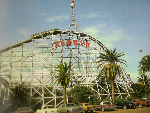
“There happens to have been a very famous roller coaster at the old Pontchartrain Beach Amusement Park that was called the Zephyr,” said Zephyrs Director of Media Relations Dave Sachs. “It was this huge white wooden roller coaster, and it was this famous landmark in the city for decades.”
It was an amazing coincidence that allowed the New Orleans Zephyrs to capitalize on an established brand—and save the team a lot of time and money in rebranding.
“You basically wonder if the guys at the time were like, ‘Eh, we can get away with this,'” Sachs said. “They were allowed kind of to be lazy in keeping the name and the logo and not really changing anything except for from Denver to New Orleans.”

The Pontchartrain Beach Amusement Park closed in 1983, but the Zephyrs pay homage to the roller coaster with a mural outside a stadium concession stand called The Last Ride.


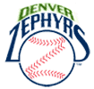
For 12 seasons after relocating, the New Orleans Zephyrs, now an affiliate of the Miami Marlins, kept the logo from the Denver Zephyrs, which was basically a baseball whose stitches formed a Z. In 2005, the team launched its first major update to their identity in three decades with a new logo based on their mascot.
“They rebranded and went to kind of a cartoony thing, trying to market to kids,” Sachs said.
The new logo featured Boudreaux the nutria, which turns out not to be a dietary supplement, but rather a distinctive rodent also known as a coypu or river rat. It was a word I had never heard before, so I asked for an explanation.
“He’s a nutria, like a water rat,” Sachs said. “You can find them in the drainage ditches around town. They’re a little like possums, kind of. They’re nutria.”

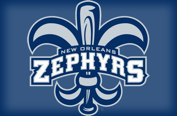
In 2010, the Zephyrs adopted their current look, which is based on the fleur de lis, the flower-based French symbol closely associated with the city of New Orleans—including several of its sports teams.
 Everyone is familiar with the New Orleans Saints fleur de lis, but also at the time, the then-New Orleans Hornets featured a logo that they called the fleur de bee. Not to be outdone, the Zephyrs have an alternate logo that they call the fleur de Z.
The timing for the Zephyrs to adopt the fleur de lis could not have been better in terms of civic pride.
“We rebranded right around the time the Saints won the Super Bowl,” Sachs said. “Everyone associates the fleur de lis with New Orleans, and we hopped on board with that, took advantage of it.”
The Zephyrs, of course, put their own twist on the iconic symbol in their primary logo. “The middle part of the fleur de lis is a baseball bat,” Sachs said. “I don’t know if people actually notice it. They see the fleur de lis logo and think, ‘Oh, it’s just like the Saints.’ We actually do have the baseball bat as part of the logo.
The Zephyrs’ typeface, featured on the wordmark on their home uniforms and a Z cap logo, also recalls some of New Orleans’ local heritage.
“It’s that kind of French Quarter font that you might see when you’re walking around in the older parts of town—kind of classical” Sachs said. “You’ll see that on restaurants and stuff down in the French Quarter.”
The purpose of the 2010 rebrand, according to Sachs, was to create a classier look. Rather than featuring a cartoon water rat in the logo, they would let Boudreaux the mascot appeal to kids on the field, but their new identity, based on a symbol from European antiquity and type that echoed signage from restaurants in the city’s French Quarter, would be more refined.
“That was kind of the focus of changing the logo,” Sachs said. “We wanted to go away from the cartoony logo and go with more of a classic, clean look. We banished Boudreaux from all the logos.”
The New Orleans Zephyrs have one of the more obscure back stories in the minors. The significance behind the name of the team shifted from a famous train to a famous roller coaster when the team moved from Denver to New Orleans, then a series of logos over the years have featured a clip art baseball (essentially), a rodent that lives in drainage, and a fleur de lis—none of which have anything to do a train, a roller coaster, or even a west wind.
That said, their classic look in an ever-wackier minor league logo landscape is something of a breath of fresh air—or maybe just a gentle breeze.
Related stories:
 More Cowbell: The Story Behind the Visalia Rawhide
  Pilot Episode: The Story Behind the Lakeland Flying Tigers
  The Evolution of Dinosaurs in Utah: The Story Behind the Ogden Raptors
  Sweet Mosquitoes: The Story Behind the Sugar Land Skeeters
  That Nashville Sound: The Story Behind the Nickname
  It’s Corny, But it’s Good: The Story Behind the Cedar Rapids Kernels
  The Story Behind the Carolina Mudcats: It’s the Fish, Stupid
  Rancho Cucamonga Quakes are the Picture of Stability