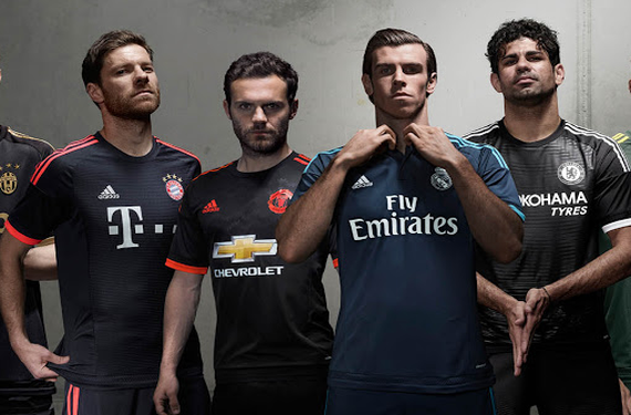
The UEFA Champions League and UEFA Europa League are about to start their group stage action, and this is normally the time when the bigger clubs of Europe like to show off their third kit. For six of the biggest clubs of all of Europe, adidas has decided to outfit them with similar looking kits that are all a dark color. The biggest shock here is what the shorts for a couple of these teams look like, but we’ll get to that later.
First, let’s start with the three clubs who went with a bit of a monochrome look (as far as the crest is concerned): Chelsea, Juventus, Manchester United, and Real Madrid.
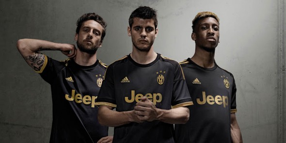
Again, these shirts are pretty simple and stylish-looking. The Juventus kit is the clear front-runner here, as the black-and-gold look is an extremely classy look for the defending Italian champions. Also, Chelsea actually wore their third kit this past Sunday for a league match against West Brom, so the defending English champions may have jumped the gun a little bit. However, considering their other two kits and putting them next to West Brom’s home kit, they really had no choice but to jump the gun.
Meanwhile, the two clubs who decided to inject a bit of color in their crests were AC Milan and Bayern Munich. While the German champions decided to keep things simple with a black-and-red kit, Milan continued to incorporate green into their kit scheme by coming out with a mostly-green third kit.
There’s a twist with most of these kits, though. I warned you in the aforementioned paragraphs that this was coming, and now that you’ve had fair warning, it’s time to unleash them on you:
If there was ever an appropriate time to look down and scream out “What are those?!” then now is the time to do so. Seriously, those are some funky shorts. It’s as if adidas was trying to make up for the shirts being so conservative by making the shorts as progressive as possible. Gradients! ’90s’-esque patterns! Random colors coming out of nowhere! Those things are all over the place.
So, what do you think? Which one is your favorite?


