Welcome to the first in a series articles where we will be giving each team a proper critique, a grade, then try to repair the uniforms. Each article will feature a uniform concept with changes made (if any are needed at all) but this is not about what we would do to teams carte-blanche (that would include crazy things like putting the Vikings in a silver helmet) but more about keeping the core ideas behind the design of a teams uniform and adjusting them to make it better overall.
We start off this series in the NFL with the Buffalo Bills.

Design Overview
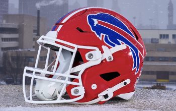
The current Bills uniform debuted in 2011, the last NFL uniform designed by Reebok before Nike took over the duties. It is based on the uniform the Bills wore from 1974 to 1983 which dressed franchise legends and Hall of Famers OJ Simpson and Joe DeLamielleure.
It makes sense for the team to take inspiration from a design which not only is meaningful but very beautiful as well, and is one of the most popular past team uniforms amongst fans. The team accomplished nothing worth mentioning while wearing the previous uniform and was one of the ugliest designs in the league; moving on from that design was long overdue.
What I appreciate most in this design is it’s not a true throwback, but Reebok used the vintage design as a foundation and inserted altered elements, like the helmet and sleeve stripes, to create a new uniform.
The Good
The helmet’s stripe widens in the back to reflect the striping of the logo. That subtle touch is a great spin on a traditional element. The face mask could work as a team colour, but the choice of grey to suggest an old-school toughness, is never a bad decision, and makes it look even more like the 70’s design.
Striped socks are very underused in the NFL, but the Bills are one of the few teams who put them to good use. Even better is the blue pants option, though it took them a few years to break them out.
The team colours are my favourite thing about the whole identity. It instantly calls to the cold, snowy environment of Buffalo winters and the light blue feels more youthful and sporty than the majority of other blue NFL teams that use navy.
The one thing that stands out in a bad way is the screen printed jersey stripes. Not only does the ink contrast poorly with the flat fabrics of the jersey and numbers, but it’s shiny appearance suggest cheapness and poor craft, reminiscent of the lowest end retail option you’d find at Walmart.
The jersey stripes also are a victim of traditional elements not fitting properly into modern templates. Stripes like these were a solution to a different problem, designed to wrap around a full sleeve, not be shoe-horned into the space they occupy now. While the majority of football uniforms suffer from this, Reebok missed an opportunity to do something for the modern era and create a design that works better on today’s jerseys.
Rating
The move toward the 70’s uniform guaranteed this would be an attractive foundation to start with. The alterations made created a unique design that could be owned by this era, and beautifully blends modern and traditional styling.
Fixing-It

The Bills’ biggest flaw is the execution of the jersey stripes, but while we’re eliminating the cheap screen printing we should also address the cropping. Instead of forcing an old idea into the new uniform, the cues are already there to allow a more modern approach and let us design a jersey that doesn’t have to call back to every detail of the 70’s. Let’s also eliminate the thin strokes around the stripes as well as the navy parts, and key in on the boldness of the rest of the uniform.
Fixed

Thanks for reading, share your thoughts in the comments, and be sure check back each and every Friday to see who we fix next.
***
Critique Guidelines
5 – Exceptional. Design that is unique to the team and/or perfectly captures their culture/brand. May be a traditional design, but no mistaking for competitors. Technical craftsmanship is without flaws. Consistency and unity among every element and across every jersey cut and helmet design.
4 – Very Good. Design is appealing and appropriate. May be a template/colours that resembles competitor(s). Perhaps a slight miss on details and/or minor flaws in craftsmanship.
3 – Passable. There are multiple issues that need to be addressed in the future, or have overlooked some details. Perhaps an off-branding move, but has a solid foundation with passable design decisions.
2 –Poor. Poor design decisions, and/or poor craftsmanship in multiple areas. Will have to be redone, but there is something worth saving and building upon.
1 – Fail. Poor design, and poor craftsmanship through out. No cohesiveness between multiple pieces or combinations. Little to nothing worth using again. Could be compared too closely to design of competitor(s)
- Uniform must identify the team clearly from distance and from TV angles.
- Jersey numbers must be readable from distance and from TV angles.
- Team logos will be part of the critique.
- Throwback uniforms will not be part of critique, but alternate colour pieces will.


