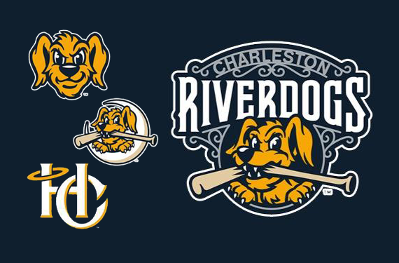
 Next season will bring changes to one of the longest-running logos of the Single-A South Atlantic League. The Charleston RiverDogs, an affiliate of the New York Yankees, unveiled significant updates to their logo for the first time since 1994. For two decades, the RiverDogs’ logo (at right) has featured Charlie the dog nestled in the letter C, snapping a baseball bat in his teeth.
“The only change in the identity had been in the color schemes and jersey scripts,” said Noel Blaha, the team’s director of marketing and new media. “It was probably past time for us to ‘modernize’ the logo and lose the copper plate gothic type set.”
But in updating their identity, the RiverDogs didn’t want to stray too far from their bread and butter.
“The C logo has become somewhat iconic—a top seller among MiLB logos, as our name is quite popular with youth teams, so we didn’t want to radically change everything,” Blaha said. “We are extremely happy with the ‘refreshed’ logo.”

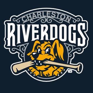 Charlie is still the centerpiece of the identity, but a series of new alternate logos and details of the primary logo are wrought with significance. The new primary, designed by Studio Simon, includes a visual reference to a notable feature of the Charleston cityscape.
“Charleston is known for many things and one of the most beautiful things is wrought iron work,” Blaha said. “This was such an important element that wrought iron work is featured in our ballpark.”
Some of the city’s most important iron work was created by noted artist and longtime RiverDogs fan Philip Simmons, who attended games well into his 90s. “This design element is a subtle nod to him and his craft,” Blaha said.

 One of the new alternate identities features the city’s nickname, which it reportedly earned for its historical acceptance of multiple denominations of religions.
“Charleston is affectionately known as and referred to as the ‘Holy City,'” Blaha said, “so this was a cool opportunity to bring in an alternate logo that would have a built-in significance and something that was known and beloved by locals.”
The team will wear Holy City jerseys and interlocking HC caps on Sunday home games next season.

 Another new mark features Charlie sitting in a crescent moon, an element of the South Carolina state flag, which was designed by a Charleston newspaper editor in the late 1700s, about 75 years before it was officially adopted as the state flag. (Note: No one’s actually sure that the thing on the South Carolina flag is a moon—that’s a design discussion for another time,” Blaha said—but Charlie the dog is definitely hanging out on a moon.)
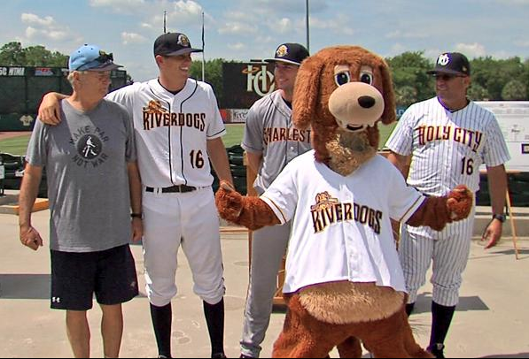
The RiverDogs’ director of fun Bill Murray was on hand to help unveil the new logos, which the team will feature on their classic white, grey, and pinstriped uniforms beginning next season.
Related stories:
 Charleston RiverDogs to celebrate Dumb anniversary
  MiLB announces record sales, top 25 teams in merchandise
  RiverDogs honour beloved vendor, to play as Boiled Peanuts
  Five Minor League All Star Games Take Place Tonight
  Charleston RiverDogs to celebrate Jamaican Bobsled Night
  Let It Glow! Fireflies Unveil Glowing Caps, Uniforms
  Sand Gnats Moving to Columbia for 2016
  It’s a Porcupine Train: The Story Behind the SWB RailRiders
