The Miami Dolphins’ 2013 logo update has drawn comparisons to cruise line branding, an opinion that is not too off base. Not surprisingly, the uniforms complete that look.
The Good
Those colours are absolutely gorgeous! Whether isolated or used together, the orange, aqua, navy, and white make for one of my favourite colour palettes in the NFL. My one concern though, is that it might be a bit considered too “soft” for a football team. Miami natives will probably have no fears about sporting those colours, but fans from the rest of the country might feel differently about them.
The Bad
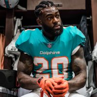
At first glance, the jersey is nice. I don’t mind the emphasis of aqua and white, but some of the orange has been missed. Digging into the details, I am quickly disappointed. I never like a helmet logo being repeated on the sleeves, it’s redundant when viewing the players from the side. The numbers might get points for matching the helmet stripe for colour, but the lack of definition with the 2 outer colours being so thin makes the stripe and numbers look cheap and a mess from a distance.
Consistency from piece to piece (helmet, jersey, pants, socks) is often something Nike struggles with, but even as bad of a stripe as they came up with, at least the pants have a perfect union with the helmet (and jersey numbers). But of course, it has the same problems as the other applications. They just cram all this colour into a tiny area with so much negative/white space around it, the focus of the uniform becomes the ugly stripe and numbers. I usually love socks with stripes, but in this case it’s probably best to go with solid tops.
What completely ruins this uniform is the number font. Nike’s biggest problem for 2 years, even at the NCAA level, was number design, and the Dolphins were not spared. With the Dolphins, they are just trying way too hard to have an original modern-meets-vintage font that is neither consistent, attractive, or well crafted. The serif of the “1” is thicker than the stem. If there was a focus on a single idea, either classic block or rounded corners, then either would fit in with the rest of the uniform. Instead, they give us a bastardization.
This was a design where the more that was changed, the worse it got. They went back in time to pull those amazing colours, but all the original designs from the logos, to the font, word mark, to the stripe makes the uniform a really bad, and not very Dolphins-like at all. It’s a real departure from so many things that have made up this identity since day one, the end result to me looks like a team stuck between the past and future with no clear idea of who they are or want to be. When you hear “this is about tradition” from Nike, it doesn’t feel honest at all, It was about doing something new enough for people to be excited about, and try to hold on to some equity so older fans wouldn’t be upset. It is very hard to have both.
The most identifiable element of their identity has always been the colour palette, and the 2nd thing was the helmet stripe. This helmet just doesn’t look like the Dolphins without it. The helmet stripe’s colours are fine, but the width of those lines are too small. The orange disappears and because the navy and orange stripes are so small, it just looks like there is one too many strokes. It feels clunky and heavy without any white space between the colours. It’s not a visual vibration, but you can see there’s something odd about it.
Rating
This uniform is very close to receiving a failing grade. The reason it gets a 2, is because the colour palette is so strong, and that is what we are going to build from with the suggested new design.
Fixing-It
Fixed
Using the great colour palette as the foundation of this new design, the colours are strong an recognizable so there is not much else that needs to be done to make this uniform stand out from other teams. But, i dropped the navy for simplicity’s sake. I wanted to let the aqua colour be bold and attention grabbing by leaving the home jersey and alternate pants without stripes or other needless design. I wanted something recognizable as “classic Dolphins” though, so on all the white pieces i added the classic stripe pattern.
The rest of the decisions were mostly about reversing the bad current design. 1. Remove helmet logo 2. Remove sleeve logo 3. Replace number font 4. Replace word mark and N.O.B. font. This leaves the helmet blank though, and as a call back to the original Dolphins logo, I used a bold orange “M” on the sides. I decided a rounded number form would be best to maintain some connection to ocean waves and moving water; a traditional block felt heavy and lifeless here.
Thanks for reading, share your thoughts in the comments, and be sure check back each and every Friday to see who we fix next.
Update Sep 11/15 – 10:50am ET [editors addition] — Due to the overwhelming opinion from commenters and Twitterers that the helmet should retain a dolphin logo, I (Chris Creamer) went ahead and quickly added it to Brandon’s design just to get a sense of how that would look.

Does this re-addition of the modern dolphin make it all better?
***
Critique Guidelines
5 – Exceptional. Design that is unique to the team and/or perfectly captures their culture/brand. May be a traditional design, but no mistaking for competitors. Technical craftsmanship is without flaws. Consistency and unity among every element and across every jersey cut and helmet design.
4 – Very Good. Design is appealing and appropriate. May be a template/colours that resembles competitor(s). Perhaps a slight miss on details and/or minor flaws in craftsmanship.
3 – Passable. There are multiple issues that need to be addressed in the future, or have overlooked some details. Perhaps an off-branding move, but has a solid foundation with passable design decisions.
2 –Poor. Poor design decisions, and/or poor craftsmanship in multiple areas. Will have to be redone, but there is something worth saving and building upon.
1 – Fail. Poor design, and poor craftsmanship through out. No cohesiveness between multiple pieces or combinations. Little to nothing worth using again. Could be compared too closely to design of competitor(s)
- Uniform must identify the team clearly from distance and from TV angles.
- Jersey numbers must be readable from distance and from TV angles.
- Team logos will be part of the critique.
- Throwback uniforms will not be part of critique, but alternate colour pieces will.


