
The Dallas Cowboys are widely considered to have one of the best uniforms of the NFL, an untouchable gridiron classic that no one dare alter, on par with the New York Yankees’ pinstripes. The uniform is absolutely a classic… but only because it’s been changed so little over the years, fans have grown accustomed to it’s flaws in which there are a few.

The Good
The helmet is perfection, it’s Braisher stripe and star still work on all modern helmet designs and need no alterations. When I think of this helmet, I think of an emotional Emmitt Smith during his retirement announcement where a Cowboys helmet was sitting on the desk and he mentioned “how much this star means to me”. Changing the helmet actually would be equivalent to changing the Yankee’s pinstripes so we’re not going to do anything silly here. The silver paint, gray mask, stripes and logo all need to stay.

While other teams may wear white at home often, the Cowboys are the only team whose white shirt is their official full-time home colour. We’re keeping that important brand identifier in this concept along with the rarely-seen navy blue still as the road jersey base.

The Bad
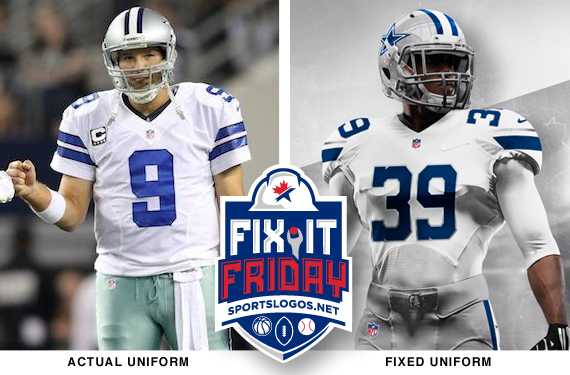
The home jersey is where most of the mistakes in this uniform live. The sleeve stripes are printed and have a nasty, cheap look to them. It’s hard to get this across in a digital reproduction but in our fix we would replace the ink with actual fabric stripes and sew them on like an NFL team should to give the jersey the professional and high quality appearance it deserves. I’m also dropping the black trim from the arm stripe; there’s absolutely no reason for black to be anywhere in this uniform.
The helmet features navy blue, which is the most used team colour (look at the end zones and team apparel) but the rest of the uniform is dressed in royal blue. This was done in the 1980s to be a better read on TV but no longer an issue in the modern HD world. The Cowboys need to pick one blue (different from the other silver-and-blue teams in Carolina and Detroit) and use it consistently.
The silver-green pants (yes, their home pants are silver-green), another TV read decision that is dated and butt-ugly. They actually have a grey pair of pants matching the helmet well but they never wear them with the white jersey (see pic above). Like the case is with the blue, the team only needs one silver.
The blue jersey doesn’t need a lot itself, but it looks like it belongs to a different team when paired with their white. I’ll eliminate the unnecessary strokes around the numbers, which make them harder to read, and use the same stripe pattern from the white. Consistency is something this team is painfully missing in their designs.
Rating

3 – The Cowboys uniform, even with it’s flaws, is still a very likeable uniform, and (surprise!) there are even folks out there who like those whacky silver-green pants. The issues with it are mainly nit-picky details that don’t jump out to most and there’s a good chance most of you never noticed a few of the things pointed out here. I view the uniform as perfectly average in every way.
Fixing-It

Fixed

The stripes extend slightly past the torso seems of the jersey, ala’ the Browns and Seahawks jerseys. Doing so breaks the expected cropping of stripes within the sleeve seams and allows for them to be a more prominent element on the jersey. Size and positioning of the stripes is crucial; I didn’t want a stripe that would get cut off with shorter sleeves or have some kind of 49ers abomination. The stripe has to be the same on every player.
I took cues from Oklahoma State, like the angle cut on the ends of the stripe. It is reflective of the ends of a star and fits perfectly on every player’s sleeve. So taking the shape and outlines of the Cowboys’ star I created a sleeve stripe of similar fashion. I added the same stripe to the socks and ideally they would be the same size as the jersey stripes. It could be a hard element to control though because of the stretching and scrunching that goes on with player’s socks.
A few teams have used this old block number font but it’s pretty synonymous with Dallas. Roger Staubach wore it all through his Dallas career and it’s not been used by an NFL team since. Bringing it back would give Dallas it’s own number font unique in the league and be a nice throwback to the past.
I’ve also trimmed the white jersey’s numbers in silver which I imagine being a metallic nylon thread. it could also be used on the jersey stripes and maybe the socks. This would pair very well with the silver helmets as opposed to a flat grey colour. The reason I’m keeping silver rather than going back to their old blue-grey or a neutral grey colour, is because Jerry Jones wants this team to reflect purity, championships, glamor, and be as much a Broadway show as a football team. Silver is the perfect choice.
Thanks for reading, share your thoughts in the comments, and be sure check back each and every Friday to see who we fix next.
***
Critique Guidelines
5 – Exceptional. Design that is unique to the team and/or perfectly captures their culture/brand. May be a traditional design, but no mistaking for competitors. Technical craftsmanship is without flaws. Consistency and unity among every element and across every jersey cut and helmet design.
4 – Very Good. Design is appealing and appropriate. May be a template/colours that resembles competitor(s). Perhaps a slight miss on details and/or minor flaws in craftsmanship.
3 – Passable. There are multiple issues that need to be addressed in the future, or have overlooked some details. Perhaps an off-branding move, but has a solid foundation with passable design decisions.
2 –Poor. Poor design decisions, and/or poor craftsmanship in multiple areas. Will have to be redone, but there is something worth saving and building upon.
1 – Fail. Poor design, and poor craftsmanship through out. No cohesiveness between multiple pieces or combinations. Little to nothing worth using again. Could be compared too closely to design of competitor(s)
- Uniform must identify the team clearly from distance and from TV angles.
- Jersey numbers must be readable from distance and from TV angles.
- Team logos will be part of the critique.
- Throwback uniforms will not be part of critique, but alternate colour pieces will.
Related stories:
 Dallas Cowboys will wear white pants with primary navy jerseys
  A look at the 10 best Super Bowl uniform matchups
  Pics: Panthers, Cowboys In Their ColorRush Uniforms
  Fix It Friday: Cleveland Browns
  Fix-It Friday: The Tampa Bay Buccaneers
  Fix-It Friday: The Buffalo Bills
  Cowboys, Jaguars to Wear Poppies on Uniforms
  Cowboys Wearing Road Blues at Home; First Time in 40+ Years

