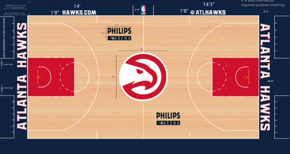
The Atlanta Hawks are now the third NBA team this week to show off their new court design for the 2015-16 season, joining the Bulls and Nuggets among those ranks. From a distance, it just looks like your typical run of the mill court and not too dissimilar from what they played on last season.
However, if you take a look at the new court, you’ll see that the updated colors and scripts aren’t the only thing that changed here.
As you can see, the “feather” design that’s present on their uniforms is now in the paint and on the sidelines and baselines. In additon, the new “ATL” wordmark that’s prominent on their alternate uniform is now at the center of the sideline.
So, while the Hawks may not be adding sublimated skylines and/or logos onto their court, they’ve decided to show off their uniqueness by implementing some of their uniform design onto the court itself. All in all, it makes for a simple court, but one that will definitely be unique in the league.
What do you think? Is this a good court for the Hawks? Or should they have kept things even simpler?


