

For 2015 the Browns added a new logo, a brighter orange, and some significant uniform changes to their identity.
What Nike has said about the uniform doesn’t add up for me; they’d make you think they felt obligated to honour tradition of a football team that resides in a blue-collar, tough-as-nails city. They’d have you believe there were elements here that are sacred and untouchable. That couldn’t be further from the result. It is definitely an evolution, not a revolution, but everything on the uniform has been changed, even the helmet has a new satin orange shell and brown mask and within the brown stripes is a carbon fibre pattern.
It’s unfair to judge any design with a drive-by, reactionary critique. Design is really a lot like rookie athletes, you need to give it two or three years before deciding if you wasted a draft pick or have a star. As a designer though, you start getting good at critiques as you gain knowledge and experience and maybe you only need a few months before giving a fair critique, most importantly you need to see the design in action.
The Browns’ uniform is a great example because my opinion of the uniform has changed quite a bit since its public reveal. By seeing the uniform on the field and having some time to think about it, I’ve been able process other information and spot flaws I didn’t see before. When I first wrote a critique on my blog there were things about it I felt were wrong in my gut, but could not pinpoint what or why. Now, I think I’ve got a good grasp on it.
You have to first understand the goal of the design. It’s not intended to represent history or built to last 100 years – it is built to make a flashy impact NOW, and appeal to the younger audience the NFL has been marketing to. With that in mind, I believe Nike has created a successful design. But that’s not what makes good design, especially as a professional sport uniform.

The Good
If there is one thing Nike is great at, its creating colour palettes. The new orange swatch is pretty great. I wouldn’t say it “matches the passion of the fans” but it definitely has a lot of energy in it. It’s bright, youthful, and should make anyone who wears it feel confident.
The number font is by far Nike’s best attempt in the NFL having the most uniformity and legibility of all their creations. It’s not built on some lame gimmick like a dolphin’s nose or cutlases, but is built to be a strong, readable, and long lasting font that has just a little customized tweak to it. The “up shadow” on the numbers is a nice call-back to the uniforms of the 1940s and give the jersey a unique element from all other 31 NFL teams.
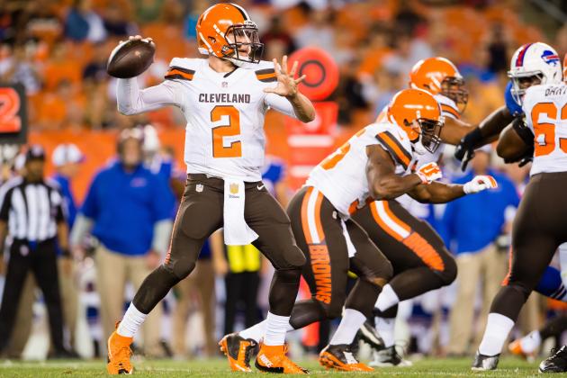
I really love colour numbers on colour jerseys and the white jersey looks fantastic with the orange numbers. There are some issues with the brown jersey though as I’ll touch on in a moment.
Personally, I love the brown pants and while the white jersey/brown pant option is my favourite, all the colour options work well together as a base; that is, an brown jersey/orange pant or a orange jersey/brown pant combo all are pleasing enough. But with the Browns’ new designs, those base colour combos don’t work as well as they could.

The Bad
Before the uniforms were revealed, my worst fear for them was they would use too much orange, and that’s exactly what happened. Bright, warm colours have to be used carefully and far more tastefully than this – otherwise you overload people’s retinas and they can’t stand to look at them. The overload on orange is gaudy, cheap, and on it’s best day looks like an NCAA team.
There is a real problem with the brown jersey – the Browns’ coaches have said they can’t see the numbers when reviewing tape from the games from the All 22 angle. The quick assumption is that it is due to the orange numbers not providing enough contrast, but I think that is only 1 part of the problem. After first thinking the “up shadow” on the numbers provided some contrast, I think it is leading to some visual vibration.
The biggest flaw leading to unreadable numbers though, is that there is a terrible hierarchy of elements on the jersey. The stripe, number, and even the oversized word mark are all competing for attention, and the focus should always be the number. Even the application of color on the stripe leads to distraction, as the white portion becomes the thing that attracts your eye with the brown jersey. The colour application there is all wrong – it’s all orange-on-brown so your eye goes where there is high contrast or something “highlighted” and that is the stripe.
The white jersey works the best because the colour application dictates the stripes do not take full focus; the use of brown and orange on white creates an optical illusion that the stripe is smaller (dark coloured objects appear smaller than light coloured ones) and because there is more brown in the stripe, the word mark is brown, but the number orange, the entire jersey looks is more readable with the numbers being at the top of the hierarchy.
Nike saw an opportunity to emphasis the word mark on the chest as no other NFL team has done this before. The issue is, lots of NCAA and High School teams do this and it makes the Browns’ jersey look anything but professional.
The Browns word mark on the leg caps off the disappointment. The Browns have such a unique and recognizable identity because of their strong colors and Braisher stripe adorned helmet. The colour and shapes of the uniform design has always carried it even without using a logo. So, to place “Cleveland Browns” all over the uniform seems very unnecessary and reminds me of someone explaining a joke; “we’re the Browns, get it?”.
The jerseys also feature contrast stitching which were added to “reflect the craftsmanship of Cleveland”, but when you see them up close, I think it just highlights all the seam s in the jersey and looks chaotic because they run all over the place in every direction. I don’t see this as being a likable quirk but, an annoyance.
Rating

Taking the whole uniform in and seeing a sans logo helmet with the whole team name spelled out largely on the rest of the uniform just looks kind of comical. There are some good ideas in the uniform but I don’t feel any of them are executed well. Overall, it feels like a design that just tries to do way, way too much. I originally felt these were average, but with the numbers on the home jersey being a readability issue, and seeing them on the field, I can no longer say the uniforms are anywhere close to good.
Fixing-It

Fixed

The focus here is on making the uniform more timeless and making all the uniforms elements work better together. You can’t make everything as large as possible, and in the case of the home jersey all the same color as well, and have it be likable, let alone readable. The Browns’ orange and brown carry the identity but orange is so intense and bright, it’s best to remove some of it.

Thanks for reading, share your thoughts in the comments, and be sure check back each and every Friday to see who we fix next.
***
Critique Guidelines
5 – Exceptional. Design that is unique to the team and/or perfectly captures their culture/brand. May be a traditional design, but no mistaking for competitors. Technical craftsmanship is without flaws. Consistency and unity among every element and across every jersey cut and helmet design.
4 – Very Good. Design is appealing and appropriate. May be a template/colours that resembles competitor(s). Perhaps a slight miss on details and/or minor flaws in craftsmanship.
3 – Passable. There are multiple issues that need to be addressed in the future, or have overlooked some details. Perhaps an off-branding move, but has a solid foundation with passable design decisions.
2 –Poor. Poor design decisions, and/or poor craftsmanship in multiple areas. Will have to be redone, but there is something worth saving and building upon.
1 – Fail. Poor design, and poor craftsmanship through out. No cohesiveness between multiple pieces or combinations. Little to nothing worth using again. Could be compared too closely to design of competitor(s)
- Uniform must identify the team clearly from distance and from TV angles.
- Jersey numbers must be readable from distance and from TV angles.
- Team logos will be part of the critique.
- Throwback uniforms will not be part of critique, but alternate colour pieces will.
Related stories:
 Cleveland Browns Honor Late Hall Of Famer Jim Brown With Helmet Decal
  Cleveland Browns To Wear Alternate Uniform In 2021 For 75th Anniversary
  Johnny Manziel jerseys are going for rock-bottom prices
  Fix-It Friday: Bills, Jets Color Rush Uniforms
  Fix It Friday: Miami Dolphins
  Fix-It Friday: The Tampa Bay Buccaneers