

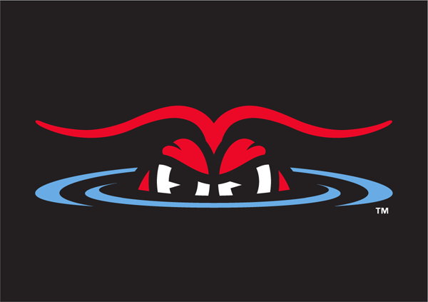
 The Hickory Crawdads, Single-A affiliate of the Texas Rangers and recently crowned champions of the South Atlantic League, unveiled a new logo in an announcement just moments ago. The new look, designed by Dan Simon of Studio Simon, is an update to and expansion of the team’s previous identity, which had been in place since the Crawdads’ debut in 1993 (pictured at right).
“We’ve had one logo for 23 years, so basically, it was time for an update,” said Douglas Locascio, the team’s executive director of sales and merchandise. “We feel that it’s a great logo, but we just wanted to clean it up, refresh it, and to give us more tools in our toolbox.”
Aaron Cox, the team’s radio broadcaster, put it succinctly: “It definitely needed a fresh coat of paint.”

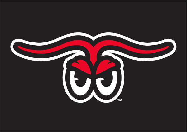
The most notable aspects of the updated identity include a new primary logo, a suite of new alternate marks, and the addition of blue to the team’s color palette.
As with many of the popular minor league baseball teams whose identities date back to the 1990s—such as the Carolina Mudcats, the Chattanooga Lookouts, or the Lansing Lugnuts—the Crawdads had a successful, recognizable logo, but were limited by the lack of alternates in their arsenal. In rebranding, the team sought to solve that problem.
“The goals were to maintain the equity of what already existed in this iconic minor league identity, and then build a fully fleshed out system around that,” said Dan Simon of Studio Simon.

The most recognizable of the new alternate logos is the letter H with Conrad the Crawdad, the previous version of which served as the team’s primary logo before they had a real primary logo. It’s been updated, and more importantly, relegated to the status of cap logo.
“It really wasn’t their primary logo. It was their cap logo, which they were using as a primary logo because of a lack of a primary logo,” Simon said. “The idea was to build an entire system with that as a springboard.”
“The H is the staple of our organization,” Locascio said. “We modernized it, cleaned it up.”

The new color palette is most evident in the alternate logo above, which features an outline of the state of North Carolina, with a claw pinching a star that marks Hickory on the map.
“We’ve always pretty much just been black and red,” Cox said. “We added, we’re calling it Crawdad Blue…. It gives us another color to mix and match in there as well. We’re using it in our hats and our jerseys, and it’s at least present in some small way in all of our logos, and sometimes in a big way.”
Even with the addition of Crawdad Blue, the team’s main colors will still be red and black.
“With the blue, we’re going to walk before we run, and gradually introduce it,” Cox said. “But it gives us more variety, it adds color to the field, to the team store, to the ballpark.

An alternate logo with Conrad resting two bats on his shoulders was initially proposed as part of a new primary logo, according to Dan Simon. While the team opted for a different primary, they liked this version of the character and asked that he be included in the suite of alternates.
Other alternates include versions of Conrad’s eyes or claw:


The Crawdads’ new color palette is particularly evident in the team’s new cap and uniform designs, especially in an alternate that features a Crawdad Blue jersey.


Back in 1993, the Crawdads were on the vanguard of minor league baseball marketing with a creative, fun logo, but the industry has changed and the time to update and expand their logo was long overdue.
“One of the first things that changed the business model of minor league baseball operations was, hey, it’s not just about opening the gate and putting on a baseball game,” Simon said. “There are other things that we can do to attract fans, to excite the fans, to give fans more of an experience, and one of those was the brand identity.”
And as the Crawdads have learned, it’s not just about having a good logo and fun name, but an entire identity system.
“Teams are building a brand identity,” Simon said. “Even if you’re an existing team, you’re always building that identity, and the more tools you have, the better you can build your identity.”