Following up on our logo and uniform history post for the Kansas City Royals… here’s their opponents in the 2015 World Series, the NL Champion New York Mets. Enjoy:
1962: Four years after both the Brooklyn Dodgers and New York Giants move to the west coast, National League Baseball returns to New York as the league expands for the first time adding clubs in New York and Houston. The name “Mets” was shortened from “Metropolitan Baseball Club of New York”, and the colours an homage to the old Dodgers (blue) and Giants (orange).
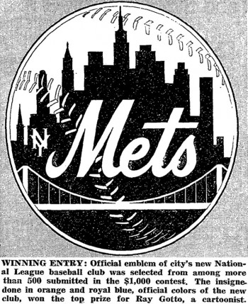
The Mets first logo in team history came as a result of a contest, the winning entry designed by cartoonist Ray Gotto netting him a cool $1,000 cash prize. The new logo features an orange and white baseball with a skyline of New York City in royal blue, “Mets” is scripted across the skyline in orange with white trim and a small orange “NY” monogram is to its left. The skyline features several real-world buildings such as Brooklyn’s Williamsburgh Savings Bank, and Manhattan’s Woolworth Tower, Empire State Building, and United Nations. Aside from the “NY” mark and a slight colour adjustment, the Mets continue to use this logo to this day 53 years later.

At home the Mets wore a white jersey with blue pinstripes, “Mets” in blue with an orange outline across the chest. For road games “NEW YORK” was arched in a similar style as worn on the old New York Giants road grey jerseys, now updated to appear in blue and orange for the Mets. The ballcap was blue with an orange “NY” on the front using another logo borrowed from the old Giants. Both the general concept of these original home and road jerseys, and the ballcap, are still worn today.

1974: The Giants-style “New York” wordmark is removed from the road grey jersey, replaced with a “Mets” script in the same style as the home jersey.

1976: In celebration of the 100th anniversary of the National League, the New York Mets play a handful of games while wearing a pillbox-style cap, similar to the ballcap players would have worn in the late 19th century.

1982: Orange and blue “racing stripes” are added to the shoulders of the road grey jersey. A road alternate jersey is introduced, it’s blue with “Mets” in orange with silver trim across the front. This jersey lasts only the one year before it’s replaced in 1983 with another blue alternate.

1983: The “racing stripes” which were added to the road jersey in 1982 are carried over to the home pinstripes.

A new road alternate jersey is adopted, the design of the jersey stays basically the same as the previous alternate, the colours on the “Mets” wordmark are now reversed, silver is the main colour and orange the trim. This jersey is dropped following the 1984 season and ends the Mets brief experimentation with alternate uniforms for another 14 years.
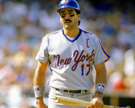
1987: Following their World Championship the year prior, the Mets bring “New York” back to their road jersey, now in a scripted font similar in style to the “Mets” font worn everywhere else.

1988: The “New York” script is replaced with a simple sans-serif arched “New York” on the road jerseys.

1993: Colours are darkened across the board, both the shades of blue and orange are tweaked slightly on the logos, caps, and jerseys.

With the colour change, the “NY” logo on the cap gets a bit of a refreshening, the points on the ends of the “N” are tidied up and the logo as a whole gets squished a bit to appear more thin.

Changes are also made to the home jersey script for the first time as a tail is added to the “Mets” wordmark, the road jersey gets a similar treatment as a new “New York” script with tail is added. The “racing stripes” added in 1982 and 83 are removed from both jerseys.

1995: Snip. The tail is removed from the “Mets” script on the home jersey and the road jersey returns to the original “New York” wordmark from 1962.

1997: A new pinstripe-free version of the home uniform is introduced as an alternate jersey, the team even tries out a white cap to go along with this set but that idea is very quickly dropped.

1998: The Mets become one of the first baseball teams to add black to their colour scheme seemingly out of nowhere. The home pinstripes are gone, replaced with a white uniform featuring a “Mets” script in blue and orange with a black drop shadow. The road jersey also adds a black drop shadow to that classic arched “New York” wordmark and now is worn with a new black cap, the “NY” logo in blue with an orange outline.

A new alternate jersey, the Mets first since 1984, is introduced. It’s black with “Mets” across the front in blue with white trim and an orange drop shadow. This jersey is worn with that new black cap also seen with the road jersey.

1999: The “NY” logo is removed from the primary logo and a new black version of the primary logo is introduced as an alternate mark.

Pinstripes return in the form of a home alternate uniform, it’s the same as the familiar home jersey worn for many years but of course now with a black dropshadow on the wordmark and player numbers. This jersey would get promoted to the home uniform the following season.

Yet another black alternate jersey is introduced, not to replace the one added the year prior but to compliment it. The new black jersey, to be worn only on the road, has “NEW YORK” across the front in a font seen on the existing road jersey, now in blue with white and orange dropshadow. A new cap is created to be worn with this jersey, black with a blue and white “NY” logo.

The Mets also participate in Major League Baseball’s “Turn Ahead the Clock” promotion, the team wears black uniforms referring to the club as the Mercury Mets (yes, the planet), the only club to presume it’s own future relocation. Don’t get too comfy Mets fans, this uniform is supposedly from the year 2019.

2010: The pinstripe-free version of the Mets uniforms is re-instated as the official home set as it originally had been in 1998. A new alternate uniform is introduced, cream (or heritage white) with blue pinstripes, featuring the “Mets” logo still with a black drop shadow.

2012: Celebration in the streets of Queens as the Mets remove almost all traces of black from their uniform. All black drop shadows are gone from the home white, home “cream” alternate, and road grey jersey, all that remains is the home black alternate jersey and cap still around from 1998, but it too would be trashed following the 2012 season. Also a minor change to the official designation of uniforms, the “cream” alternates are now the home jersey while the pinstripe-free set is “home alternate”.

A new blue alternate uniform is added to the mix, to be worn only at home it is blue with “Mets” across the front in orange script.

2014: Two new alternate uniforms are added, a blue road alternate which, like the road alternate from 1983-84, reads “NEW YORK” in silver with orange trim. The team also goes camouflage (the black jersey of the 2010’s) with their new “Military Monday” home alternate uniform. The jersey is US Marine digital camo with “Mets” across in blue and orange, a camouflage cap featuring the “NY” logo is worn with the jersey.

2015: The “cream” home pinstripe jersey takes a few spins in the wash with some bleach and comes out nice and clean, it’s back to white as the official home uniform.


