Minor League Baseball’s Double-A Southern League unveiled its first rebrand in 21 years. The new identity was created by prominent baseball logo designer Todd Radom, who is a regular guest on Buster Olney’s Baseball Tonight podcast and whose work can be seen on baseball fields in Anaheim, Washington, and Brooklyn.
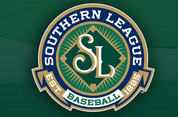
 The updated Southern League logo features some elements from the league’s previous logo from 1994 (at right), including an approximate color palette and an overall circular shape, with significant updates to make it more contemporary.
“There are commonalities that connect new and old, but this identity is built for the 21st-century,” Radom said. “Strong typography, solid shapes, and a pivot away from an abundance of detail characterize our efforts.”
The updated look features the letters SL, a baseball diamond (referencing one of the league’s logos prior to 1994), and a sunburst that signifies “positivity yet to come,” according to a statement issued by the league.
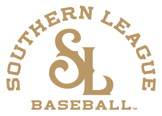 While the league has been around for 130 years, it has never had a secondary logo. That changes with the new identity, which includes a simple, gold-only version used for embroidery and stationary purposes.
The Southern League itself includes established teams with classic looks like the Chattanooga Lookouts and Montgomery Biscuits, as well as new teams with popular identities, such as the Pensacola Blue Wahoos and Biloxi Shuckers, so it was important for the league to keep up with its clubs in terms of a visual identity.
“It became apparent the Southern League was in need of a touch-up, both aesthetically and for graphic-design purposes,” said Southern League President Lori Webb, quoted on MiLB.com. “Thanks to the help of MiLB, Todd Radom, and of course, our member clubs, we feel that our new logos are more crisp and modern, while still maintaining the strong symbols associated with the tradition of Southern League Baseball.”
That said, there aren’t many fans out there snapping up logo gear for entire leagues.
“A league logo is very different from a team logo,” Radom said. “It’s not incredibly visible to the average fan and there are less opportunities to monetize the investment in changing it than there might be with regard to a team identity.”
Even so, the Southern League’s logo was dated and this update is welcome. The new look has a classic baseball feel and is receiving positive reviews on social media from designers and baseball fans alike.

