

The Bowling Green Hot Rods, Midwest League Single-A affiliate of the Tampa Bay Rays, unveiled their new logos, uniforms, and colour scheme yesterday evening. The new look was designed by New York-based SME Branding.
“We partnered with SME Branding when we purchased the Reno Aces and we knew they would be the perfect fit to help us create and redesign the Hot Rods brand” – Hot Rods owner Stuart Katzoff to MiLB.com
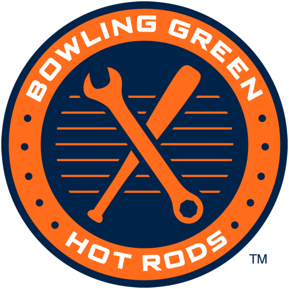
Blue and orange replace the old colour scheme of black, yellow, and red. Blue a nod to Kentucky, “The Bluegrass State”, and orange as that is the colour a rod turns as it is heated. Y’know, a “hot rod”.
The full explanation of all the elements of the new primary mark here:

And to compare it to the old look:

There’s a whole bevy of new alternate and secondary marks which compliment this primary mark, the team recognized the popularity of the car in the previous set and did incorporate it into one of the new logos:

Other marks feature a wrench or a flaming baseball:


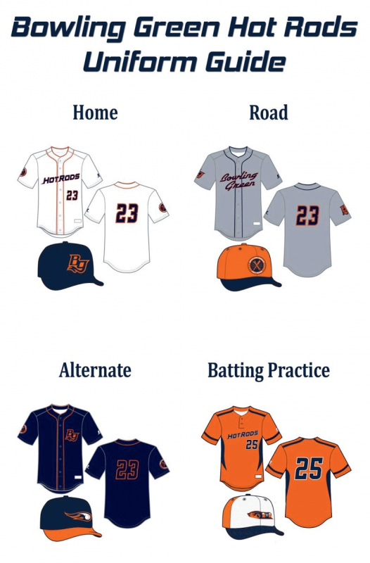
The home and road jersey wordmarks:


Home cap is blue, features the “BG” logo in blue and orange:

Road cap is orange and features the wrench/bat roundel:

An overview of all the new jerseys and their caps:
Related stories:
 USA! USA! Baseball Team Wears Miracle on Ice Jerseys
  Norfolk Tides Wearing SpongeBob Jerseys August 7th
  Hartford Yard Goats Unveil Logos, Colour Scheme
  Aberdeen Ironbirds Update Identity for 2013
  Whitecaps Acknowledge Tigers with New Logos