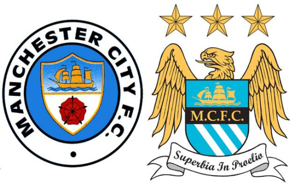
Earlier in the fall, we shared the news that Manchester City were having a period of consultation with their season ticket holders (a.k.a. “Cityzens) about whether or not the club should change its crest logo going forward.
Now, MCFC have announced that the period of consultation has ended, and the club is going to go ahead with plans for a new crest going forward. That means that this will be the last season in which MCFC will have the Eagle badge, which was the subject of a derision due to the three stars above the crest that were there for seemingly every reason except for representing championships won.
Here’s a bit from the club’s announcement on the matter:
Having analysed all responses received, the Club can confirm that there is an overwhelming desire amongst Cityzens for the badge to evolve and that a round design, as used in two of the Club’s three previous crests, is by far the most popular shape and remained so throughout the consultation process.
The Club has therefore been working with our designers to establish a badge which most authentically reflects both Manchester City Football Club and the city of Manchester and which takes into account the feedback received during this consultation.
As expected, the new crest will be in a roundel, so I’d bet that it’ll look extremely similar to what they’ve had in the past. Also, MCFC will now be aesthetically consistent with their children clubs in the United States (New York City FC) and Australia (Melbourne City FC).
So, are you a supporter of Manchester City returning to their roundel roots, or do you believe that they should’ve stuck with the Eagle logo?


