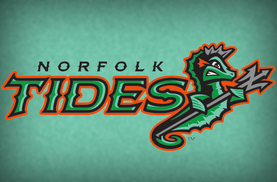
The Triple-A Norfolk Tides abandoned a longstanding conservative identity and threw themselves feet first into the world of wacky minor league logos today. The Tides kept their name, which dates back to 1961, but changed pretty much everything else.

When they take the field in 2016, they’ll be the first minor league baseball team to feature a seahorse in their logo, and the first to use the decidedly untidy color palette of battleship gray, sea foam, tidal green, Orioles orange, and black.
The new identity, created by Brandiose, gives the Tides much more flexibility than their previous one did.
“When we met with the entire staff, they felt limited creatively having really just one logo,” said Brandiose partner Jason Klein. “They also wanted answers the questions ‘What is a Tide?’ and ‘What character can we make our own?'”
The answer, of course, was a seahorse.
The Tides’ new look covers a lot of bases, all under the umbrella of a nautical theme. The suite of logos includes homages not only to the area’s natural habitat, but also its biggest industry, the Navy, and a little bit of Greek mythology.
“We used the ‘Tides’ name as freedom to explore the nautical world that celebrates the Hampton Roads,” Klein said, referring to the tidewater area of which Norfolk is part. “This includes the Navy, shipbuilding, underwater sea creatures, and the connection with Poseidon.”
An anchor-themed letter N bound in chains is battleship gray, such as you might find at the Norfolk Naval Shipyard. A logo featuring the letter T in both tidal and seafoam green is set in a typeface that evokes historic Naval lettering. And, of course, the central figure of the logo series is a grimacing seahorse wielding a trident with a Norfolk N on the end of it. All of the logos are highlighted with Orioles orange, a wink and a nod to the Tides’ parent club in Baltimore.
“We realized, that within the overall climate of Minor League Baseball, that this is something that can help us succeed,” said Tides general manager Joe Gregory, quoted on MiLB.com.
The new identity will be featured on traditional home whites and road grays, as well as camo-themed military appreciation alternates, all of which were also unveiled today.
The new look is a startling departure from one of minor league baseball’s more traditional identities, but it’s a fun one. Traditionalists and longtime fans will likely recoil a bit at first, but this new look puts the Tides on the map in an increasingly wacky landscape.


