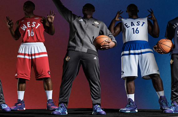
The marquee event on the NBA’s calendar is going to be held in Toronto, Canada this season, and now we’ve got our first look at the uniforms that the most popular players in the NBA will be wearing for the 2016 NBA All-Star Game. While we won’t be seeing the strikingly-simple-yet-unique uniforms that we saw last year, the 2016 set of uniforms are still unique in their own way.
The jerseys are pretty simple, at least on the front. The back of the jerseys feature a sublimated Toronto skyline, as well as a secondary 2016 All-Star Game logo. They also include the advertisement for Kia cars on the chest, so the NBA made good on their word as far as that’s concerned and this appears to be yet another step in slowly getting you warmed up to the idea of advertisements on the regular uniforms — and they’ll also be on the jerseys that are being sold to the fans as well.
Meanwhile, the shorts are where things start to get funky. Adidas has been outfitting some of their college basketball teams with weird stripes that go slightly below the waist, and they’ve done something similar with the shorts for the NBA All-Star Game. I think that simply making the waistband white on the West’s uniforms and blue on the East’s uniforms would’ve been a much better-looking option for the uniforms, but I’m not the one in charge here so I suppose we’ve got to settle with what we got from the designers here. Then again, I do think that they did a good job by using negative space to include the Canadian Maple Leaf in the shorts design, so I guess I’m conflicted on this design. What a time to be alive.
One thing that is actually really cool and a nice reference to the hometown team is the Claw-star logo. It’s always nice to see All-Star logos that pay homage to the home team’s identity, and this is no exception.
Here’s further explanation from adidas’ press release:
The red-and-white Western Conference and white-and-blue Eastern Conference uniforms feature a maple leaf overlay on the front of the jerseys as a tribute to the national symbol of Canada, while Toronto’s cityscape is featured across the back to represent the host city. Clean, single-layered fonts are a nod to the NBA’s early days in Toronto, where the first NBA game was played on Nov. 1, 1946, between the Toronto Huskies and New York Knickerbockers.
A star patch that incorporates the maple leaf and NBA logo is displayed on the upper back of the uniforms, while black-and-gold jock tags display the Toronto Raptors’ alternate team colors and claw logo. Featured on the jersey’s neck liner and shorts’ draw strings is a mosaic of flag colors that represent the multinational makeup of the league’s players.
Also, take note of the fact that if any Toronto Raptors players get into the All-Star Game, they’ll be wearing the blue-and-white uniforms instead of the Western Conference uniforms that are colored in the Raptors/Canada’s colors of red-and-white. If there was any time for the two conferences to switch colors for just one year, then this was the year to do it. Oh well.
Anyways, what do you guys think? Is this an upgrade over last year’s streetball-esque uniforms? Or should they have gone with something similar? Let us know what you think!


