It’s that time again, when the folks at SportsLogos.Net (well, just me really) go through every new logo and rank them based on how you, the readers of this site, have rated them since their unveiling.
This year we received over 65,000 votes from you guys to put together this list, thank you! You’re awesome! For those unfamiliar with the process, logos are rated on a scale of 1 to 10, a logo cannot be assigned a score of zero (1 is the lowest) but could theoretically get a perfect score of 10. Only one vote per person was permitted, this is not a ballot stuffing “let’s start trending!” type of hashtag contest here *cough* #2015CreamerAwards *cough*
To be eligible for any of the awards and lists we’re presenting here today a new team logo must have made it’s on-field/ice/court debut during the 2015 calendar year. This means any of the new logos unveiled recently (which won’t actually be used until 2016), such as the Hartford Yard Goats and Louisville Bats, are not included — you’ll have to tune back in next year to see how those new logos fared. We’re also not including simple re-colourings of logos previously used (St. John’s IceCaps, Manitoba Moose) or those who are bringing back a largely unchanged old logo from the past (San Diego Gulls). All of the ratings and rankings you see below were tallied at of the end of November 2015.
We start the show off with the big one.
★★★★★ BEST NEW PRIMARY TEAM LOGO OF THE YEAR ★★★★★
Previous Winners:
2014: Amur Khabarovsk (KHL). 2013: Creighton Bluejays (NCAA). 2012: Toronto Blue Jays (AL)
This award is open only to official primary team logos designated by the club, each club only has one. It had to have made it’s in-play debut in 2015.
This year’s winner was a minor league team who adopted a major league worthy identity, winning universal praise from both the media and fans in the process (which almost never happens when it comes to anything logo-related), that’s how good this new logo was.
Without further ado, we’d like to extend our congratulations to the 2015 winner of Best New Primary Logo of the Year…
The Milwaukee Admirals of the American Hockey League

(Read our article about the Admirals New Logo from July 15, 2015)
*Champagne pops!*
The new Admirals look, designed by Dan Simon out of Studio Simon in Louisville, Kentucky, scored an incredibly high 9.2 out of 10 amongst the readers of SportsLogos.Net placing it well above the runner-up team, the Eastern Illinois Panthers (who scored an impressive 8.45/10).
Back in July, the Milwaukee Admirals described their award-winning design in a press release:
“The new logo is an evolution of the Admirals last logo and features a more fierce and determined sailor. The sailor is accented by the upper portion of a naval uniform and a hat that was inspired by the one worn by the Admirals ‘Captain Crunch’ logo from the late 70s and early 80s. The hat is adorned with an ‘A’ composed by three bones.”
A thunderous applause could be heard throughout the BMO Harris Bradley Center when the new logo was first flashed on the scoreboard that night in July, SportsLogos.Net commenter “MikelGuess” responded to our original story sharing the excitement of the crowd:

Dan Simon didn’t sign any new players for the Admirals, but with a few clicks of his mouse in Kentucky (sprinkle in a wealth of natural talent), he was able to re-energize a disappointed fan base. Logos can be very powerful when executed correctly.
When the Admirals first moved to the more kid-friendly skeleton set in 2006, fans did not seem too impressed, the mark replaced a more serious look the team had been using for the previous quarter-century. The skeleton, they said, was the remains of their original mascot, not seen since their first logo from the 1970s. That’s some dark stuff there. While the new colour scheme was generally well-received fans did not like the actual logo, receiving a very average score of 5.3 out of 10. This re-brand scored the Admirals nearly four additional points. Rocket to the top!

SportsLogos.Net is very happy to present the Admirals and Studio Simon with this well-deserved award. Congratulations!
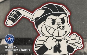
Finishing behind the Admirals we have the Eastern Illinois Panthers in second and the expansion West Virginia Black Bears of the New York-Penn League taking the bronze. Fourth place goes to the Howard Bison who finally ditched their Buffalo Bills clone, while fifth goes to the Connecticut Whale of the brand new National Women’s Hockey League.
The rest of the top ten sees the Atlanta Hawks going back to the past, but a little more modern and roundel-ish, in sixth, another entry from the new women’s hockey league – the New York Riveters in 7th, the Greenville Swamp Rabbits, who are minor league hockey’s first real attempt to jump on the whacky-names bandwagon we see all the time in baseball now are 8th, the Washington Wizards rare right-during-the-season logo change takes 9th, and the Daytona Tortugas of the Florida State League in tenth.
A look at the 39 other primary logos who finished behind those top ten in 2015 (click image for larger view)… please please please don’t link directly to the image, instead link to the post you’re reading here.
There were well over 150 new primary team logos that qualified for this list so finishing 49th isn’t anything at all to be ashamed of! Congratulations to all the teams who appear on this list.
—
★★★★★ BEST NEW ALTERNATE TEAM LOGO OF THE YEAR ★★★★★
Previous Winner:
2014: Philadelphia 76ers (NBA)
Continuing with our team categories, we now look at the top alternate logo of the year. Any team logo that’s not the primary logo is eligible for this award including any team-specific commemorative anniversary patches, baseball cap logos, and of course officially designated alternate or secondary team logos.
Congratulations to this year’s winner of the best new alternate team logo of 2015…
The Utica Comets of the American Hockey League
(Read our article about the new Comets alternate logo from August 26, 2015)
In designing a new alternate jersey for the Comets, led by in-house designer Eric Kowiatek, the team took their primary shield logo, eliminated the team banner from it, and carved out some negative space from the top to form a “U” for their home town of Utica, NY. The result is a logo which could easily stand on it’s own as a primary mark for the franchise. Combine that with the use of the wildly underrated colour scheme of blue, white, and green and you’ve got yourself the best alternate logo of 2015.
Congrats to the Comets and to Mr. Kowiatek!
It was a pretty good year for branding in the American Hockey League, amidst the historic amount of franchise shuffling that went on, we see two teams who didn’t actually shift around at all taking the awards for both the best new primary and best new alternate logo of 2015. Good on you, AHL!
Utica finished with a score of 7.70 out of 10, just ahead of the runner-ups:

The South Bend Cubs of the Midwest League came in second with a score of 7.5 while the North Carolina-Wilmington Seahawks finished third at 7.33.
—
We’ll finish things up with our only league category, it’s the…
★★★★★ BEST NEW LEAGUE OR EVENT LOGO OF THE YEAR ★★★★★
Previous Winner:
2014: 2014 NBA All-Star Game (NBA)
Only logos representing an event put on by a league such as an All-Star Game, Playoffs, Special Outdoor Hockey Game, or Entry Draft are eligible for this award, as are any new primary league logo which may have debuted in-season throughout the past year.
This year the award goes to an annual event which does incorporate some element of “templating” in the logo, but readers of this site were able to look past that to focus on the actual design of the mark.
The best league/event logo of 2015 goes to…
The 2015 National Hockey League Draft
Yes, it’s a hockey sweep of our three main awards! This year’s South Florida edition of the NHL Draft logo, designed by Brian Casscles of Casscles Design, Inc. scored an impressive 7.89 out of 10, much higher than last year’s Philadelphia logo which came two points lower at 5.92. Making use of a grossly underrated colour scheme while splashing in elements of Florida’s famous beaches landed Brian’s design the number one spot amongst all league logos released for the 2015 calendar year.
He’s a man of few words, and dramatic pauses, but Nicholas Hodell is right on.
The money.

Very honourable mentions to the 2015 MLB All-Star Game (Cincinnati) and the 2015 World Series logos, both of which were very well-done designs finishing *just* behind the eventual winner at 7.81 and 7.80 respectively. A close race this year!
—
So, wondering just how you can have a say in any of this for 2016? Well I’m glad you asked, all you have to do is visit any logo page on the site and click the stars shown to the left of the logo… easy peasy. You only get one vote per logo so make it count, no takebacks! It’s on a scale from 1 to 10. This graphic shows you exactly where to cast your vote:

***
Welp, that’s it for 2015, we hope you enjoyed the best and the worst of the year in sports logos… if you’re feeling especially nostalgic take a look back at our annual awards posts from 2014, 2013, and 2012, see if time has changed any of your opinions of those choices.
If you’re wondering where the “Worst Logos of the Year” section is this year, well we’ve decided to separate the two posts, I’ve already written it and it will be coming up later this week, don’t fret! For now, let’s keep today a happy day to celebrate another year of great logo design.
We’ll wrap this up with yet another congratulations to the Milwaukee Admirals for winning the top prize, a quality design from a quality designer.


