Everyone having a good week so far? Good.
Mine’s been a little busy.
A couple days ago we shared with you our 2015 Sports Logos of the Year Awards, an annual run-down of the best in logo design over the past twelve months, and a fine reminder to those of you who insist the logo and uniform review community “hates everything new” are wrong. But there are a few things we don’t like, I mean, can you blame us?
Today we’re going to take a look at the lowest rated logos to make their in-game debut in 2015. Just logos, not uniforms. Using over 65,000 ratings from you swell folks who visit our site every day we’ve assembled the lowest of the low in sports logo design in 2015.
Let’s take a look.
★ WORST NEW PRIMARY TEAM LOGOS OF 2015 ★
Yeah, you already knew where this was going.

(Read our original article about the Clippers logo unveil from June 18, 2015)
So, the Clippers. Where do we begin?
They’re owned by Microsoft and are known as the “Clips” so I suppose we can’t be too surprised their logo looks like MS Clip-Art, right? Or like the cover of an old computer game.
Despite the fact it looks like someone just threw a bunch of things together, everything here is actually symbolizing something specifically… for instance, did you know those lines above and below the logo are supposed to be the horizon of the Pacific Ocean? How about that the “LA” on the “LAC”-basketball logo represents a basketball court? And that the “C” shows the whole “City” rallying around the team.
Fun, right? Those silver highlights on the wordmark, yup, that’s the silver lining that awaits long-time fans of the team.
No, I’m not making any of this up. It’s good times.
Let’s look at the runners-up…

You can always count on minor/junior league hockey to produce some less-than-stellar logos, they just haven’t quite achieved the level of quality that minor league baseball has going for it lately (take note, there are no baseball logos on any of the “Worst” lists for 2015… there’s a reason for that). The American Hockey League feeling the love and the hate this year, won both the best primary and alternate team logo categories earlier this week, finish 4th and 6th worst on the primary list.
And hey, while we’re at it let’s give a standing ovation to Maple Leaf Sports and Entertainment, they own two basketball teams (Toronto Raptors and Raptors 905) and they both ended up right at the bottom. That’s hard to do. While MLSE had a bad year design-wise (going into the most important new logo re-design, like, ever), nobody can top the LA Clippers.
So “hooray!” for the NBA? While four of their teams cracked the Top 49 of the year they also take the top two spots for worst primary logo and then a team in their minor league system rounds out the top three. The highs and lows of logo design all right there in one year, one league.
We’d also like to say “Sorry!”, and not just because I’m Canadian, to both you guys and to the San Jose Barracuda; we erroneously named them as the worst rated logo in California last week, and while the Barracuda do have a low rating (2nd worst in California!) it turns out that someone sad and lonely tampered with the Clippers vote totals bumping them way up higher than they should’ve been. We removed those fake votes and the Clips immediately took a dip down to last place. We’ll upgrade the system before next year, this won’t happen again.
—
★ WORST NEW ALTERNATE TEAM LOGO OF 2015 ★

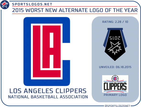
Sweep! Sweep! Surprise, it’s everyone’s favourite new logo set this year, those Los Angeles Clippers. Yikes. Of all their new logos, this one above rated the lowest at an absolutely abysmal 2.3 (and that’s after rounding up!) out of 10. This might be the lowest rated logo in the entire world right now, let me check… and, yes, it is. Not even close. Congratulations Clippers, you did it.
Other alternate marks to finish this low (Clippers aside, because all their other new alternate logos were actually all rated worse than these) are the Atlanta Hawks neon-green retro mash-up (3.7) and Cleveland Browns “Dawg Pound” (3.8)

We finish things up with the worst league or event logo of the year…
—
★ WORST NEW LEAGUE/EVENT LOGO OF 2015 ★

The United Soccer League went with a retro and simplistic approach when they unveiled their new league logo in February of this year, the league name was shortened in the graphic from USL PRO to just simply “USL”. This was the only change the readers seemed to embrace. As for the idea of anyone in 2015 using a logo that looks like it was designed in the 1970s or 80s? Well, unless it was *actually used back then*, apparently, is not a popular move. Weird right? You learn something new every day.
Dishonourable mentions to the 2015 NBA D-League All-Star Game (4.7/10) and the 2015 IIHF Women’s World Hockey Championship (4.77/10)

As for the CFL… you’re lucky your logo isn’t official until the 2016 season. I’m pretty much calling that one as the “winner” right now.
That’s it! And please take a look at our Best New Logos of the Year Award winners, while there were some duds this year, there were far more great ones. Thanks for reading.


