![]()
Back in December when we broke the story on the Toronto Maple Leafs getting a new logo I noted that the team had been pushing a simplified version of their primary logo without a wordmark across their social media channels. Perhaps this was a sign of the changes to come, I wondered out loud at the time.
Since then the club has increased it’s usage of this possible new logo.
This week the club launched it’s new line of clothing and ballcaps, the “Leafs Nation” collection they’re calling it, not only featuring that plain blue leaf but also using their old wordmark alongside it. Check it out:

We’ve also seen this logo appear suddenly on the Air Canada Centre scoreboard before a game:

Right?
When the news broke the only clue we had as to what the new logo would look like was that it would be a combination of the past, present, and future. This fits that bill perfectly: we have the past (60s wordmark), present (modern shape of the leaf), and future (just a plain blue leaf, name arched around).
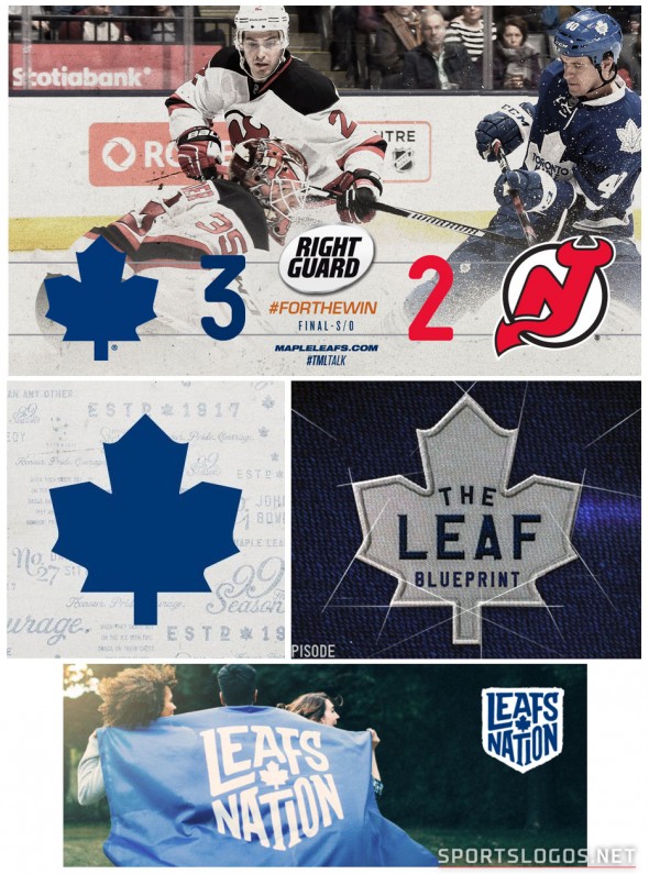
While yes, it does seem to be a tad early for the club to be throwing the new look out there, let’s not forget that this is the same ownership group (MLSE) who unveiled the new Toronto Raptors logo for 2015-16 in December 2014. By that measurement, this would be late.
So either this is the new mark or it’s a really bizarre time to introduce something new when we all know a change is coming later this year.
Related stories:
 My Journey to (and at) the 2022 NHL Heritage Classic
  NHL Leaks! New Third Uniforms for Lightning, Leafs, Kings
  New Leafs Uniforms Coming in One Week
  New Details: Leafs New Look A Classic Combo
  Leafs, Red Wings Unveil 2014 Winter Classic Jerseys
  Red vs Blue at Winter Classic? Leafs, Wings Jerseys Spotted
