

The Carolina Panthers were an NFL expansion team in 1995 and, even though they updated their logo in 2012, have worn the same uniform since their inaugural year. While that design worked well twenty years ago, a lot has changed in uniform template design since then, and the Panthers current design no longer works as originally intended. Today we’ll attempt to fix that.

Design Overview
The Good
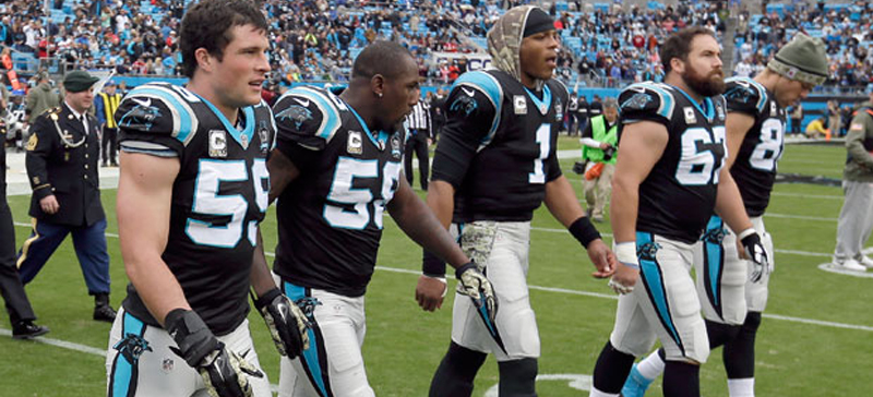
The Panthers colours aren’t the most original, but it’s hard to go wrong with a blue, silver, and black palette. The jersey stripe, although their biggest issue, is still a good pattern that just needs to be brought up to modern standards. Even as overused as black is, the home jersey is best to remain black; if they were to make blue the primary colour it would only make them more similar to other silver helmet-blue jersey-silver pants teams such as the Lions and Cowboys. Since the Lions also share a big cat mascot, it’s vital for Carolina to separate themselves from that team in particular.
Silver pants aren’t really silver anymore, but grey pants are still a good option. The Panthers also have a pair of white pants they use with the white jersey, and might be their most signature look. We’ll keep that in mind when designing the new uniform.
The Bad
Helmet
We’ll be keeping the logo as-is for this concept, but if you want to see a great logo proposal for Carolina, check out Fraser Davidson’s concept. The only thing we’ll do to the logo is eliminate it’s overuse on the uniform, it’s in 6 different locations on the current uniform, this becomes a tad redundant.
The stripes were probably intended to reflect the shapes within the original logo and follow a 1990’s trend of tapered stripes, but the execution has always been a bit off, starting close together at the bumper and flaring outwards at the back. We’ll definitely revisit that.
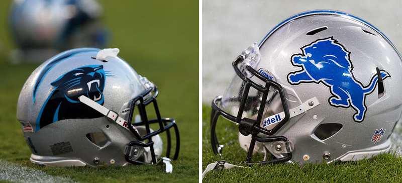
The main problem with the helmet is that it’s just too similar to the Detroit Lions in that they’re both silver with a black face mask and a big cat mascot logo on the side. Since the helmet is such an important piece of branding material for a football team, we have to address this issue as well.
Jersey
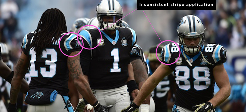
Stripes are the biggest problem on the jersey, and like many stripes on football uniforms, they were solutions to a very different problem that no longer fit today’s jersey templates and, as a result, are just shoe-horned in. They were intended to be a sort of tapered wrap-under UCLA stripe, similar to the Baltimore Colts. Indianapolis eventually truncated that stripe to make it more consistent on the ever-shrinking, tighter-fitting jerseys. With every jersey cut option, the Panthers players have a stripe doing a different thing. The stripes don’t work on modern templates but, it can evolve into something that is more appropriate for modern times.
The traditional block number is almost always a good choice for a football jersey, but it’s out of place here. This isn’t a design that should use straight lines and block shapes, it needs to pull lines from the logo and use curved lines to its advantage.

Pants
The pants stripe used to pair perfectly with the jersey, but the issues laid out above make this stripe out of place. It’s not the same as the helmet stripe and very rarely the same as the jersey. It will need some reworking as well.
Rating

What’s worth saving from the current design is the colour palette and general stripe ideas, they should serve as a starting point for a new design. This jersey is the NFL’s most inconsistent design across all the different templates players can choose from, and let’s be honest, if your uniform isn’t the same on every player, then it isn’t a uniform at all; overall, the design is stuck in the 90s.
New Design


The point of Fix-It-Friday is to make small tweaks to current uniforms and try to resist doing something drastically different. The thing with designing a uniform though, it’s not too far from designing the aerodynamics of a race car – what you do to 1 thing effects everything else. Wing adjustments in the front effect the airflow to the rear and you have to find a way to make everything work together. When I started making a couple of small changes tot he Panthers, I realized I had to make other changes in order to make every element part of a cohesive, complete package. So, even though this design makes more changes than I intended, I feel good about this new design.
Helmet
To distance this team identity from the Lions, we’re changing the helmet to black. That’s not something they would have done in 1995 when they came into the league with the Jaguars, but since that team has changed so much since, the Panthers should focus on separating themselves from Detroit. Let’s also give them a matte black finish and a gray mask so this helmet doesn’t look like other black helmets in the NFL (Steelers, Falcons, Ravens). The helmet’s stripe remains tapered, but it’s only one stripe instead of two – this better reflects the shapes from the logo.
Jersey
Keeping black as the home jersey color, I focused on the stripes. I wanted to retain the silver-blue-silver pattern and do something that would pair well with the helmet stripe. I’ve taken the same stripe and turned it sideways across the sleeves. This will allow for a much more consistent application throughout the team and follows modern trends of stripes breaking the sleeve seems like the Seahawks and Browns. I couldn’t keep the jersey number font the same because the traditional block wasn’t pairing well with the new stripes. I looked at the logo once again, and selected a font that shared similar shapes. The blue swatch has been tweaked, getting away from the 90s “electric blue” and something a bit more timeless.
Pants
The pants are just following the design above them, with the same stripe applied to them. Since the Panthers currently use gray pants, I thought that was fine to make as the primary color, but in 2013, fans voted for The Best Uniform of All Time and the winner was Carolina’s “double black”. To satisfy those 1.1 million fans that voted, I’ve included a pair of black pants as well.


Check out our other Fix-It Friday posts here
Related stories:
 Sources: Carolina Panthers To Unveil New Uniforms Prior To NFL Draft
  Carolina Panthers Unveil Glorious New Black Alternate Helmet
  Phantom Merchandise: Carolina Panthers Super Bowl 50 Champions Gear
  A look at the 10 best Super Bowl uniform matchups
  Fix-It Friday: Bills, Jets Color Rush Uniforms
  Fix It Friday: Cleveland Browns
  Fix It Friday: Dallas Cowboys
  Fix It Friday: Miami Dolphins