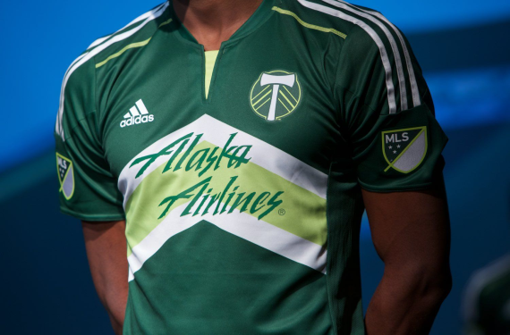
The defending MLS Cup Champions are going to have a bit of a new look next season. Firstly, they will have a new away (Rose City) kit, which Timbers owner Merritt Paulson teased on Twitter.

It’s going to be real interesting to see what the rest of that kit looks like, because the teaser is a bit of a doozy. However, the eagle-eyed among you will notice that the Timbers are still using the version of the crest that has no wording and just has the T-axe with chevrons within a circle. That’s by design, since the club has officially decided to make this their new primary crest.

The Timbers wore this crest on both their regular home kit and the fauxback alt that they wore on a multitude of occasions last season.

In my opinion, this is an upgrade. The now-old primary crest was nice, but the “new” crest is closer to what the NASL’s version of the Timbers had, and anything that invokes the long tradition of this club is always nice. Plus, I’m sure that the fans will probably appreciate the addition of the star, for obvious reasons. Also, Alaska Airlines recently updated their brand, so there’s a chance that the new branding could make its way to the front of the Timbers’ kits as well.
What do you think of the change, though? Should the Timbers stick with their more detailed crest? Or are they making a good decision here?
Related stories:
 MLS Renews Calls to End Plastic Waste With Return of Parley Kits
  2023 Football Kit Preview: Major League Soccer
  Busy Wednesday Sees 13 MLS Clubs Launch New Jerseys for 2023 Season
  2022 Football Kit Preview: Major League Soccer
  As 2022 Season Kickoff Approaches, 7 MLS Teams Unveil New Kits on Tuesday
  The Cascadia clubs of MLS unveil their new kits for 2018
  Multiple 2015 MLS Kits Leak Over This Past Weekend