Spring Training’s going to look a whole lot better in 2016.
Today Major League Baseball, Majestic, and New Era announced a new unified on-field look for the annual slate of exhibition games held every March. The new look includes ball caps, lighter-weight uniforms featuring regular season designs, specially marked baseballs, and other on-field elements.
Jerseys are all part of the new Flex Base “uniform system” developed by Majestic, this new template is not exclusive to Spring Training, it will be worn throughout the regular season as well. Via a host of player feedback over the last two years, the new “Flex Base” jerseys are now anywhere between 10-20% lighter, will feature a lighter weight twill for application of logos and player name/numbers, and will also have new mesh panels up either side of the jersey (see a photo of that on a regular season jersey, and the new MLB tag on the pants here). These side panels are now available to be designed, as we saw with the new Arizona Diamondbacks uniforms released early last month.
But I know you guys are more interested in the actual designs than the technologies, so we’ll move on to that…
THE CAPS
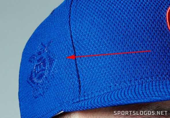
While the New Era cap technology is staying the same (Diamond Era 59FIFTY), there are new elements being added to the cap of each team. All caps will have each team’s respective league logo embossed on the right side and a patch noting whether they’re a Florida or Arizona based Spring Training club on the other:
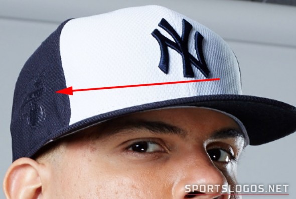


There will also be a design featuring Spring Training elements on the inside of the cap crowns, you’ll see details of this design (as it’s also featured on player jersey name and numbers) later on in this post.
Several teams are getting a new cap design as part of the change, the Chicago White Sox are going along the same route the Brewers took earlier this week by wearing a retro design with their modern colours:

The recently crowned World Series champions will crown themselves, the Kansas City Royals placing a gold crown above the “KC” logo on their cap:

One of the two caps being worn by the Los Angeles Dodgers will be without their familiar “LA” logo, replaced with a script “D” from their jersey chest, kinda reminds me of Mr. Baseball:

Toronto is going a more puzzling route, the Blue Jays remain blue but now dark navy blue (on the cap only), a double-white outline forms the shape of a maple leaf, no red to be found:

Detroit is going bold, and bright, their road Spring Training cap is an all-over orange… that should really stand out under that Florida sun (no fears, they also have a navy blue version of this, seen later in the post):

There’s several more designs you’ll see below, take note of Texas and their new state outline cap, and the Marlins have an orange “M” on their usual cap logo.
THE JERSEYS
Team jerseys will look more like their regular season counterparts, actually they’re the same thing teams will wear during the regular season. From Spring through the World Series most teams will now be wearing the same basic uniform design, with the usual exceptions such as the Tigers, Yankees, Cardinals, Dodgers.
These will not be replacing the batting practice uniform, as soon as the regular season begins teams will return to wearing their regular BP cap and jersey, in most cases the same design as last year, before games.
As mentioned earlier the biggest difference between the regular season and spring training uniform will be the sublimated graphics featured within the player name and numbers, these graphics feature general Florida and Arizona imagery along with the 2016 Spring Training logo. The design is the same for every team regardless of where they play.


These examples above are the same graphic style which is featured on the inside crown of the cap.
Most teams are wearing their standard regular season alternate jerseys with new Spring Training patches on the sleeve — FL for Florida clubs, AZ for Arizona teams.

Some teams have created new designs for the Spring such as the Tampa Bay Rays who have their large yellow sunburst logo on the left side of their chest:

The White Sox matching the cap with the new modern-retro batterman look:

And Minnesota, possibly giving us an early look at their new red alternate jersey? (Edit: Yes, they were)

That new gold, blue, and red combo of theirs really is growing on me every day.
Taking a look now at every team’s new look, grouped by division. Click on any of the images below for a much closer look at the new uniforms, patches, and number sublimation pattern
AL EAST

Baltimore adds a new all-black cap to their usual orange alternate jersey, Boston does the same with their red alternate now with a new red and blue cap. The Yankees, one of the few alternate-less teams in the league will stick with their usual Spring Training design, now with a white panel cap — this uniform is their home Spring set, they also have a road one which is featured later in this post.
Tampa Bay is wearing their powder blue alternate with the sunburst logo in place of “RAYS”, they have two caps to choose from, we are showing it with the designated home powder blue, they also have a navy blue which is shown later in this post. Toronto went with a mis-matched look, wearing a navy blue cap with a double-outline around a navy maple leaf (they’ve told me they’re going to play up the double outline much more going forward, it’s on their sleeves, pants, wordmarks, numbers, and new 40th season patch). The Jays will wear this new cap with their regular royal blue alternate jersey, no names on the back.
AL CENTRAL

The White Sox, like the Brewers, are going with a modern re-colouring of an old logo from the 1980s, changing their previously blue and red “batterman” logo to the modern black and silver. This logo is worn on both the cap and jersey (the jersey using the same design as their regular black alternate look), the familiar “SOX” logo as a patch on one sleeve.
Cleveland keeps their blue jersey untouched, now with a white panel cap and red “C” up front. Detroit has a home and road Spring jersey, we’re showing the home set in this image, the cap shows just a white outline around a navy blue “D” (road version of this set later in this post).
Kansas City has added a crown to their cap, possibly as a nod to their World Championship but more likely just a nod to their name. A patch celebrating their title is on the sleeve of their standard regular season road alternate blue jersey. Minnesota, like Detroit, has a home and road set, we’re not sure which is which, the above look is an all red uniform with a red front-panel on the cap. The Twins are set to unveil a new red alternate jersey this weekend, it’s possible this could be it. They just unveiled it, this is it!
AL WEST

No surprise with Houston, we had already heard they would be wearing their new regular season blue alternate uniforms in the Spring, the cap is new and features their BP cap logo, the H-star in a circle. The Angels go with their usual red alternate uniform, name-less, with a red and blue cap (note that the Angels are the only team wearing the Spring Training patch on the left sleeve).
Oakland, like the rest of the AL West in their usual alternate jersey, the cap has their alternate white elephant logo up front. Seattle goes with their teal alternates, cap features the compass rose logo with a teal bill. Texas, again, standard alternate jersey, but with a neat new cap, their white “T” over a map of the State.
NL EAST

Another modern-retro look as the Atlanta Braves stick with their old 1970s “A” logo, now in today’s colours, the jersey is the same as their regular road alternate but now reading “BRAVES” across the front instead of “ATLANTA”. Miami sticks with the usual black alternate but now with an orange “M” on their cap.
Nothing changes for the National League champs in New York, the Mets wearing their usual home alternate jersey with last year’s BP cap. The Phillies have a nice new red jersey, looks like a legitimate red alternate jersey… and spoiler alert, it totally is! The Phillies will wear this jersey a few times during the 2016 regular season. Hooray!
Washington is Washington. Usual red alternate, same white-front-panel cap as last year (only team with different colours for the “eyelets” on this year’s caps) .

NL CENTRAL
This division dominated the regular season last year! And then got hammered in the playoffs… 162 games of competing so much against the best of the best will do that.
Chicago goes with the standard blue alternates, same BP cap as last year, funny thing — in this image they’re shown to still be wearing the old 16-star National League logo as a patch. A new jersey and they’re still using the logo which was replaced three years ago. Cincinnati regular red alternates with last year’s BP cap.
Milwaukee will go with their brand new alternate uniforms, and hey, first look at this set with name and numbers! Pittsburgh stays the same as last year, wearing their black alternate jersey, and St. Louis joins the Phillies in wearing what looks like a red alternate jersey which does not exist as a regular season option… hopefully they, like the Phils, wear this a few times in 2016. New cap too, an all red version of their blue Sunday home alternate.
NL WEST

Arizona’s the only team to get a major overhaul heading into 2016, that’s their new regular season alternate jersey you see above, paired with a new cap bringing back the classic baseball chomping snake head logo. Colorado goes with the purple alternate jersey and keeps the streaking baseball mountain cap logo from years of BP past.
The Dodgers, there’s another one of those “looks like a regular season jersey but isn’t” designs, paired with a new “D” cap shown in larger detail earlier in this post. The Dodgers also have brought back their BP cap from last year, you’ll see that in the image following this section.
San Diego shows no signs of their new blue and yellow (or even brown and yellow) colour scheme, it’s their navy blue alternate jerseys from last year with their same old BP cap from the last several seasons. Giants also with their usual BP cap, but with a new jersey, a black version of their road grey alternates. I like it.
ROAD UNIFORMS AND ALTERNATE CAPS

Five teams will be wearing either a separate road set or have two cap options. The Yankees are shown with their road uniform above, cap is the same but now with a grey front panel instead of white, the jersey reads “NEW YORK” across the front in grey with white trim, the number on the back in the same style.
Tampa Bay has a road navy and powder blue cap, the jersey is the same as shown earlier. The Tigers road uniform requires sunglasses, an all-orange cap with orange “D” logo is set to be worn with a navy blue jersey and orange “D” (the home features a white “D”). Typically the Tigers do not wear their MLB designated Spring Training jerseys, opting to stick with their regular season home and roads, we’ll see if that plan sticks.
Minnesota has last year’s BP cap and their usual regular season alternate, there may be some mixing and matching going on with their red cap and this jersey as well. Finishing things up it’s the Dodgers with their new Spring Training jersey paired with their BP cap carried over from last year.
THE OTHERS
The visual Spring Training experience doesn’t end with the caps and jerseys, MLB is really going all out this year, Spring Training will be treated (visually) as a “jewel event”, the same level as Opening Day, the All-Star Game, and the Postseason. This means a unified look across the board, on-field logos, on-deck circles, base jewels, in-game baseball designs, hoodies, and the previously featured cap and jersey patches.
The big question will be “Why?”, yes, I hear the familiar calls of “money!”, but I get the sense it’s not quite as much about money as past league-wide endeavours… “money!” wouldn’t explain why almost every team is wearing the exact same jersey design as their regular season set. They could have just as easily churned out another 30 designs, called it a Spring jersey, and added it in addition to their BP set.
I get the feeling this is more about upping the overall appearance of a Spring Training game, make things look a little more professional (Tigers orange aside), worthy of the title of the best baseball league in the land. Sure the sublimated numbers are kinda silly, but again, it’s Spring, if they’re going to experiment with some odd things I’d rather they do it then than during the regular season.
Looking forward to seeing how it all looks out there on the field in just a very few short weeks! BASEBALL IS BACK!


