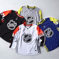
In honour of the National Hockey League’s All-Star Game tonight, let’s take a look back at the history of the uniforms worn during the past NHL All-Star Games, from the Ace Bailey Benefit Game way back in 1934 through to the four-division mini tournament of 2016.
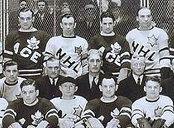
The first all-star game was a benefit held for Ace Bailey, a Toronto Maple Leafs forward who suffered a career ending injury during a game in 1933. The Leafs battled the best players from around the NHL on February 14, 1934 raising a cool $20,000 for Ace and his family.
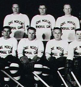
Another tragedy gets the league’s best together, this time following a death. Montreal Canadiens star Howie Morenz died just a few months after suffering a career ending leg injury in a game in 1937. Like the Bailey game, a fundraiser game was held pitting the stars of the two Montreal teams – the Canadiens and the Maroons, against the best of the remaining six NHL clubs. Despite the bevy of stars, the event raised only half of what the Ace Bailey game did three years prior.
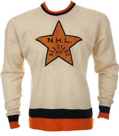
Having already held benefits for Bailey and Morenz, the league does so a third time, this in support of the family of Babe Siebert, the former Canadiens star (and just then recently named head coach) who drowned during the summer. The Canadiens took on a team of NHL All-Stars selected by the Canadian Press, raising $11,000 for Siebert’s family.
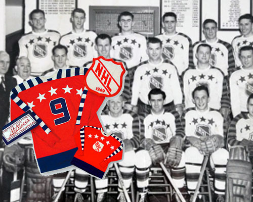
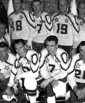
The first all-star game not held for a death or serious injury was in 1947 at Maple Leaf Gardens, for most of these first few years the game format was the defending Stanley Cup Champion versus the NHL All-Stars (there was a temporary switch to First Team All-Stars vs Second Team All-Stars in the early 1950s). The All-Stars wore these red (or white) jerseys featuring alternating blue/white or blue/red sleeves. The crest was the NHL logo with the year of the game and a rainbow of stars arched above both the logo and the number on the back. Players wore these uniforms in the All-Star Game from 1947 through 1959.
The Stanley Cup Champ vs NHL All-Stars format continued into the next set of uniforms, white with a black and gold shoulder yoke/shield design, fairly radical for 1960. Players didn’t wear a logo on the front of the jersey, instead going football style with the player number on both the front and back. Worn for only four games from 1960 until 1963.
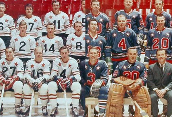
Sticking with the football style uniforms, the league did away with the shoulder mess, replacing them with simple (kinda NY Ranger style) stripes. The Champ vs All-Star format was scrapped during this run, the first East vs West NHL All-Star Game was played in 1968 with one side in blue, the other in white. This uniform was worn through 1972.
The league finally played up the NHL’s shield logo and colour scheme for their next uniform set, outfitting both teams (now representing the Campbell and Wales Conferences) in black and orange. The shield was front and center with two stars (also containing the shield) on either side. These uniforms were in place from 1973 until 1981.
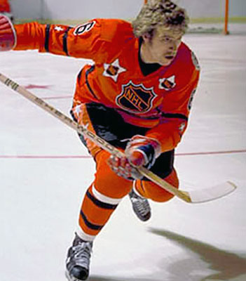
The one-year star-filled wonder from 1982, almost feels like a design idea which would be implemented more recently. The uniforms were orange, black, and white with the NHL logo up front, a chevron stripe on the bottom, and approximately 35 stars throughout the front, back, and sleeves of the jersey. They tried.

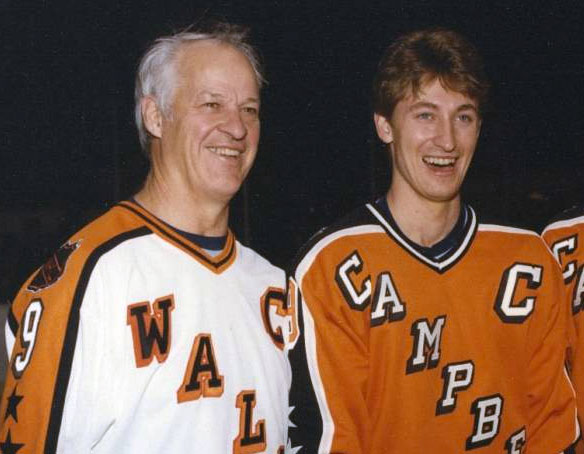
Moving on to what’s commonly considered to be some of the best All-Star Game uniforms, from 1983 through 1986 the league wore these orange and black jerseys with the conference name laid out diagonally NY Rangers style. Sleeves were either black or orange with a tasteful amount of stars on both arms.
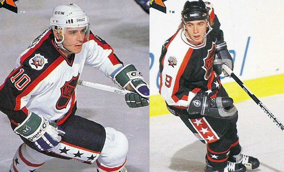
Here’s the one I grew up with, in 1989 the league moved away from the orange, replacing that uniform with a trendy black version, conference names were replaced with the NHL Shield and stars were added to the waist stripe. This look was worn only four times from 1989 through 1993, taking one year off in 1992 for the 75th anniversary of the NHL.
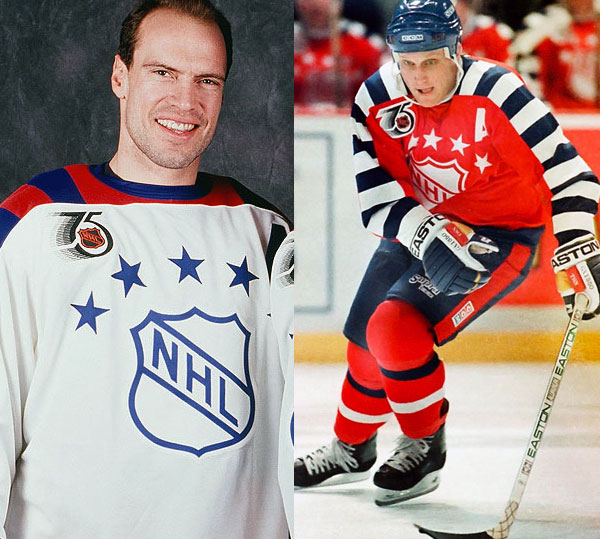
A one-year design to celebrate the 75th anniversary of the NHL in 1992, a faithful replica of the All-Star Game uniforms worn from 1947 through 1959, sadly no “1992” was included on the NHL Shield. Big miss.
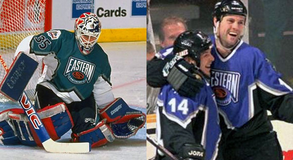
Behold the done of the Gary Bettman era… I mean, you can just tell by the uniforms right? In 1994 the league switched to geographical naming for the conferences replacing Campbell and Wales with Western and Eastern. Conference logos (and thus All-Star Game uniforms) were purple, black, and teal. These uniforms lasted for three games from 1994 through 1997, no game was played in 1995.
Fun fact: the uniforms featured a star template which was later borrowed by the Dallas Stars and was worn as they won the Stanley Cup in 1999.
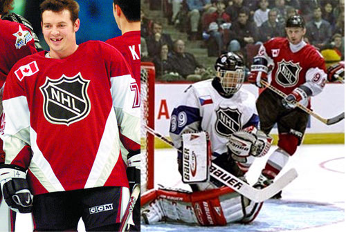
Never one to stick with any one idea for long, the Bettman regime tinkers with the All-Star Game again doing away with the conferences replacing them with teams divided by nationality of player. North America vs the World saw the best American and Canadian players battle the best players from anywhere else (pretty much a Team Europe). The uniforms were burgundy for North America, white for World and featured their national flags on the chest above the (suddenly silver) NHL shield. This look lasted two years, 1998 and 1999.
The North America vs World survives (not for long) but the uniforms get radical, it’s dark vs dark as The World is dressed in red, North America in navy blue, goalies wear white uniforms for some reason (different for the sake of being different?). The design sees a horizontal stripe across the front of the jersey with an NHL shield off to one side. Yeah. Not good. Two years of this and they were tossed away to be forgotten.
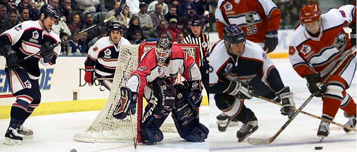
Tinker, tinker, it’s back to East vs West in 2002. The uniforms look more like hockey uniforms but still get a little creative — we see square collars for the first time for one side and lace-up collars on the other; player numbers are featured in a star on the front near the waist. This style is worn in 2002 and 2003.
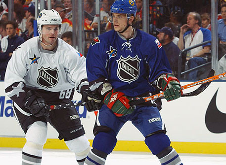
Things get old school in 2004 as heritage white is introduced to the league, the Eastern All-Stars wear the new/old white with red and a diagonal wordmark on the front. The West, similar, but in their main colour of green (in honour of the host Minnesota Wild). This is a one year style and the last design used in the pre-Reebok Edge era.
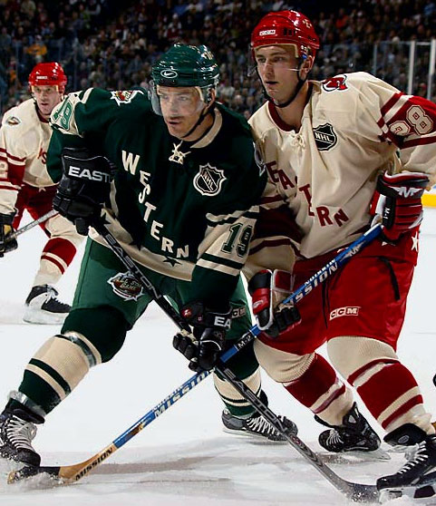
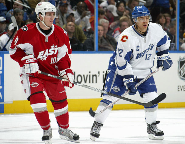
A combination of lockouts and Olympic breaks sees a three year gap between NHL All-Star Games, when we get back at it in 2007 the uniforms are now part of the Reebok Edge uniform system, the latest technologies, light weight, water beads off of it, you know… the stuff that usually makes uniforms look crummy. Players wear the tight fitting uniforms for the first time at the All-Star Game, a test run for what was to come the following season. Conference logos are brought back to the jerseys for the first time in ten years, and the Eastern All-Stars wear white gloves. Bleh. Another one-year-only design… soon to become a trend.
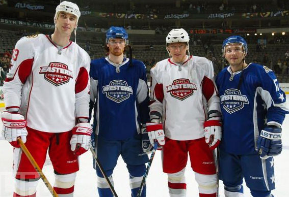
Red vs. Blue continues but conference logos are replaced with generic wordmarks. The design of the uniform is otherwise the same as in 2007. One-year-only, once again.
In 2009 the Montreal Canadiens hosted the game as part of their 100th anniversary and the uniforms paid tribute to that. Dressed in the colours of the Habs, the uniforms featured stars up either sleeve with the years of games hosted previously by the city of Montreal. The logo on the chest was, again, a wordmark, and there was an odd one-sleeve-only stripe. Just can’t resist doing something weird just because. One year only.
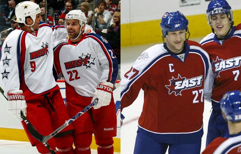
Following another Olympic off year we get some more tinkering as teams are now divided up by two captains who then pick their teams in a road hockey style draft before the game. Whatever. Anyways, because there’s no real teams going on anymore, the NHL returns the league logo to the chest of the jersey with one side in blue, the other white with red. Player numbers are on the front below the collar, and those white gloves are back! This set lasts two years (someone forgot to design the 2012 set in time, probably).
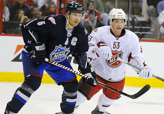
Another combination of lockouts and Olympics sees a gap of three years between games again, in 2015 the All-Star Game returns with the same captains format with an off-the-wall uniform set. Now black vs. white, the trim colours are silver and neon green (why? why? why?!), the crests are flat and metallic looking, team logo and all-star patches are monochromatic. Everybody take one step back… thank you. One year only.

Somebody has a light bulb moment and realizes people might buy more uniforms if they look half-decent, and perhaps more local fans attending the game might think it’s neat to have an NHL jersey in their home colours. Brilliant guys, welcome to the 61st NHL All-Star Game in 2016. Uniforms are black vs. white, NHL shield on the chest with gold highlights in honour of the host Nashville Predators. On the collar, three stars representing the State of Tennessee. The format gets tinkered with again but one that kinda makes some sense, a mini tournament pitting the four divisions against each other in a no-defense three vs three format. Now we’re talkin’!


