
Major League Soccer’s annual kit rollout is continuing on, and this time it’s the Vancouver Whitecaps’ turn to reveal a new look for 2016. It could definitely be argued that their new away kit is probably the most eye-catching look that we’ve seen unveiled so far.

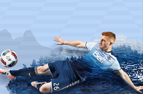
The Whitecaps are referring to this new kit as their “Sea to Sky” kit, and both the name and design pay homage to local scenery in the Vancouver area. If that wasn’t enough of an explanation for you (and I’m sure that it wasn’t), then maybe you’ll enjoy this infographic that the Whitecaps gracefully came up with to explain the many elements of this kit.

Normally, gradients on sports uniforms don’t go over well at all. With that being said, this is a pretty notable exception. The gradient chevron design ties in perfectly with the elements from the team’s crest, and it also does a good job of realizing the whole “Sea to Sky” aesthetic. It’s a really sharp kit, and it’s definitely the most interesting and intriguing MLS shirt to be unveiled so far in 2016.
What do you think? Do you agree that htis is a sharp-looking shirt, or did Adidas and the Whitecaps miss on this one?
Related stories:
 MLS Renews Calls to End Plastic Waste With Return of Parley Kits
  2023 Football Kit Preview: Major League Soccer
  Adidas, Major League Soccer Extend Contract Until 2030
  MLS’s Vancouver Whitecaps Team with Local Artist for National Indigenous History Month Logo
  2022 Football Kit Preview: Major League Soccer
  Hoop, There It Is: Vancouver Whitecaps Flip the Script for New 2022 Away Jersey
  Whitecaps unveil Rain kits and Fire make their new kit official