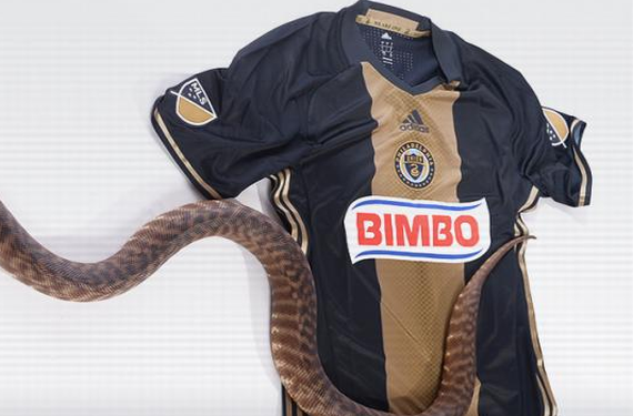
The Philadelphia Union are the latest Major League Soccer team to unveil their new home shirt for the upcoming season, and while it isn’t a drastic change from what they normally wear, it’s still got a very interesting element.
That interesting element is the snakeskin design that’s present on their traditional broad vertical gold stripe on their home jersey. The snake is actually an important part of the Union’s identity, as evidenced by the fact that it’s front-and-center in the team’s crest and secondary logo. So, it’s good to see that they’re actually using a direct reference to the snake on their new home shirt.
It’s nice that they didn’t go overboard with the snakeskin design. It’s a very subtle design, and it doesn’t dominate the entire look or take away from the rest of the shirt. It’s a unique look, but it’s not too crazy, which is what you should be going for when you’re trying to create a modern shirt that still retains a bit of class as well.
Here are further details from the story on the Union’s website:
The new kit takes the snake featured in the Philadelphia Union crest and expands its presence to various aspects of the jersey. The center gold stripe features a snakeskin texture, and the bottom of the jersey features a golden snake jock-tag. On the inside collar, the words “We Are One” are scripted next to a snake, making reference to the Union’s identity.
The jersey also includes a rubber crest, in contrast to the woven crest in previous jerseys. As all 2016 MLS jerseys, the Adidas stripes have been moved to under the arm.
Also, check out CJ Sapong posing with what may or may not be an actual snake in order to model the shirt. There’s absolutely no way I could do this, so props to him for being way more comfortable with the reptiles than I would be.
What do you think of the Union’s new shirt for 2016? More importantly — do you think that the snake is real?


