

It’s been a few days since we talked about Major League Soccer kit releases, so why not take a little bit of time to discuss some of the new kits that have come out? Since we last talked about MLS kits (which included NYCFC’s ripple-effect kits and those zany Columbus Crew kits), a few teams have come out with new looks for 2016, so let’s check them out.

Le Impact have finally done what I’ve wanted them to do for so long: They’ve gone with the blue-and-black vertical stripes look on their shirt! I’ve always felt like they should’ve made this their primary look considering that the particular striping pattern is prominent in their crest. They utilized the look as their third kit for 2013 and 2014, but it hasn’t been seen since then. Now it’s their primary look, and I’m hoping that it stays that way for years to come. I could do without the thin silver stripes in between the blue and black stripes, but this is still, in my opinion, the best possible look for the Impact.

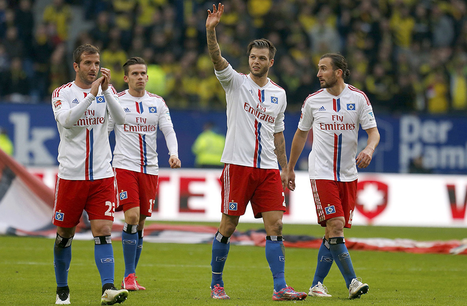
The Major League Soccer team that is most desperately in need of a new logo continues to make up for that particular weakness by coming out with solid kits. After spending the past two seasons playing with a simple-yet-effective home kit, the Revs have spiced things up a bit by adding a red-and-white vertical bar design to the center of their shirt. It reminds me of the Bundesliga’s Hamburg SV and their kits from the 2014-15 season. IN fact, if you moved the Adidas stripes from the sides to the shoulders, and you could say that the Revs are basically using a two-year old template, here. That’s not necessarily a bad thing, since this is still a solid kit design for the Revs. Again, they’ve GOT to fix that logo, soon.

Although Major League Soccer is a league that’s known for going through changes, some things just won’t change, and one of those things is the New York Red Bulls’ kit choices. When they release a kit, you know that three things are going to happen: The Red Bull logo will be front and center, the home uniform will have white shirts and red shorts, and the away uniform will have some combination of navy blue and yellow. NYRB delivered in that regard with their latest away kit, which is actually reminiscent of Arsenal’s away kit from 2014-15. Just invert the colors on the shirt and you’ve got nearly a carbon copy.

Just like their expansion brothers in the Bronx, Orlando City SC have abaondoned their inaugural season away shirt after just one season in favor of a new one. This time, the away kit isn’t just a white version of the home kit. Instead, this one is mostly white with purple sleeves and includes a faux collar and a 3D crest. Personally, I’m not a big fan of the faux collar. If you’re gonna put a collar on a soccer shirt, you may as well go all the way and actually put the collar on there. An actual collar would’ve improved the shirt, but for now, it’s pretty average.
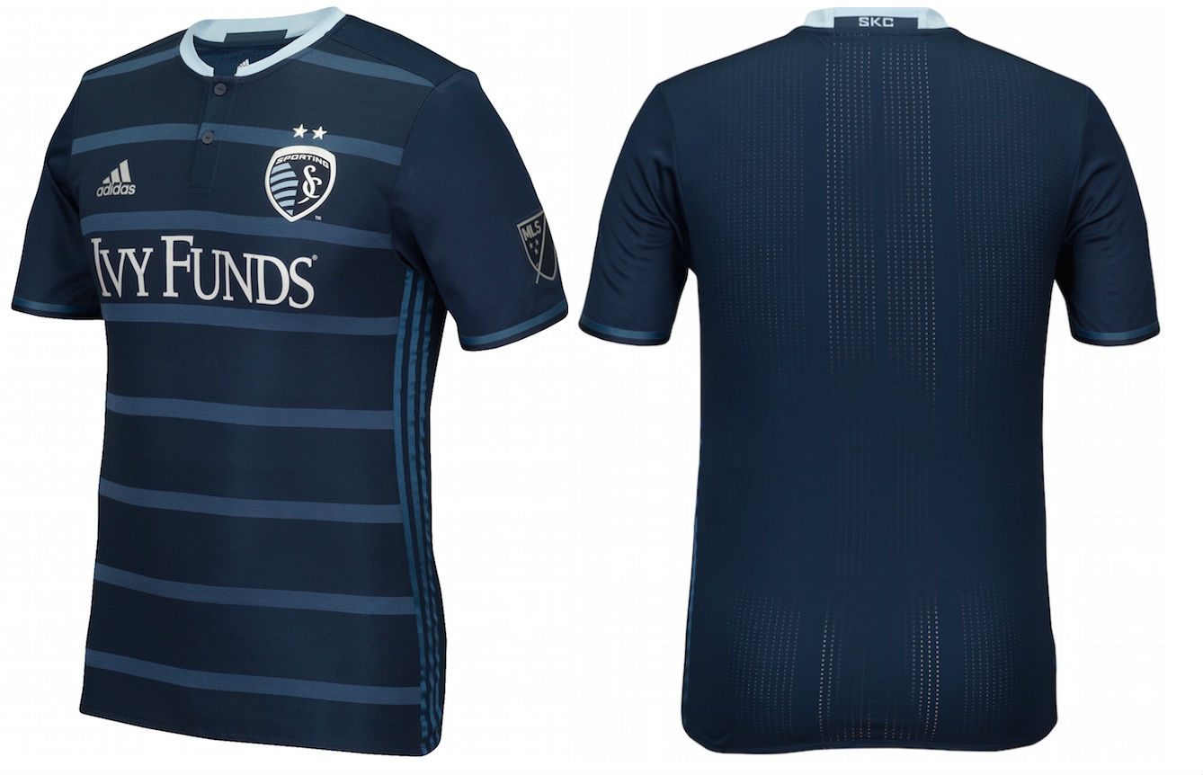
Sporting Kansas City have always tried to be fashion-forward with their kit designs, and their new secondary look is no different. It’s a subtle look, but pretty bold at the same time. Also, they did the best job of utilizing the Adidas stripes on the side, in that they made the Adidas stripes nearly match up in color with the sublimated stripes on the rest of the shirt. As a result, the stripes almost blend into the shirt, which means that you aren’t focusing on the stripes, but you’re focusing on the rest of the shirt design. That’s a good thing, and it helps keep SKC at the top of MLS when it comes to kit designs, in my opinion.
***
Now we’re caught up with the 2016 MLS kit releases. We’ve still got a few more shirts left to be released, but we’re nearing the end of the annual MLS kit rollout. Which one has been your favorite so far?
Related stories:
 MLS Renews Calls to End Plastic Waste With Return of Parley Kits
  2023 Football Kit Preview: Major League Soccer
  Adidas, Major League Soccer Extend Contract Until 2030
  2022 Football Kit Preview: Major League Soccer
  Friday Flurry of Activity Across MLS Sees 11 Teams Unveil Kits Ahead of 2022 Season
  MLS 2021: What’s New in Kits and Logos
  13 More Jerseys Revealed As MLS Jersey Week Ends