The worst kept secret in recent memory is officially here — US Soccer has finally given their new logo an official rollout. For the first time since 1995, US Soccer will have a brand new crest to represent their organization.
I outlined my thoughts on the new logo when the new crest initially leaked, but the gist is this: I’m not enamored with the new logo, but it’s still a pretty big upgrade over what US Soccer had previously, and it’s mostly because of the fact that the new logo fixed one of my biggest pet peeves with the old logo: The new logo actually has 13 red-and-white stripes instead of blue-and-white stripes. It actually looks like the United States flag, now! That’s been a thorn in my side for years, so I’m glad that they fixed it.
For reference, here are the two crests side by side and then a history of US Soccer crests, to boot.

Additionally, US Soccer went with a relatively unique way of officially unveiling the new crest, as they decided to go the route of virtual reality. As you’ll read from the snippet of The New York Times’ article on the matter, it was unique and costly for US Soccer.
Mike Gressle, U.S. Soccer’s director of marketing, said that the organization considered the demographics of its fan base before choosing virtual reality.
“Our fans are pretty early adopters to technology,” Mr. Gressle said. “Given that this is the next new thing, we think they’ll be pretty interested in it.”
The rebranding effort is centered on the crest. Crests are like logos for soccer federations, and they are treated reverentially by soccer enthusiasts. The old mark — which included a flying soccer ball at its center, a rippled top, and six blue stripes below a red field — was ridiculed as dated and cartoonish. The new one is not unveiled until the end of a two-minute virtual reality highlight reel, which was shot by StriVR and contains 360-degree video from the most recent men’s national team game and the women’s World Cup.
Mr. Berhalter said the rebranding and unveiling added up to one of the costliest marketing efforts in the federation’s 102-year history — reaching seven figures and far outpacing a standard news conference unveiling that might cost around $30,000.
“We kept on coming back to the notion that the press conference isn’t really something that drives the fan experience,” he said. “Therefore we’ve moved away from that to something that is more immersive and interacting and experiential for the fan.”
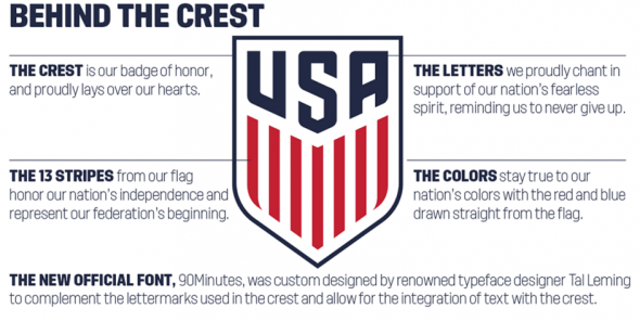
Of course, if any of you have been reading what I’ve been writing lately, then you know that I love a good infographic, and US Soccer delivered in that regard. They go into further detail on their website, but here’s a quick taste of their explanation for the new crest:
Now that the official crest is here, what’s your verdict? Is this an upgrade or a downgrade? Also, aren’t you glad that the leaked shirt we saw earlier is only going to be part of a clash kit? Thank goodness.


