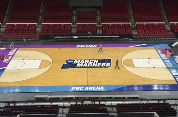
After 8 seasons of sticking with a pretty bland and extremely standardized court design for non-Final Four NCAA Basketball Tournament games, the NCAA has finally decided to go with a new court design for tournament games.
For reference, here’s what the courts for tournament games have looked like (for the most part) since 2007:
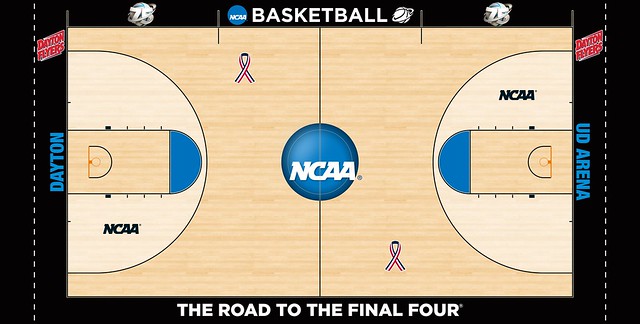
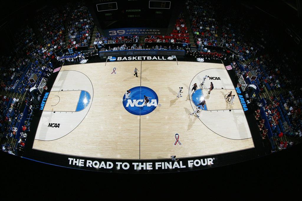
That’s about as generic as generic can get. Now, here’s a look at what the court will look like as Dayton, Ohio hosts the First Four this week:

For the teams who are fortunate enough to make it out of the First Four, they’ll be playing on courts that look very similar to these:


Now granted, I’m still not a fan of having a standardized look for these courts, but isn’t this such a refreshing look? It’s a nice little departure from the bland looks that we’ve gotten since 2007, and the midcourt logos are pretty solid — especially the “March Madness” logo. It’s a bit weird to see them acknowledging the unofficial name of the tournament, but I guess if that’s what everybody refers to it as, then you may as well go with the flow and put it on the court, right?
Either way, I’d say that this design is a lot better than the previous, if only because of the fact that the previous was just so generic and bland that any type of personality injected into the new court would’ve been an upgrade in my eyes. What do you think, though? Do you want the old standardized courts back, or are you fine with the new courts?


