

We’re on the cusp of the 2016 baseball season, which means that we’ll finally be able to see in action the new minor league baseball identities that have been unveiled over the last few months. The 11 affiliated teams that rebranded during the offseason can be broken down into three categories: new teams playing with new names in new cities, existing teams that kept their names but completely overhauled their brands, and teams that simply refreshed or updated their current brands.
New Teams

Columbia Fireflies
The New York Mets’ Single-A affiliate traded one bug for another when the Savannah Sand Gnats left Georgia to become the Columbia Fireflies. The logo, which comes from Sky Design in Atlanta, is meant to evoke pleasant evenings in the South Carolina summer. The Fireflies made headlines when they unveiled glow-in-the-dark caps and uniforms, though all indications are that they’ll play most of their games with the lights on.
We wrote about them here.

Hartford Yard Goats
The Rockies’ Double-A affiliate made the biggest splash of the offseason, not just with a wacky new identity based on the railroad industry (a yard goat is a nickname for a locomotive), but with an engaging and active Twitter account. The team was borne from the ashes of the New Britain Rock Cats, who left town for their new intra-state home after the 2015 season.
The logo, designed by Brandiose, shares a color scheme with Hartford’s beloved and defunct NHL team, the Whalers. While the goat-based imagery gets the most attention, the new identity is highlighted by a fantastic custom font based on the Hartford Railroad’s old logo.
We wrote about them here.
New Logos for Existing Teams

Bowling Green Hot Rods
The Single-A Bowling Green Hot Rods went from red, yellow, and black to a more common set of complements. The new color scheme is blue, from Kentucky, the bluegrass state, and orange, the color that a metal rod literally turns when heated to a certain point. The new identity, created by SME Branding, includes roughly a million alternate logos featuring cars, automotive tools, the state of Kentucky, flames, and baseball equipment.
We wrote about them here.
![]()
Kane County Cougars
The Cougars’ in-house designer Emmet Broderick and Dan Simon of Studio Simon tag-teamed on Kane County’s new look, which features Ozzie the Cougar in a much more fleshed-out form than he had been in the team’s previous logos. The Single-A Cougars have been around for a quarter-century, and this was a much-needed update. The logo features new colors, much more flexibility in terms of alternates, and a more menacing version of Ozzie.
We wrote about them here.

Louisville Bats
The Triple-A Bats, named for their city’s association with a certain manufacturer of baseball equipment, dropped their unique purple identity for a more traditional red and blue affair designed by SME Branding. I try not to get emotionally involved with the logos I write about, but I liked the stylized bat of old, partly because it was designed in house and partly because it was a slick logo. That said, the new look has a certain timeless quality about it, including a typeface that’s a wink and a nod to Louisville’s bourbon industry.
We wrote about them here.
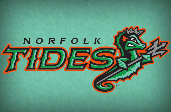
Norfolk Tides
In perhaps the biggest departure of the minor league rebrands this offseason, the Triple-A Tides ditched a conservative blue logo in favor of a look that features a seahorse set in battleship grey, sea foam, tidal green, and Orioles orange. The identity, created by Brandiose, pays homage to the area’s natural habitat, as well as its association with the Navy and the Greek God Poseidon.
We wrote about them here.
Existing Brands Refreshed
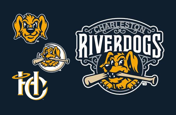
The Charleston RiverDogs modernized Charlie the dog, courtesy of Studio Simon. The new identity includes an update to the primary logo, which dates back to 1994, complete with the wrought iron flair common to the city. A suite of alternates includes a crescent moon, as found in the South Carolina state flag, and an HC, per the city’s nickname, the Holy City.
We wrote about them here.
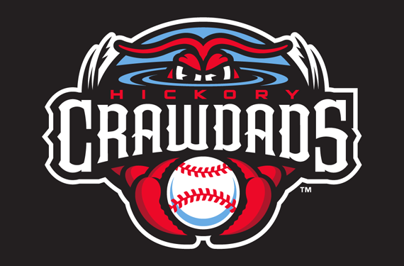
Hickory Crawdads
The Single-A Crawdads updated and expanded on one of Minor League Baseball’s classic identities, which goes back to 1993. With a popular logo and 23 years of branding under their belts, the Crawdads didn’t want an overhaul, but rather a fresh coat of paint. The new look from Studio Simon updates the team’s well-known logo, introducing Carolina blue to the existing red and black scheme, as well as a host of alternate logos, giving the team more flexibility while building on a successful brand.
We wrote about them here.

Great Lakes Loons
The Single-A Loons are another team whose new look is more of a substantial update and upgrade to their old look. Brandiose kept the team’s color scheme and concept intact, while introducing a suite of new alternates—along with a narrative based on summertime in Michigan. Of particular note with the new identity is the seasonal alternates, which feature the loon itself in a winter cap and a summer fishing hat.
We wrote about them here.

Ogden Raptors
The rookie-level Ogden Raptors turned to New Era to refresh their Oggie the utahraptor logo. The team was introduced shortly after the first Jurassic Park movie came out, so it seems appropriate that they’d update their logo a couple decades later with the series being rebooted. The new Oggie is streamlined and on the move, and a new alternate features a claw reaching through the letter O.
We wrote about them here.

Syracuse Chiefs
The Triple-A Chiefs changed their color scheme from the blue-black of the 2004-2011 Toronto Blue Jays to the red, white, and blue of their current parent club, the Washington Nationals. The new look from Brandiose raised some eyebrows because it reprises a logo that the team used in the 1980s, a silhouette of a Native American in a headdress. The Chiefs tried to head controversy off at the pass by emphasizing the respectful nature of the imagery and their strong relationship with the local Onondaga tribe, but it was still something of a surprise to see a modern-day team introduce a logo featuring Native American imagery.
We wrote about them here.
Related stories:
 MiLB announces record sales, top 25 teams in merchandise
  The Evolution of Dinosaurs in Utah: The Story Behind the Ogden Raptors
  Norfolk Tides make a splash with new logo
  Norfolk Tides Wearing SpongeBob Jerseys August 7th
  Hartford Yard Goats Unveil Logos, Colour Scheme
  Chiefs Honour 100 Years With Multi-Logo Patch