For years now we’ve been having readers of this site rate every logo on our website, there’s over 30,000 graphics on here so needless to say, we’ve gotten a lot of votes from you guys over that time!
Each December we show off the new logos from that past year that had been rated the highest, what we’ve never done however is shown off the rankings from an entire league… Well, we’re going to do that right now!
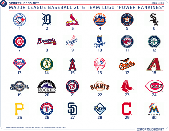
In celebration of Major League Baseball’s rapidly approaching Opening Day we’re going to show how you guys have rated the current primary logos in use by the 30 MLB teams for the 2016 season and how they end up ranked from those ratings.
Each logo was rated on a scale of 1 to 10, there is no 0 rating (“phew” – Marlins fans). Only one vote was allowed per person and once that vote was made it could not be changed. Votes have been accumulated since some time in the past decade.
Starting from the bottom…
RANKED 26TH THROUGH 30TH

30. MIAMI MARLINS (3.78 out of 10) – The logo it replaced, the teal and silver Florida Marlins logo scores a 7.2 rating which would have placed it third in all of Major League Baseball. Whoops.
29. CLEVELAND INDIANS (3.82) – Another drop from their previous logo (Chief Wahoo scores a 7), but in the Indians defence the switch from Wahoo to the “C” as the official primary mark was reportedly all on MLB.
28. TAMPA BAY RAYS (5.28) – A shuffle to the side, the Devil Rays mark this replaced from the mid-00s wasn’t too much of anything to get excited about either. That old mark scored a 5.6, still in the bottom third of the league.
27. SAN DIEGO PADRES (5.31) – These guys seem set on trying anything but going back to the brown and gold full-time. The switch to just the SD mark drops them just two spots vs. where their previous logo would rank (the Swingin’ Friar from 1969, however, would be in the Top 10)
26. TEXAS RANGERS (5.52) – Par for the course for the Rangers, throughout their entire history not a single primary logo of theirs would place in the top 20 in 2016.
RANKED 21ST THROUGH 25TH
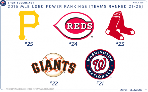
25. PITTSBURGH PIRATES (5.78) – It’s the trend these days to switch to your cap logo as your primary mark, I thought it’d be a more drastic drop but Pittsburgh’s decision to demote their pirate logo to merely alternate status cost them just two spots in the rankings.
24. CINCINNATI REDS (5.89) – Apparently many of you are fine with adding “black for black’s sake” in some instances, here the Reds addition of black to their old red and white logo bumps them from 28th to 24th in the league.
23. BOSTON RED SOX (6.01) – Boston stripped the circle and baseball from their logo of many years, simplifying it down to just a pair of red socks (or sox, as they’d spell it 110 years ago). While I personally prefer that change, most of you didn’t; the old look would’ve placed them 10 spots higher in this list.
22. SAN FRANCISCO GIANTS (6.05) – Even years only work in the Giants favour for meaningless things like World Series championships, they place 22nd overall where it counts.
21. WASHINGTON NATIONALS (6.09) – The Nats previous “uh guys, we gotta develop an entire new identity in like a month” look was never popular with fans (but for a rush job it wasn’t bad). The current mark, which simply places their classic curly W logo in a circle bumped them up a full point and 8 spots in the rankings.
RANKED 16TH THROUGH 20TH

20. COLORADO ROCKIES (6.10) – Unchanged since their first game, the Colorado Rockies are the only team in the league to have only used one logo throughout their entire history (aside from a logo tweak prior to playing their first season). They’re in a bit of a rough spot here, logos start to look stale after 20-25 years and teams can get itchy trigger fingers, the key is to stick with it just long enough to have it suddenly become “iconic” and untouchable. Maybe another 10 years.
19. MILWAUKEE BREWERS (6.14) – The Brewers are a team trying to balance two different eras of team history, while the primary mark in use since 2000 is still used most often the “Ball in glove” logo of the 1980s has just been added to a second cap and jersey in their uniform rotation. For what it’s worth, that retro logo would have been ranked 5th overall if it were the primary logo today.
18. ARIZONA DIAMONDBACKS (6.16) – Yeah, the new uniforms are nutty, but the logo is still a solid use of negative space. If this were a long-ago relocated hockey team it’d be scoring two full points higher! The switch from purple and teal to Sedona and black hasn’t hurt them too much, their inaugural season logo would only be in 16th place today.
17. BALTIMORE ORIOLES (6.17) – Not sure why the team is sticking with this version of the bird as their official primary logo, the old-school cartoon bird is everywhere. For whatever it’s worth, the readers have rated the modern 70s bird much higher, it would have been 5th in these rankings if it were the primary.
16. NEW YORK YANKEES (6.33) – This surprises me. Could be a case of a lot of Yankee haters voting it lower than it should be or I’m letting myself be hypnotized by a two dozen (plus three) World Championships. The Yanks have used a version of this logo since 1948, the one we see today has not been touched since 1968 making it the oldest logo continuously in use in the league by eleven years (second oldest – Cubs since 1979).
RANKED 11TH THROUGH 15TH
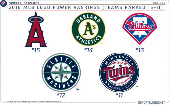
15. LOS ANGELES ANGELS OF ANAHEIM (6.37) – A logo which I think will stand the test of time, originally unveiled with a blue baseball field in the background it was simplified to just the A with a halo when the team was re-named in 2005. The new version is much more popular with fans; despite being the logo they used during their only World Series, the original 2002 mark scored only a 5.3 while somehow the Disney-era Angels logo is in the same ballpark at 5.0.
14. OAKLAND ATHLETICS (6.39) – Why so high? Right? I’m not sure, I’ve never been too in love with this logo. The A’s modernized their logo in 1993 by adding a thicker green outline to their circle and incorporating their team name within this new border. Of the two, this looks better, but I don’t see how this logo is any better than the Nationals or Rangers which both ranked much lower.
13. PHILADELPHIA PHILLIES (6.40) – I feel like this is a logo which is starting to feel a little dated, it was unveiled around the same time as the Rockies, A’s, and Mariners marks before the 1993 season. It’s a vast improvement on anything the Phils have used in the last half century, besting their previous logo by half a point (and 15 spots in the rankings).
12. SEATTLE MARINERS (6.47) – The retro movement is trying to push this one out in favour of the 1980s royal blue and yellow, but the Mariners have to remain strong and stick with this logo. Now that the Marlins are doing whatever they’re doing, Seattle is the only team to really embrace the teal (Arizona’s slowly starting to bring it back too). Regardless of which colour scheme you like for the team, this logo is far superior to what they used before and the voters agreed, the old logo scored only a 4.9.
11. MINNESOTA TWINS (6.50) – A simple but very necessary update of the logo they used during the World Series years, although a tad predictable in that it was silver and a roundel both added to make it look a little more 21st century. The current Twins logo is the highest rated in their team history, placing well ahead of both the older version of the logo and the two “Win-Twins” logos from the 60s and 70s.
RANKED 6TH THROUGH 10TH

10. KANSAS CITY ROYALS (6.51) – The defending champs sneak into the top ten logos of the league just barely beating out their division foes from Minnesota. Kansas City has used the same basic construct of their logo since they entered the league in 1969, a crown on top of a homeplate with the team initials on it. The current version, adopted in 2002, put the focus on “KC” with the cap insignia front and centre (before it was small in the corner, an “R” was the star) and a black drop shadow was added. Good for nearly two additional ratings points and a surge in the rankings from 28th to 10.
9. LOS ANGELES DODGERS (6.54) – The Dodgers, like the Royals, have used the same basic logo for several decades but Los Angeles’ changes have been far more subtle. Their latest, a cleaning up of the script and bolder baseball lines, was used and went unnoticed for 6 months before we finally pointed it out in September of that season. Those tiny changes were still good for a slight bump in ratings, the old mark scored a 5.8.
8. ATLANTA BRAVES (6.60) – They’re stickin’ with the tomahawk. A compromise, I suppose, for dropping their controversial “Screaming” (or laughing, depends who you ask) Native American head logo in 1990. Regardless of what side you’re on, the logo switch happened just in time for the teams transition from perennial last place loser to something like ridiculous-teen straight division championships. Oh, and one World Series.
7. CHICAGO CUBS (6.61) – Another logo which has evolved slightly over time, this logo can be traced all the way back to 1937 and has been thickened and roundeled a few times before it’s current state was finalized in 1979. Seventh in the league ain’t anything to be disappointed about, however I think with who placed one spot above them…
6. CHICAGO WHITE SOX (6.85) – The South Siders take the logo battle of the Windy City in 2016. It’ll give ’em something to boast about to the Cubbies for a few months this year, might as well get them last shots in before October. The White Sox have used this all black version of an old 1960s logo for 25 years now, but, as I said earlier with the Rockies, around 25 years and teams get that itch, hopefully the increased usage of the 1980s “Batterman” logo we’ve seen a lot of lately isn’t an indicator of things to come.
THE TOP FIVE

5. HOUSTON ASTROS (6.90) – There’s an awful lot of 2015 playoff teams in this top five, could be a coincidence, could be that fans love whatever the team wears as long as they win. Houston’s newish logo, a roundeled and bevelled version of their 1965-1993 cap logo, was introduced just as the club made the switch to the American League in 2013. How does this modern-retro combo compare to their old black and brick theme? No contest, the old mark scored a 5.1. Retro wins almost every time in this industry.
4. NEW YORK METS (7.07) – This is a suspicious ranking, not on the surface as the logo itself is solid and has certainly lasted through the years (like a few others, only slight modifications over the past 50+ years). Where things get fishy is when you compare its score to the logo it replaced, a small “NY” insignia was removed from the skyline in 1999, certainly not enough to bump this logo up from a 5.3 (and third last in the league) to a 7.1 (and fourth best). Sometimes you just scratch your head and wonder why, or you can owe it to perhaps a massive bump due to their run to the World Series last fall.
3. ST LOUIS CARDINALS (7.11) – Going into this I would have guessed the Cardinals would’ve taken top spot on the list, third place isn’t anything to be ashamed of. There’s really nothing negative to say about the Cards identity, they’re doing it all and they’re doing it right, if I had to ask for anything it’d be to see the blue cap with the cream alternates just once, I think that’d look pretty smart. This logo was introduced just in time for Mark McGwire’s big year in 1998, the logo it replaced (which had been in use for 30 years) scored a lower but respectable score of 6.3.
2. DETROIT TIGERS (7.45) – This one is high, there’s a good reason for it. It’s new. Not new new, but “new”. The Tigers made this logo, which has been worn on their cap on-and-off since nineteen-aught-five for heaven’s sake, was promoted to primary logo status for the 2016 season replacing the version which is still worn on their home jersey. So again, why so high? Being new means it’s had far fewer votes than any other logo on this list which generally skewers a result to an extreme in either direction, the Tigers skewer high because it is a good logo afterall, but I get the feeling this one will drop when we look at this list again in 2017.
1. TORONTO BLUE JAYS (8.96) – I stress that I have nothing to do with these results, so save your angry “biased!” comments. Yes, my team took top spot in the league and it wasn’t even close. Factors in such a high score? The overall jump in quality of the logos, the colour schemes, the entire identity of the team, a club which after years of ignoring the cries of the fans finally gave in and gave them exactly what they asked for. Blue. Lots of blue. And something that looked like what they wore when they were a good team. While this logo blows everyone away with nearly a 9 out of 10 (no one else even hit 7.5), their previous logo was a horrid 4.5. In case you were wondering, the original logo this one is based on scores a 7.6 which would have also topped this list.
Fun note: The logo which finished first was unveiled just one week after the logo which finished last. November 11-18 of 2011 was a roller coaster of a logo weekend, my friends!
A graphic overview of the entire rankings heading into 2016:
I’m sure you disagree with at least some of this, but while you’re sitting there getting angry about whatever it is that ticked you off, remember this… baseball’s back. Happy? (Braves fans are exempt from answering this question).
Go Baseball! Huzzah!

