

Back in 2012, Rutgers University gave their athletic program a new look. The Scarlet Knights abandoned their regular classic look of red-white-and-black in favor of red-silver-and-black, and this included silver helmets for the football team that were supposed to look similar to a medieval knight’s armor. This happened near the beginning of college football’s love affair with alternate uniforms and different combos, and it was proof that even a school like Rutgers was willing to spice up their look on the field.
However, the look was unpopular with fans, and it seemed as if fans were counting the days until another update to the school’s athletic look. With the hire of new football coach Chris Ash, the rumors of new uniforms got louder and louder, and those rumors turned to fact when Rutgers officially unveiled their new uniforms.
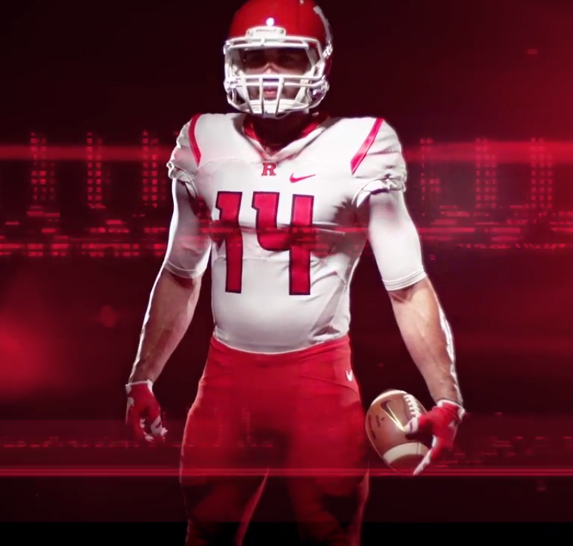
The new football uniforms appear to be a bit of a merger between the Pro Combat-inspired uniforms from 2012 and the classic uniforms that preceded it, which means that they’ve managed to reach a happy medium when it comes to the design.


The only knight-inspired design on the uniforms comes in the form of a sublimated chainmail pattern on the football uniforms, which you can see in pretty good detail below:

As far as combos are concerned, they’re going to keep things pretty simple: The traditional red helmet with a white “R,” a white helmet with a red “R,” and the head coach also mentioned that there will be a black uniform on the way as well, though there’s no word on whether or not there will be black helmets and pants to go with it.

Also, the team unveiled a new alternate logo, which is basically a Scarlet Knight’s head.

Once again, the new look is a nice fusion of their previous looks, and Rutgers fans should be pretty satisfied with the new look. They should have absolutely no problem deciphering the numbers on these uniforms, which should be a relief for fans and family of the players.
Meanwhile, there was this interesting note from Coach Ash concerning the previous uniforms. One of the reasons that many football programs have stated for going to wild new uniforms is that it’s for recruiting purposes. At least in the case of Rutgers, that didn’t appear to work out so much for them with the previous uniforms:
The old uniforms were supposedly a selling point for recruits, but that hasn’t been Ash’s experience.
“Not one recruit has ever asked me about the uniform,” Ash said. “When they come on campus, just like they do everywhere, they want to put it on and they want to take pictures with it. But nobody has ever said anything to me about it. Except a lot of fans have.”
Hopefully this means that college football teams and suppliers like Nike, Adidas, Under Armour, and others will start going back to making designs that are solid (such as this one), instead of going with crazy looks for recruiting purposes when, as it turns out in the case of Rutgers, crazy uniforms didn’t really help recruiting that much.
So overall, what do you all make of the new look for Rutgers? It’s an upgrade, right?
Related stories:
 FIU Panthers Unveil “Miami Vice” Alternate Uniforms
  ReliaQuest Named New Title Sponsor Of Former Outback Bowl
  Oregon State Set to Unveil New Football Uniforms
  Duke Blue Devils commemorate 1942 Rose Bowl appearance with Battleship Grey helmet
  Notre Dame declares themselves the “Green Monster” with 2015 Shamrock Series uniform
  Florida State Seminoles Will Wear Black “Unconquered” Uniforms This Weekend