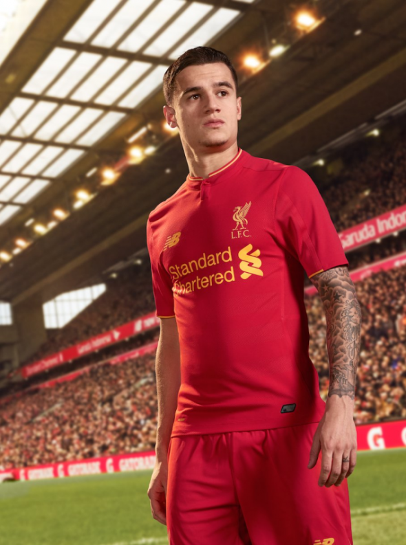
It’s time to talk about a big European team’s new kits for next season, and for once, we aren’t dealing with a leak here — we’re actually talking about an official unveiling! Europa League finalists Liverpool FC have officially unveiled their kits for next season, and as usual, the home kit is an example of classic simplicity.
Probably the biggest change is the fact that the “Liverbird” crest has returned to gold after being white on the 2015-16 kit. It’s a return to form since they’ve normally gone with a gold bird on their shirt ever since they left Adidas and stopped wearing the Hillsborough memorial crest on their shirts and reverted back to the bird.
As usual though, there is still a tribute to the Hillsborough 96 on the shirt, and it comes on the back collar of the shirt.
The other big change is the fact that there are sublimated hoops on the shirt, though I’m pretty sure that it would take a pretty sharp eye to notice them on the pitch. Also, there’s a button-up collar, which the club haven’t had on their home shirts since their initial move to Warrior Sports/New Balance back in 2012-13.
Overall, it’s about as classy as you’d expect a kit would be for a classic club like Liverpool. The fans would probably go crazy if Liverpool ever decided to go with a wild design for their home kit, so New Balance honors those wishes by coming up with something classy for the Reds. The main question is whether or not we’ll see something wild for their away kits, and we’ve seen Warrior/New Balance come up with some whoppers over the years.
What do you all think about these new kits?


