
Another NBA team has bought a D-League team of their own, as the Phoenix Suns have taken control of the Bakersfield Jam, relocated them to Prescott, Arizona, and re-named them the Northern Arizona Suns. As such, that obviously means that it’s time for a new identity, and like many other newly-revamped D-League teams, this identity looks a lot like what the parent club’s identity looks like.


The uniforms are very simple and in the vein of what the Salt Lake City Stars unveiled recently. The logo itself is extremely simple: Just a basketball centered in a sunburst, with a triangle arrow pointing North, meant to represent the team’s new location in Arizona.
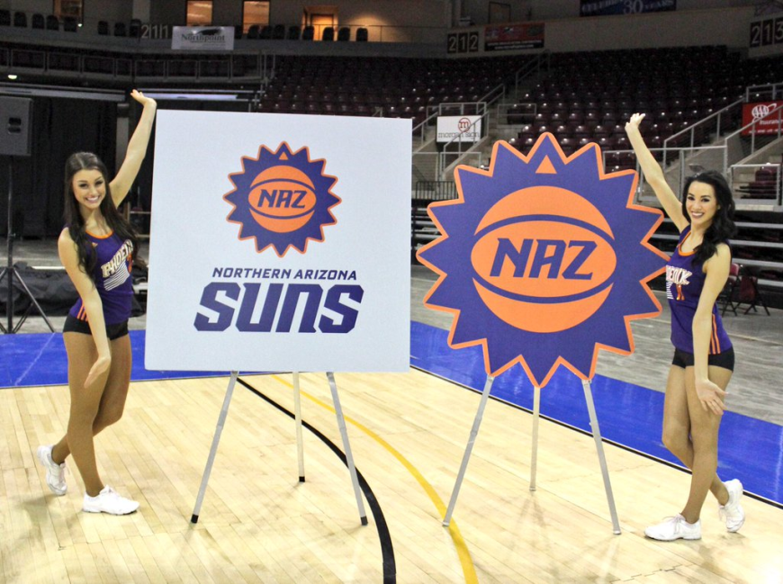

The logo itself appears to be an effort to pay tribute to the parent club’s retro secondary logo, and according to the report from above, the 16 sun rays are supposed to represent the team’s founding in 2016.

Here’s a look at the uniforms on actual people, with the obvious wrinkle being white numbers on white jerseys. That is always a strange choice for teams to make, but I suppose that the NAZ Suns didn’t want to look like a complete carbon copy of their parent club.

So, what do you think of the NAZ Suns look? Is it took simple for you? Is it just right? Do you think they should’ve taken more chances instead of doing what plenty of other D-League teams have done with their new identity revamps? Let us know what you think about it.
Related stories:
 Uniform Matchups Set for 2021 NBA Finals Between Bucks and Suns
  Agua Caliente Clippers of Ontario unveil logo set
  Atlanta Hawks will have local NBA D-League team
  Idaho Stampede will become Salt Lake City Stars; Unveil logo and uniforms
  As Rated By You: The Worst New Logos of 2015
  2015 Logo of the Year Awards: The Best New Sports Logos of the Year
  Two D-League Teams Introduce Ad Laden Jerseys, Courts

