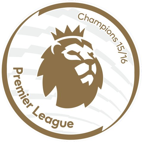
The Premier League will have a new look next season, and it won’t just be due to the fact that everything is already topsy-turvy with Leicester City, of all clubs, going into that season as the defending Premier League champions. Earlier this year, we shared the news that the Premier League would have a new brand identity going into next season, and now we know what the league patch will look like.
So as it turns out, the purple logo wasn’t a placeholder color — that’s the color that they’ll be using for the 2016-17 season, at least. They did roll out the new Premier League logo in a bevy of different colors, so there very well could be a different colored patch by this time next season.
Either way, here’s a side-by-side comparison of the new logo and what is now the old Premier League logo:
Also, as tradition merits, there is a gold-colored patch for the defending champions, and this will be the patch that Leicester (!!!) will be wearing on their sleeves next season:
And here’s the side-to-side comparison with the old Champions’ patch:
Personally, I don’t hate the new logo, but I’ve got to say that it’s a bit of a downgrade over the old patch. I’d imagine that we’ll all just get used to the new look as time wears on.
What do you all think? Do you agree that this is a bit of a downgrade, or am I wrong here? Let us know what you think!


