
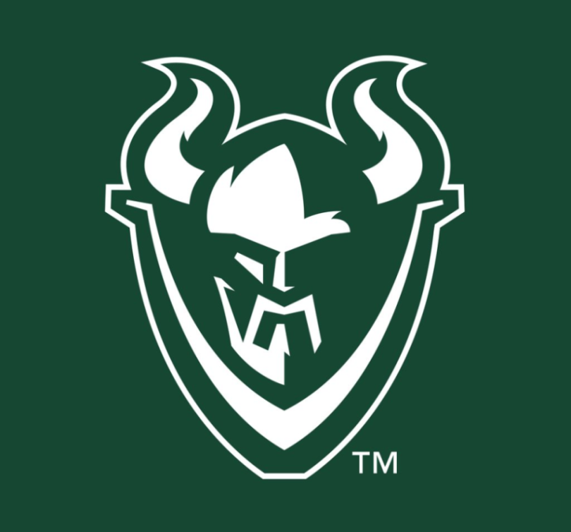
Ever since the late 1990s, the Portland State Vikings have used this logo to represent their athletic program. If we’re being honest, it brought back memories of the old “Buffaslug” logo that the Buffalo Sabres used, and that’s not particularly a good memory to have.

However, that logo has officially been put to rest, and in its place is a new, fresher set of logos that will probably do a better job of standing the test of time.


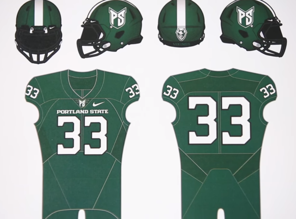
As part of the grand unveiling, Portland State and Nike teamed up to make a video detailing the process behind coming up with the ideas for Portland State’s new athletic identity. The video is fascinating and definitely worth a watch, if only for informative gems like what you see below.

Additionally, we get a look at what the school’s various athletic teams will look like with new, revamped uniforms.

The football helmets in particular are pretty cool, as they look like traditional helmets from the front, but make use of the secondary logo on the back of the helmet in a pretty unique way.


Overall, I’d say that this is a pretty massive upgrade for the Vikings, and again, it should age much more gracefully than its predecessor did. What do you all think, though? Do you agree that it’s an upgrade? Is anybody going to miss the slug?
Related stories:
 ReliaQuest Named New Title Sponsor Of Former Outback Bowl
  Sam Houston State Bearkats Unveil New Uniforms
  Perspecta Named New Title Sponsor Of The Military Bowl
  Oregon, Oregon State Rivalry Will No Longer Reference Civil War
  Kansas State Wildcats Unveil New Lavender Throwback Uniforms
  Tar Heels Get Consistent and Modernize Logos. Argyle for All!
  Rutgers New Uniforms With Distressing – PICS Logo Links Mar 16, 2012: NCAA and High School Unis, New name for NHL arena

