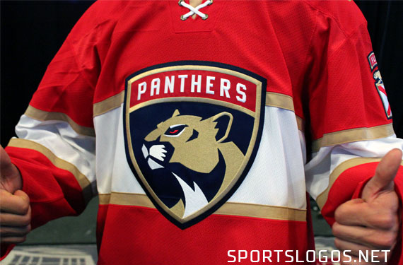
The Florida Panthers today took a step toward the future, unveiling the first major logo and uniform overhaul in the franchise’s 23-year history.
A military-style badge, a nod in honour toward the 101st Airborne, replaces the long standing leaping Florida panther as the main focal point of the set, it becomes the new team primary mark and appears on the chest of both home and road jerseys.

“The idea was to create a uniform that represents the core values of a winning organization, a winning team”, Panthers owner Vincent Viola told SportsLogos.Net. “From my perspective there’s no organization in our society that has more victories to its credit than the United States Army. That’s what a winning hockey team looks and feels like.”

The military theme didn’t stop on the new primary crest, while the sleeve patch (not shoulder) features a modified State of Florida motif with a tab above reading “FLORIDA” or “PANTHERS” (depending on home or away), it also includes a “Captains Tab” above if the player is the team captain or an alternate captain. Viola also hinted that the team may play without the team name tab during pre-season, the player only getting that team tab once they make the club.
“The Panther tabs above the flag are basically earned by the players”, Viola told Panthers.com. “The idea is that they’ll come to training camp and they’ll only have the flag on their shoulder. Once they make the team, they earn that tab. And, of course, the captain’s tab sites above the panther. It speaks to the idea of earning a place. It heralds you making the team.”

Now, Florida’s classic leaping panther logo (which was actually a pretty important logo in my earlier logo days) isn’t quite dead, it’ll be back on the player helmets but it’s appearance will be a little different. The logo has been modernized, simplified, and re-coloured to match the new set.

“We treated it like a responsibility to take the franchise in a new direction while being respectful of the past”, said John Viola who was both heavily involved in the re-design as well as being a self-proclaimed uniform nerd. “Tradition and simplicity, there’s a fine line between the two. You can’t manufacture tradition but you can emphasize simplicity”

Both the home and road uniform features a horizontal stripe across the jersey, while similar to the Montreal Canadiens it was actually an idea that started off as a cross in reference to the state flag but quickly transformed into the simple stripe.

“I think it’s good, it’s trending with society these days.”, Panthers defenseman Steven Kampfer said. “It’s kind of a flashy jersey that you’re going to see it, you’re going to recognize it, and it’s what we wanted to go with. It’s something that will catch your eye when you see it and do a double take. It’s exciting to wear it.”
At the collar, two laces, forming an “X”. On the road whites the “X” is in red, again, another nod to the Florida state flag.
There will not be an alternate jersey for the upcoming 2016-17 season, reports among media row suggested the team could add an additional uniform in 2017-18 which would be Adidas’ first year outfitting the league.


More to come… maybe tomorrow.
—
Full disclosure, the Florida Panthers did cover the expenses of my trip to Sunrise to attend this event.


