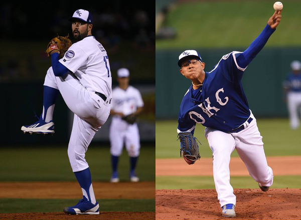
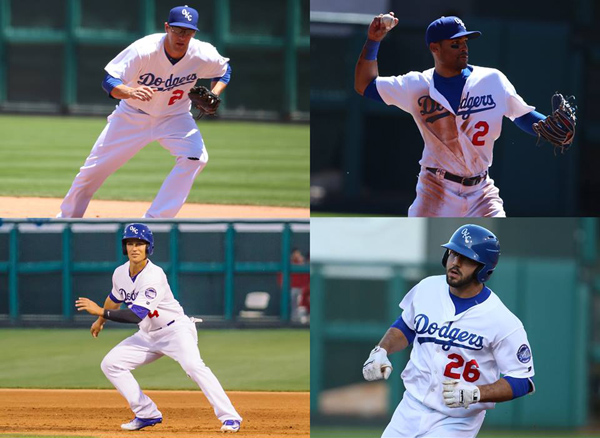
There are few trends in sports more pronounced than minor league baseball teams abandoning their parent club’s brand in favor of a unique nickname appropriate to the local community. So shortly after the 2014 season, when the Oklahoma City RedHawks announced that they would take on the name of their new parent club (just weeks after we featured them in this series), it came as something of a surprise.
“At first, I think, all people heard was ‘Oklahoma City Dodgers,’” said Alex Freedman, the team’s director of media and broadcasting. “It’s like, where’s our local identity now?”
There were several reasons that Oklahoma City bucked the trend of the unique minor league nickname. First, the Los Angeles Dodgers had just purchased 50 percent of the team, and they wanted their Triple-A team to match their Major League brand. It wasn’t clear at first that the team would be called the Dodgers, but they sure weren’t going to take to the field wearing red.
“Their thought was not as much that a team they owned had a different name than the Dodgers,” Freedman said, “but that a team they owned had a different name that had a color in it that was not blue. We’ve learned how sacred Dodger blue is, how it’s its own Pantone color, 294C.” (As a graphic designer and frequent user of the Pantone Matching System, one of my favorite quirks of LA Dodgers fans is that there’s a traveling fan club named Pantone 294. They have shirts and everything.)
Another reason that the team went with the Dodgers moniker is that it’s a classic brand. If a minor league team can benefit from being associated with one of baseball’s iconic identities, then why not? In fact, one of the other rare instances of a minor league team ditching a unique name in favor of its parent club’s identity also happened before the 2015 season, when the South Bend Silver Hawks became the South Bend Cubs.
“This is not a Southwest Michigan Devil Rays we’re talking about,” Freedman said. (Note: The Southwest Michigan Devil Rays were actually a thing! They played in 2005 and 2006, and are now the Great Lakes Loons.)
Of course, minor league teams taking on their parent club’s name only works in certain situations. “I don’t think the Albuquerque Rockies would work the way that the Albuquerque Isotopes do,” Freedman said. “It depends on who the parent club is, and ownership comes into it as well.”
 As with all new identities in the minors, the announcement of the Oklahoma City Dodgers was not immediately embraced. But in this instance, it left fans longing not for the most recent name, but one the team had from 1962 to 1997.
“When we first made the announcement, there was a little bit of pushback,” Freedman said, “but it wasn’t as much the fact that we were getting rid of the RedHawks name. I think people were still thinking, well how can you change the name and not go back to 89ers?”
Of course, the process of changing a team’s name is never simple, and Freedman had some concerns about the early part of the process.
“At first, some of the names we talked about, I didn’t like at all,” he said. “I didn’t think we really had any good idea, and I was afraid that eventually we were going to force a name on us just for the sake of the name change and a color scheme change.”
Even when the idea of using the parent club’s name came up, it wasn’t immediately embraced in internal discussions—but it was the Dodgers themselves who hesitated. “It’s not a name they just let anyone use,” Freedman said. But as everyone involved in the discussion got their head around the idea, there was consensus. “One day, we just kind of went, you know what, the Dodgers are making a significant investment here. If they want to plant their flag here in Oklahoma City, what better way than to adopt the Dodgers name?”
It’s one thing to choose a name, but quite another to see the actual brand in place. “I was a little skeptical as to how it would go,” Freedman said. “Like the public, once I saw the logos and marks, hats, jerseys, I felt a lot better about it.”
The logos—and there are lots of them—were designed by the LA Dodgers’ director of graphic design Ross Yoshida.
Determining the most popular of the lot depends on where you are. If you’re in Oklahoma, the road cap’s interlocking OKLA (which at first seems to be two logos mashed together, then the more you look at it, turns out to be very clever) carries the day, according to Freedman. If you’re a fan of the big league club, the script D on the home batting practice cap fits the bill.

 In fact, that particular logo was so well received, the big league club adopted it for their spring training caps this year (pictured above).
“If we don’t have the success with that hat,” Freedman said, “I don’t think the Dodgers are wearing it as their spring training hat this coming year.”
One thing is for certain, and that’s that the rebrand has been a rousing success. Every day, Triple-A baseball players in Oklahoma City take to the field in uniforms befitting the lofty professional status they’ve achieved (it might not be the Majors, but reaching the highest level of the minors is a serious accomplishment). Not only that, but merchandise sales are way up.
“I’ve seen people in our first year as the Dodgers out in the community wearing OKC Dodgers stuff more than I saw in my first four years here in Oklahoma City when we were the RedHawks combined,” Freedman said)
Of course, this series is called the Story Behind the Nickname, so I had to ask if Oklahoma City had any connection to the original inspiration for the name, the preponderance of trolleys in Brooklyn that made Manhattanites disdainfully refer to the borough’s residents as “trolley dodgers” in the late 1800s.
“There has been a streetcar that’s been bandied about for a while,” Freedman said. “It has yet to get underway, but they keep saying, oh it’s going to come.”
Until that happens (projected to debut in 2017, according to Wikipedia!), the sole inspiration for the Oklahoma City Dodgers’ name is the classic brand that their parent club wears. And this instance might just be one of the rare occasions when that really works.


