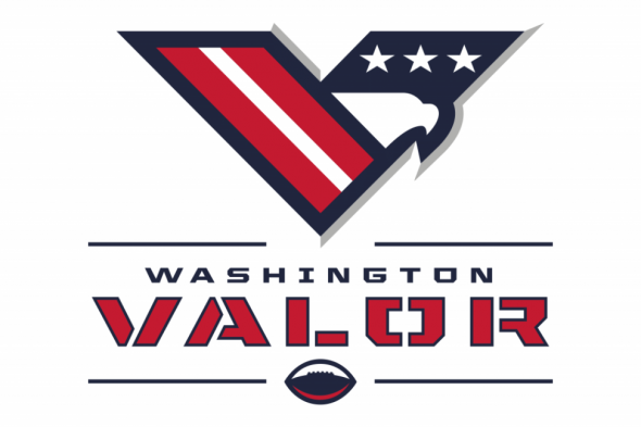
The Arena Football League is still kicking, and they’ll have a new franchise in Washington D.C. in time for the 2017 season. The expansion team was officially announced during this past Spring, and now that we’re in the summer, the newest AFL team has unveiled their name, logos, and colors. Say hello to the Washington Valor, everyone!
The Washington Post covered the unveiling, which included the organization giving overly detailed explanations behind the meaning of the colors (besides the fact that a team in the capital of the United States is almost required to have a patriotic color scheme) and also explaining who helped work on the identity.
Valor managing partner Roger Mody outlined what each color means to AFL’s newest franchise. The blue “represents strength, trust and fortitude,” red “represents our fire, passion and courage,” white “represents the purity and completeness of our organization,” and silver “illuminates our vision as a way forward.”
The team partnered with Rodney Richardson of RARE Design to create the Valor insignia after going through a list of about 100 possible team names. Richardson previously worked with the Washington Wizards on advertising campaigns and created the new logos and uniforms for the NBA’s Sacramento Kings, New Orleans Pelicans, Charlotte Hornets and Atlanta Hawks.
Zach Leonsis, Monumental Sports Network’s vice president and general manager, believes the logos “are all really in line with our expectations. It’s fitting for the brand. It’s fitting as a military salute. It’s fitting for football.”
For Mody, Valor was a clear winner for a team name.
“Ultimately and unanimously … Valor became the obvious choice for our AFL team,” Mody said. “To a man and a woman, everybody loved the name.”
Again, the color scheme fits right in with the rest of the teams in Washington D.C. (with the obvious exception being the local NFL team), and the name also fits with an identity that’s going for an obvious nod to patriotism. The uniforms will be coming later this Summer, and here’s hoping that the uniforms can live up to the standards of the logos. This is a very good-looking identity, and if the uniforms are up to par then this will be one of the better-looking identities in the AFL next season.
What do you all think? Do you agree that this is a solid identity, or should Washington have come up with something different here?


