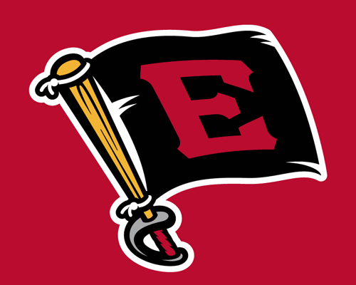
 The Double-A Erie SeaWolves have all the qualities you’d expect from a loyal affiliate of the Pittsburgh Pirates. They play just under two hours north of the Bucs on the coast of Lake Erie, their nickname derives from a slang term for pirate, and their logo evokes Pittsburgh’s erstwhile primary mark from 1997 to 2013 (at right).
The problem is, the SeaWolves haven’t been a Pirates affiliate since 1998, when they were a short-season Single-A team in the New York–Penn League. After a short stint in the Anaheim Angels’ farm system from 1999 to 2000 when they first moved to the Double-A Eastern League, the SeaWolves have been a Detroit Tigers affiliate since 2001.
It’s not an accident that the SeaWolves’ identity draws from their Big League neighbors to the south. The team is well aware that their brand ties them visually to their former parent club, but it’s all part of the club’s history. The nickname derives from their original affiliation, in addition to another important factor.
“The combination of the fact that the team was a Pirates affiliate and was just 10 short blocks from Lake Erie made for kind of a natural fit,” said SeaWolves president Greg Coleman. “One could debate the geographic description of being near the sea, but it was kind of a nice play on the Pirates affiliation at the time.”
The SeaWolves had the chance to put some visual distance between themselves and the Pirates when they rebranded in 2013, but chose to double down on the pirate theme instead. The team briefly considered changing the name of the team altogether during the rebranding process, but decided against it. Then they considered keeping the name but changing the backstory, and decided against that too.
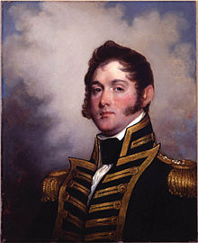
“It became, well, should SeaWolves continue to mean what it meant?” Coleman said. “There’s some history with the Battle of Lake Erie in the War of 1812…. So there was kind of a question of whether we should stick with the pirate or lean kind of more towards the War of 1812.”
The local history Coleman references is specific to the Flagship Niagara, the official state ship of Pennsylvania, which is docked in Lake Erie. The Niagara was commanded by Commodore Oliver Hazard Perry, who earned the nickname the “Hero of Lake Erie” for his decisive victory over the British in the Battle of Lake Erie. Perry famously flew a battle flag that read “Don’t Give Up the Ship,” which Coleman says is the reason there’s a flag logo in the SeaWolves’ identity system.
Ultimately, though, the War of 1812 just wasn’t as much fun as the pirate theme as a primary inspiration for an identity.
“While the War of 1812 has a lot of great relevance locally,” Coleman said, “it’s a little tough to build a brand around.”

Another concept the team explored was to take the idea of the sea wolf to a scary pirate extreme. Dan Simon of Studio Simon, who created the current brand, proposed an identity based on a skull of a sea wolf, but the team wanted a friendlier look.

So the SeaWolves stuck with their current name and its accompanying backstory, as well as the color palette that had been in place since the team’s inception. While they toyed with a blue version of the logo (above on the left) to tie in to their parent club in Detroit, the SeaWolves stuck with their original black, yellow, and red.
“They had a lot of equity built up in those colors, and those are colors that fans and the community associated with the SeaWolves,” Simon said. “They wanted to maintain some connection to their existing identity.”
That said, the SeaWolves decided to emphasize one of those colors more than others.
“We didn’t want to mimic the Pirates exactly,” Coleman said, “which is why red is a much more dominant color in our palette than the gold is.”
The new identity unveiled in 2013 replaced one that, frankly, was not very good. In fact, the logo above, in use from 1999 to 2012, was listed in Bleacher Report’s 50 Worst Logos in Baseball History. Dan Simon, who is a kind person and does not like to say negative things, went through great contortions to find a nice way to say that he was glad to give the SeaWolves a new look.
“The main thing we were trying to do was give this identity, the execution of the identity, the professionalism it warranted,” he said. (Later in our conversation, Simon told me that he has instructed his wife and children that he wants the epitaph “Life is too short for bad design” engraved on his tombstone.)
Coleman, who had worked with Studio Simon on projects with other teams before he joined the SeaWolves in 2011, approached the rebrand with a simple goal. “Our objective was to do something that had local relevance but also would be widely accepted on a national scale,” Coleman said.
The SeaWolves are an interesting case. Their 2013 rebrand looks to the casual observer to have been simply an upgrade to the visual brand (and a huge upgrade, at that). But the process was much more than that. It was an affirmation of the team’s brand—everything from the team’s name, the backstory behind it, the colors, and the logo were questioned, and in the end, only the logo changed. Even the spelling of the name was in question—in the end, the traditional SeaWolves, “one word, two capital letters, in that old-fashioned minor league baseball charm,” as Coleman puts it, won the day.
It’s the story of a team whose rebrand was successful without resorting to change for change’s sake, and in this day and age in minor league baseball, that’s saying something.

