
Along the banks of the Susquehanna River in Pennsylvania, you’ll find a rejuvenated ecosystem, brought back from the brink of ruin by conservation efforts and a concerned citizenry. You’ll find lots of wildlife along the river, not to mention the humans recreating on the water. What you will not find, most likely, is religious warriors killing people who don’t believe what they believe.
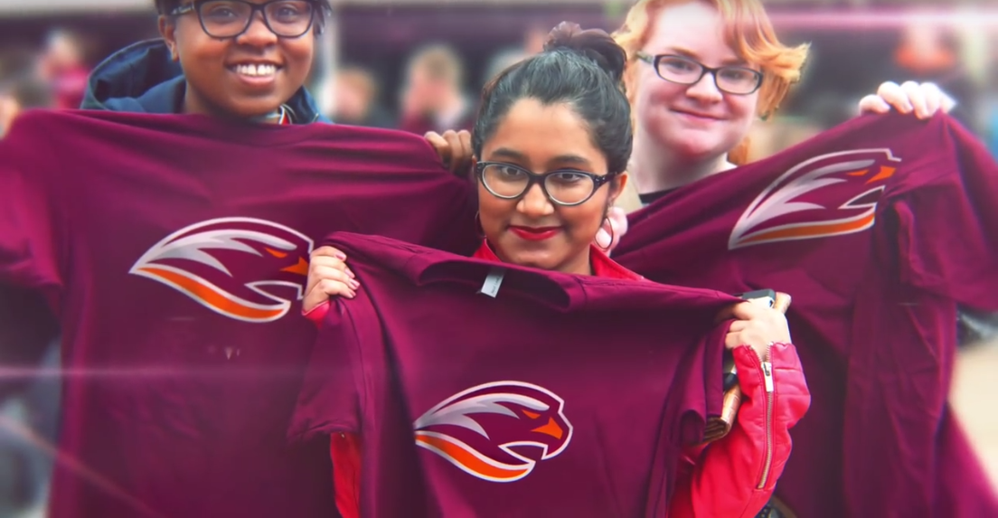
This is one of the reasons that after nearly a century as the Crusaders, Susquehanna University’s student athletes are now the River Hawks, as unveiled on the university’s website. The reason for the change is best summed up by a statement from the university after they decided to change names last year:
“Many critics of the term Crusader feel that connotations of the word—related to the medieval crusaders who used violence in the name of religion—are at odds with the university’s commitment to embracing and respecting difference.”

Susquehanna turned to Pennsylvania-based designer Joe Bosack of the firm Joe Bosack & Co. to help create the new brand. Bosack entered the process with an awareness that change pretty much always creates pushback, but this situation came pre-loaded with all of the lightning rods for criticism: The university was changing names because their old name had the potential to offend, the old nickname had been around a really long time, and in general, the ties to a brand are stronger at an academic institution than with a professional team.
“There’s lots of graduates of Susquehanna University, who graduated under the nickname Crusaders, and to them, this is a little bit more personal,” he said. “Brand loyalty in sports in general is really irrational brand loyalty. It’s a lot like people’s loyalty to their professional teams. It’s even doubly so when it comes to colleges and universities because you have the power of alma mater. It’s more than just your favorite team. This is where you spent four or five of your formative years.”
Starting with a completely blank slate was something of a departure for Bosack.
“Usually it’s a client comes to us with a very solid foundation of what that nickname is going to be,” he said. “Part of the process was for us to be able to help them, in a number of ways, find a proper nickname, something that would effectively represent the institution and its athletic program, and also be relevant to the institution and the students that go there.”

The choice of River Hawks, a colloquial name for osprey, was appropriate on a handful of levels. First, the story of the bird parallels that of the rebranding process the university was going through.
“It’s really a great metaphor for rebirth and coming back and being new, if you will,” Bosack said. “The osprey were gone for many, many years in that part of Pennsylvania. They were almost extinct in that part of the world, and through conservation and through cleaning up of the river, the osprey have made a resurgence.”
In terms of the specific characteristics of the River Hawk, in addition to the usual things, “like the ferocity of the osprey and the osprey and the ferocity that we like to see in our student athletes,” Bosack points to its wide range as being especially poignant.
“The osprey is worldly, it exists on every continent on the planet except Antarctica,” he said. It’s all over the place. It’s well traveled. Ospreys that were tagged in Pennsylvania have been found as far away as Aruba. They travel great, great distances, and the same thing can be said for students at Susquehanna. They have a great study-abroad program, so their students are worldly, their students come from all over the world.”

In creating the actual logos, Bosack and the university aimed to create something iconic and clean, and something that would get away from some of the unfortunate design trends from recent years.
“You think about some of the logos that were developed in the late ‘90s to mid ‘90s, really overly animated cartoon kind of looks,” Bosack said. “That happened not only in the collegiate space but also in the professional space. I think what you’re really seeing now is that you’re seeing a bucking of that trend, if you will, and a move back to simpler, cleaner, more iconic kinds of looks. And I would certainly put this one in that category.”
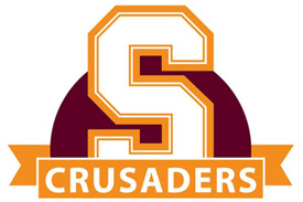
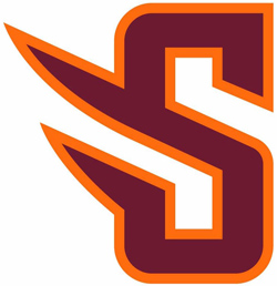
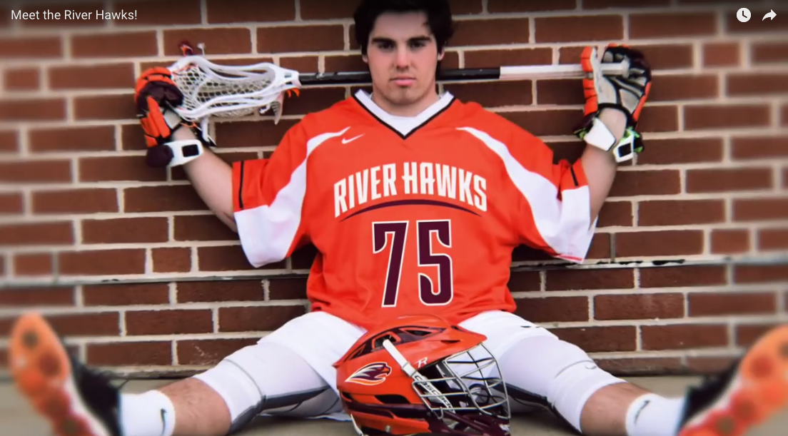
The new look retains Susquehanna’s maroon and orange color palette. The university’s previous block letter S (on the left above) was often confused with a similar look at Syracuse University, so the new version (right) is intentionally unique.
“That winged S logo, it’s a really simple mark, but a really iconic mark that has lots of potential to be able to build equity for a really long time,” Bosack said. “I sort of see this, overall in the design, as being much cleaner than what’s typically going on out there, but it still has that aggressive, kind of forward-leaning feel to it.”

The hawk itself also relies on simplicity for effectiveness.
“When it came to the actual River Hawk itself, the simple use of line and shape that is incorporated in that logo, it’s something that I think is really a hallmark of our style,” Bosack said.
After ditching the name Crusaders, with so much history under its belt, the new River Hawks brand has its work cut out for it before it’s fully embraced by fans and alumni. The class of 2020 will be the first to graduate having spent their entire tenure at the school with the new brand. But it’s a solid look and there are enough ties through the design to the old brand that this one is well positioned to succeed.


