The 2016 Major League Baseball playoffs start up tonight with the Baltimore Orioles travelling to Toronto to face the Blue Jays in the AL Wild Card Game. As has been the case, especially over the last three seasons, the postseason offers an opportunity for Major League Baseball to wrap their games in a single consistent brand, everything from scoreboard graphics to jersey patches, even the bases will be branded following a strict postseason style guide.
Let’s take a look at what you can expect to see, branding-wise, on the field and in the stadium during the 2016 MLB Postseason.
Starting with what interests our readers the most, the uniforms.
The biggest change us obsessive uniform nuts will notice is the ball cap, with the beginning of the playoffs comes the introduction of the New Era “flag” to the side of every on-field cap. This was announced a couple of weeks ago, the change carries on through to the 2017 regular season. It’s just a part of the uniform now going forward.
What we’ve learned since that announcement is that the New Era logo will be coloured to match each teams cap; at the time we had only seen white used in examples now we see orange in use for the Orioles, Mets, Giants and red for the Indians road cap:
Postseason patches will be added to the other side of the ballcap, an example of that here:
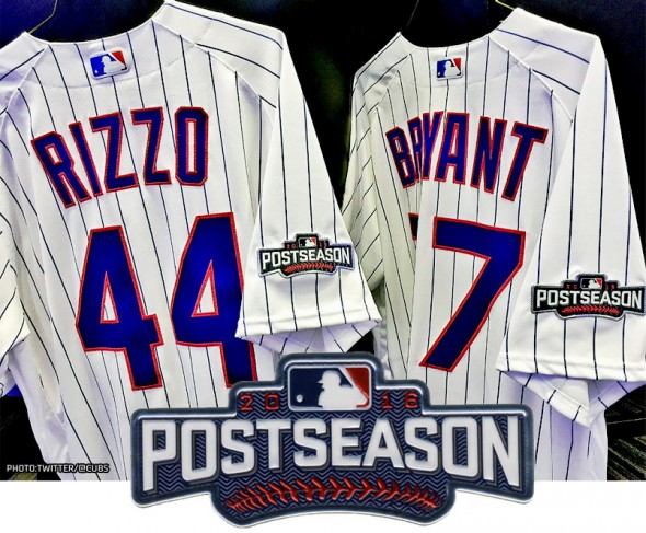
Jerseys will once again be patched for every postseason game, there was a time (1987-2012) such an honour was reserved solely for the World Series, not anymore. Take a look:
Moving onto the actual field, as we alluded to earlier you will see special base designs in use for the first three rounds (all of these designs are changed for the World Series):
Round-specific logos will also be painted on the field:
And added to the dugout walls:
Scoreboard graphics will be universal throughout all stadiums and follow this basic template — with only the round logo and team logos changing where necessary (note the primary graphics on the main centrefield scoreboard and a brief look at the secondary graphics featuring a pennant design on the two outfield walls):
Finally, the Star of the Show, the official Rawlings Major League baseball will also get a special design. The usual blue lettering and graphics replaced with silver:
As we mentioned earlier, this all gets scrapped for the World Series but it’ll be the same basic idea, the patches will read “WORLD SERIES” instead of POSTSEASON for example and the ball above will switch to gold lettering and graphics.
Best of luck to all teams involved, I’ll be at the Wild Card game in Toronto tonight right down at field level in the front row behind first base cheering on my boys in blue.


